Play game
Ascension's itch.io pageResults
| Criteria | Rank | Score* | Raw Score |
| Gameplay | #14 | 2.719 | 3.100 |
| Concept/Theme | #16 | 2.631 | 3.000 |
| Art | #18 | 2.894 | 3.300 |
Ranked from 10 ratings. Score is adjusted from raw score by the median number of ratings per game in the jam.
What game engine did you use?
Unity
Leave a comment
Log in with itch.io to leave a comment.


Comments
I broke it.

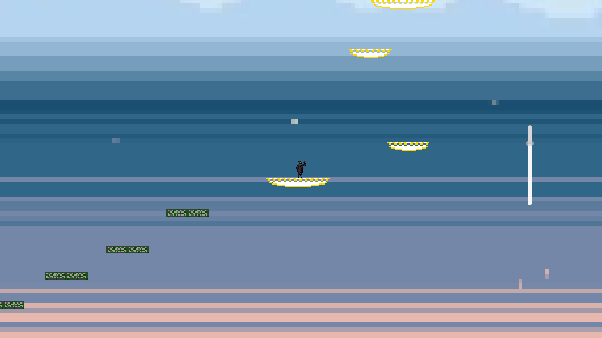
At the very top the 4th moving gold platform drops and doesn't go back. Am I missing something?
We have now fixed this problem, we are still working on some mechanics such as the player getting stuck in the ground. We are glad that you played our game and made it that far! If you want a version that has the end platforms working feel free to reach out! Or we might reupload it soon!
I'll wait right here until it updates on itchi.io

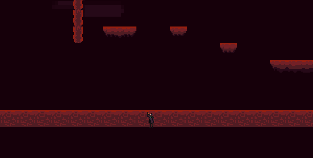
i love that the player is casually sipping beer while climbing out of hell 10/10
Hardest Game ever, fun tho
actually good game feel, moving platforms are hard to get right and yall did great - nice idle animation and art, 10/10 ragebait game jump king has nothing on you (it even features the unity blue background!)
I believe this game suffers from camera issues and visual indicators. The feeling of the game is like Sisyphus pushing the boulder up hill. While checkpoints aren't necessary, a better distinction between what a platform is and what is background would've been nice. There were many times where I didn't know where to go because (especially for the bottom parts of the game) the platforms bended in too much with the background. Additionally, many parts of the game require that I take an unreasonable risk similar to that of something I would see in Kaizo Super Mario World.
If you continue to polish the game here is what I recommend:
- Fixing the camera (preventing showing the blue skybox.
You could do that by creating a script which bounds the camera between coordinates)- Making platforms (atleast on the lower level) more obviously distinct from the background
- Fairer platforms (moving platforms tracks and falling platform differentiation)
The game has a lot of potential, and I strongly encourage you to look into polishing up the game a bit more. For 48 hours though, well done!
Thank you for your feedback, we have been working on polishing the game up from its initial game jam launch. Thank you for your recommendations, we will keep that into account moving forward. Thank you for playing and taking time to give feedback!
I like the concept of a vertical platformer with the constant threat of lost progress, but... Some of the mechanics here don't serve that premise very well. A few of my falls were from obstacles that I couldn't have understood except through trial and error. A game like this is at its best when it communicates clearly to the player. Visual distinctions between normal and falling platforms and better indicators of the tracks that moving platforms are moving along would go a long way in making this a more enjoyable experience.
We understand your complaints, but we took inspiration from games like getting over it. We wanted it to be challenging and rage inducing so we did not make a clear indicator on things of that nature on purpose. Thank you for playing!