Play game
Brackey6's itch.io pageResults
| Criteria | Rank | Score* | Raw Score |
| Graphics | #70 | 4.154 | 4.154 |
| Audio | #205 | 3.462 | 3.462 |
| Theme | #381 | 3.385 | 3.385 |
| Overall | #401 | 3.282 | 3.282 |
| Game Design | #610 | 3.077 | 3.077 |
| Innovation | #661 | 2.846 | 2.846 |
| Fun | #789 | 2.769 | 2.769 |
Ranked from 13 ratings. Score is adjusted from raw score by the median number of ratings per game in the jam.
In what way does your game fit the theme?
Chaotic obsticle generation on racing track.
Did you write all the code yourself and made all the assets from scratch?
Code yes. Assets no. I used a combinations of free assets off of asset store and a couple purchased tools / assets.
Leave a comment
Log in with itch.io to leave a comment.


Comments
Those portals are bullcrap XD, loved the graphics and voice
The GUI is God Tier!
Nice game! The portals are kind of confusing though, I can't tell if they are sending me backwards or moving me closer to the goal but since i keep losing I guess they are sending me back :P
Good job!
Thanks! I've noticed the random function favoured back more than forward ... hahaha. Maybe I could have included probability to make it more favourable...
Thanks for playing =)
Cool UI! The controls are bit confusing since you change directions. Overall, it's a decent game!
Thanks!
The Chaos portals were a part of theme. I added the arrows on the track to lessen the chaos impact...but it seems it was too chaotic for most.
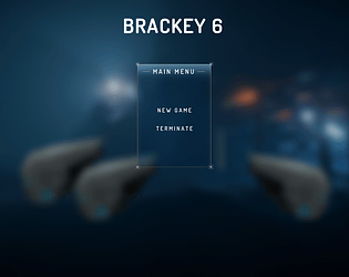
UI Credit goes to (free asset): https://assetstore.unity.com/packages/tools/gui/slimui-tech-menu-133049
good UI
Credit goes to: https://assetstore.unity.com/packages/tools/gui/slimui-tech-menu-133049
I adjusted the script and background image.
It would have been better if you could see your position in the race. Cool menu UI!
Ya. Agree. The UI was lacking a few things:
Thanks for the feedback!
I grew up with micromachines on the megadrive, so THIS is my jam!
I loved it, I can certainly think of some tweaks.
I would of loved to have seen the camera zoom out in proportion to your speed. Also the robots who shoot you, I think if you are in last place they should have given you a speed booast instead of slowing you down, because if you go through a wrong portal and are in the wrong place it becomes a bit hard to catch up.
OMG. Micromachines!!! I modelled this game as an RC PRO AM reboot.
Yes! I love your ideas! Here were some features / mechanics on my "wish list" if I had time:
... The list goes on! I think this could have potential to be something fun, even a platformer.
Re: Bit hard to catch up; I had similar that feedback from another play tester too. The lagging speed boost is a great idea!; the best I think of (with the time constrait) is give the player a tiny bit more speed. I guess that's the challenge when you go solo, your thinking is scoped.
Not bad, not great. Its a bit of mess as you don't really know which place you're in. Also, do the portals take you to a random spot?? Good job finishing the game tho!
Agree. The game is still requires several mechanics.
The chaos portals are up to 100units in any (valid) direction. When I had others play test it, they also didn't like the chaos portals. The wanted more control, such as:
I think the portal mechanic definitely needs tweaking. But my reply was, that's didn't feel as "chaotic" when you have a choice as to what portal you took. So despite the feedback I kept it as random as possible...
Appreciate the feedback! =)
Fun! Next time, try to do the graphics by yourself :)
and also, think for the european keyboard, we don't use qwerty but azerty ^^
Thank you!
Great point about the European keyboard, I'll aim to make my next game's controls more universal.
I recently subscribed to an Udemy blender course, so hopefully my next game will have more of my assets. =)
nice game
Thank you!
https://itch.io/jam/one-minute-game-1
VERY GOOD
Thank you!