

Play game
Withering Dreams's itch.io pageResults
| Criteria | Rank | Score* | Raw Score |
| Presentation | #1 | 4.333 | 4.333 |
| Story | #1 | 3.667 | 3.667 |
| Gameplay | #2 | 3.333 | 3.333 |
| Creativity | #2 | 4.000 | 4.000 |
| Overall | #2 | 3.556 | 3.556 |
| Horror | #3 | 3.000 | 3.000 |
| Theme | #3 | 3.000 | 3.000 |
Ranked from 3 ratings. Score is adjusted from raw score by the median number of ratings per game in the jam.
How did you choose to implement the Theme: Urban Horror in your game?
The game features our MC who recently moves to an apartment in the city and is tormented by a creature feeding on their past trauma. We used the familiar feeling of an apartment to create the dread of feeling trapped and the uncanny as the familiar becomes unfamiliar.
Did you implement any of the optional Bonus Challenges, and if so, which ones?
We included a few important scenes that take place in parks and a short stealth puzzle where the MC has to make it to a door without making noise.
Leave a comment
Log in with itch.io to leave a comment.
Comments
Posted as part of the Review The Old Event #1: January 2025
Gameplay - 3/5: Serviceable
The inclusion of the instructions in the 'weird note' is a nice touch!
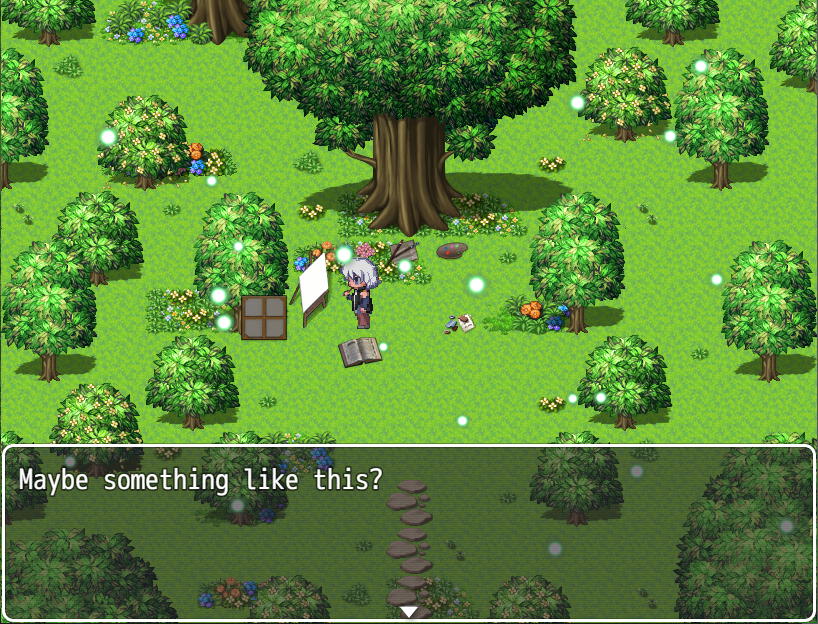
The amount of detail that goes into the map design definitely helps the world to feel more alive and lived in. However, sometimes it's a little difficult to navigate areas. Maybe making doorways more clear could help with this, such as extended tiles, door frame sprites, highlighted areas, etc. I think maybe this is done by adding sections to the room along the floor and walls. It works, but it's not super intuitive. The easier places to see you can travel to a new area are the stairs, door sprites, or even just holes in the wall. I think probably making entry walls more visible like those examples could help with navigation, or even just making the map bigger so you transition less often.
I was a little surprised by the lack of intractable items put into the maps too. Not that a game needs to have everything be interactable per se, but it felt like the things that were was kind of random. It didn't help with the feeling of blindly interacting to try to figure things out. I think at least for the puzzle where you have to find the right box, even just interacting with a box and Mateo saying "oh no, wrong box!" could help give the player a bit more direction. I wasn't even sure I was in the right room, so it ended up feeling like an accident when I found the supplies
I will say that the fetch quests are kind of tedious, but puzzles like the flower one was a lot more fun.
Presentation - 3/5 Stars: Serviceable
The use of both RTP assets and custom assets are pretty effective at giving the game a more unique feel.
I like the main menu music, though it is more sweet than mysterious or foreboding. I think the music that plays later in the basement and the house is a better fit maybe for getting the player in the right horror/mystery mood for the game. Other than that, I really liked the music in this game! Especially the section after you plant the seed was very creepy.
I think also making better use of sound effects could help the game feel a little better. Specifically, when you're trying to enter a code and you get it wrong, you get a sound effect or maybe some text like "oh wrong code". Just in general it could give a little more life to the game, if that makes sense.
I do have to say that this game suffers really badly with bugs that let you walk on walls, especially in the later parts of the game. They're not game-breaking, but it gets really distracting after a while especially as the story starts getting more intense and they're becoming more not less frequent. There's also some bugs with respawning items, again more in the later part of the game,and possibly some bugs where you can only transition in certain spots, or you might switch back to a previous map just by walking in the wrong direction.
Creativity - 4/5: Good!
Though most of the assets are RTP, the custom assets, music, and story really shown with their own creativity, particularly the story and custom art. I will say that some elements, like the puzzles, were never something too unusual for RPG Horror games. I think a little bit of creativity not only with the art and story, but also getting creative with puzzles and gameplay could have helped to make this a particularly creative game. I liked puzzles like the flower puzzle and the car scene puzzle, but I think I wanted more puzzles like that and less of the more generic or more confusing ones.
Horror - 4/5: Good!
I think the game does a very good job of having a slow build up of dread. Particularly the car crash scene was very unsettling. Like other reviewers have mentioned, the monster has a good design but not a very sophisticated chasing AI, though I didn't mind this since I personally hate chase scenes. I will say that some of the horror was undercut by distracting bugs and some slight confusion about the story.
Story - 4/5: Good!
The game keeps it's focus pretty well on the characters of Mateo, Lysander and Ianthe. I liked the small reminders Mateo got of their time spent together, and how it becomes more foreboding by the absence of those characters. I also have a soft spot for stories about people trapped in houses... well, you could probably tell just by playing any of my games. But especially the way Mateo becomes more and more cut off from the outside world as his own personal horrors grow was a nice touch, I really liked the way the game explored his anxiety.
I will say I think the game could have used a little more context? We know Lysander and Ianthe were Mateo's friends, but for a while I wasn't sure if they were also his siblings, roommates, or even his parents. I also had assumed Mateo had just moved into a new apartment, and this helped the idea that he was more reluctant to leave it. But then later a pile of books says he's "not done packing", implying he's getting ready to move away? I think a couple more details could have helped get us into his headspace and help the story flow a little better.
Overall:
For a first game using RPGMaker, this game was excellently made. It used a mix of RTP assets and customs assets very well, had a good mix of puzzles and gameplay, and even had decent music and an interesting story to boot. However, the game also suffers from some bugs, lack of context, and some trouble with navigation. There's a lot of things this game does right in terms of design and gameplay, I just think I would have preferred to see more of them. More things to interact with, more sound effects, more obvious transitioning areas, etc. If y'all ever make another game in RPGMaker or otherwise, it would be interesting to see what you come up with!
Extra Tips:
Many of the issues in this game are minor, and thankfully have some pretty easy fixes. With the map collisions, probably just a better knowledge of RPGMaker and an eye for detail is needed. When adding custom tiles or creating new tilesets, you really have to keep aware of what the collision is set to for each tile to avoid these kind of bugs (this includes events!).
When I was first starting out with RPGMaker I didn't really like the default look of the menus, especially when it shows health and mana and so on in games that don't use those resources. For MV specifically, mjshi's Non-Combat Menu plugin is a really good solution to this and pretty easy to use (https://forums.rpgmakerweb.com/index.php?threads/non-combat-menu.56344/). I think adding this to the game would be a nice quality of life update that requires less menu navigation on the player's end and keeps them focused on the story and the horror, rather than wondering what they'll be using their HP for later on.
Another thing I noticed, specifically when opening up notes such as Ianthe's guide is the text box at the bottom of the screen. There should be a way in the editor to make a transparent textbox, and then you can simply put a textbox with a space so it doesn't show up and block the guide or other pictures.
Hope these tips are helpful!
Posted as a Review The Old Event #1: January 2025
Cool intro, nice little finding stuff in boxes in the apartment, but no music or ambience or anything is very felt. Convo after painting is hard to follow with how it is written. Weird. What's up with all the water in the kitchen, etc now. Ok, now we have ambience; redeemed. Somewhat. Why was the orange a banana in the code? What's up with the Now Loading screen?
This seems maybe a bit inspired by Oculus and also by Heriditary with the calls checking on art/work. Love the hallway transition.
Wow that whole planting seed at the tree and after was great with the call after. And now the freaky apartment jeez. Love the vignette now too.
After the road and wreck reveal it went very downhill though. Not obvious at all what to do and once I watched a playthrough to see what to do didn't even feel like finishing. Whoops.
Doing this review long after the jam ended, so I'm not going to mess around with number values, but some of the rating categories are still useful for formatting.
Playtime - probably between 30-40 minutes on average, but it depends on how often you get stuck on the puzzles.
Presentation - Excellent in basically every respect. A fair amount of custom art/sprites/etc and what wasn't custom was used well. Great visual storytelling through the map designs, lots of small details and stuff moving around over the course of the game as time passes - the water bottles especially were a nice touch. The creature design was interesting as well. The ringtone/alarm did last a bit too long each time, although I liked what the game does with it later.
Story/Horror - I found it interesting enough, if a bit predictable. It's told very well though, both in text and visually (as I already mentioned). It wasn't particularly scary, although I could see somebody getting jumpscared in the stealth sequence due to how abrupt it starts and how easy it is to fail accidentally. Decent slow-burn psychological horror though over the course of the game though, and it was overall effective at portraying its themes of grief and slow self-destruction. I also felt it fit the jam's Urban Horror theme well, although that's probably just because I liked the map design so much.
Gameplay - Pretty standard "fetch items and solve puzzles" stuff, but I personally like that style of RPG Maker Horror game so it worked well for me. None of the puzzles were too difficult and I found all of them reasonably engaging. I actually think the "chase" sections were quite well done, since they focused more on avoiding the creature using the map clutter rather than just running away while dodging obstacles like a typical chase. The stealth section felt sudden and a little out of place, and wasn't particularly difficult once I figured out what was going on, but it wasn't bad. There were a lot of passability errors in the maps in the middle of the game, but thankfully none that really impacted the gameplay in places like the final "chase".
Overall - Definitely a game I would recommend, especially if you like the somewhat traditional style of "RPG Maker Horror game" (Ao Oni, Ib, Crooked Man, etcetera). I would have rated it highly during the actual ratings period, and I'm glad Beregon picked it for the Monthly Reviews because it would be a shame for all the new people who've come to these jams since to miss out on this.