

cool game!
A member registered Aug 27, 2019 · View creator page →
Creator of

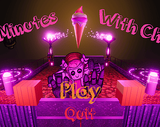
Split-screen survival game where 2 employees collaborate to run from the ice-cream monster
Survival

Shooter

Simulation

A two player shooter game that plays on the same keyboard.
Shooter