Thank you! You nailed it. I was coming down to the wire, and I madea hard choice, especially with the size, to lean into the writing, with evocative imagery, and a clear map. Later, when playing around with "V01.2" I found some ways I could have increased visual impact but I might save that for post-jam time frames.
Glad you are feeling the vibe! Totally, I wish I had allowed myself more time to integrate the map a little better into the work. But I was also worried that if the map was too artistic, given the number of rooms, it might become more frustrating.
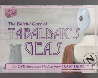
Thank you for the kind words! "Fraunces" is the Google font I used at 12 point. Big fan of "Soutane" but, this is a slighly pointer family member with a great bold and italics versions. I would say its one small drawback is that is a little cramped at a smaller size versus, say, "Jost"- but I think its my new favorite for adventure writing.
Thank you! Totally agree that I'd like to have a bigger section to provide 2-3 different set-ups for the PCs, who I initially imagined being all squires of the group already present.
I did try to use stars to mark the two methods of escape: the Moon Mask and drawing The Moon from the Deck of Fates (aka Deck of Many Things). Or whatever other solution might arise out of the deck.
A top contender for sure! And I think it matches the Appx. N via BX D&D, with its inclusion of titles such as The Black Cauldron. Also, Hydra Chandelier- love it.