

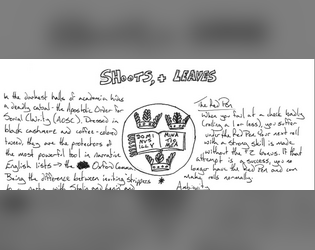
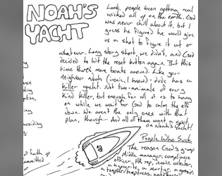
I played around with a couple of fonts, and I might play around with them more as the project goes on, but nothing really fit. Tried a couple of serif fonts but they became more difficult to grok. Tried a couple of typefaces that emulated handwriting (Chinacat being my personal favorite) but they had to be so small to fit the format that they were harder to read than my own handwriting was. >.< I don't love how lifeless Arial looks here, either, and I would love to find a stronger middle ground between function and aesthetic.
A member registered Jun 09, 2020 · View creator page →
Creator of
Role Playing
Cleaned up and prettied up!
A One-Page RPG About The Families of Child Soldiers in an Intergalactic War
A One Page Role-playing Game About Old Romantics
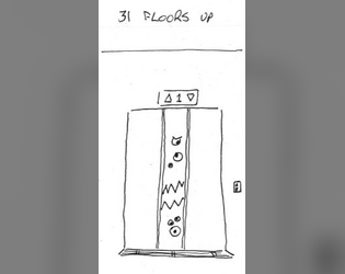
A Horror Elevator One-page RPG
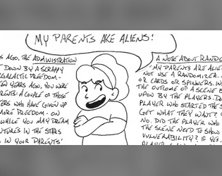
A Galactic Empire Regency Drama One-page RPG
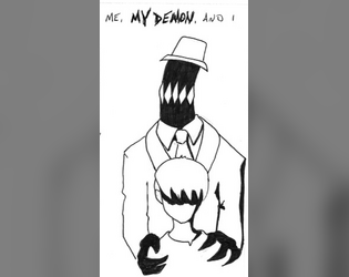
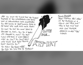
Everybody's Got Their Demons
A One-page RPG About Touring with Your Band
A One-page RPG About Games
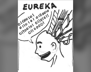
A One Page Role Playing Game About Digital Ascendency
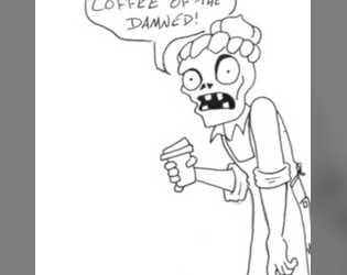
A One-page RPG About Serving Coffee to Dracula
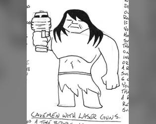
A Game About Post-post Apocalyptic Survival
A One-page RPG About Gnomes
A One-page RPG About Ambition and Authority
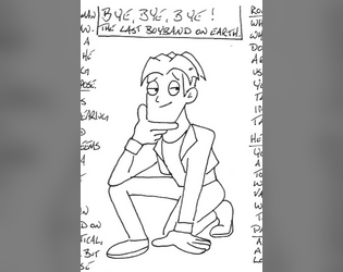
A One-page RPG About the Last Boyband on Earth
A One-page RPG About Vulnerability and Belonging
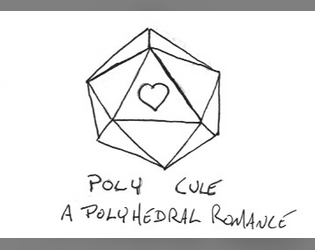
A One-page RPG of Polyhedral Romance
A One-Page RPG for One Player and One Game Master
A Diceless One-page RPG About Faith
A One-page RPG About Capitalism or Something
A One-page RPG Mostly About Being Goosedeses