













Hi,
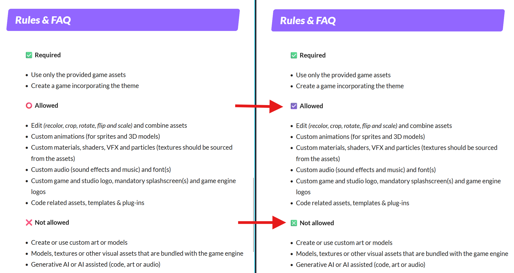
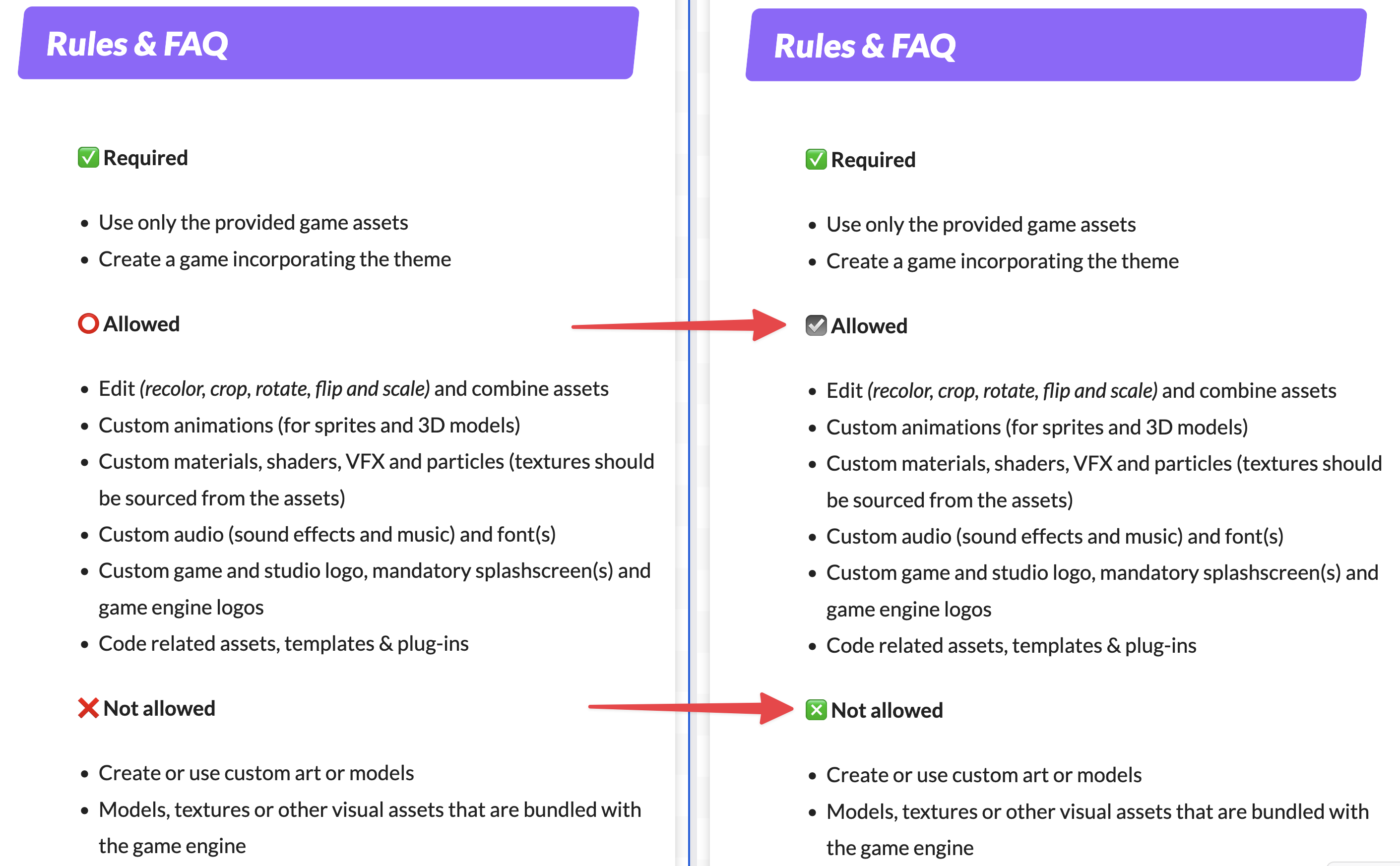
I know this is a petty nitpick, but I have noticed that on the jam page under the “Allowed” section for assets, the heading is marked by a red circle emoji (⭕). I find the usage of red iconography counter-intuitive, as the color red usually implies something is prohibited. May I instead suggest the check box with check emoji (☑️) as it not only uses a neutral color, but also matches the visual style of the check mark button emoji (✅) used for the “Required” heading.
While we’re at it, you may also consider swapping the cross mark emoji (❌) used in the “Not allowed” heading with the cross mark button emoji (❎) for the sake of visual consistency. That way all icons will be represented by rounded squares (✅☑️❎ℹ️ VS ✅⭕❌ℹ️). Admittedly, I am on the fence about this one as you’d be swapping the color red, which is used correctly in this context, for green. But, as the selection of emojis is finite, I’d personally lean towards consistent UX versus semantic coloring in this particular scenario.
Here is a mockup of what the suggested changes would look like on Windows and macOS
Regards