Thanks a lot for playing and giving feedback :D
SeelenGeier
Creator of
Recent community posts
They are quite big and can obscure some of the other assets. The unfilled bar and the border make them very present and distracting as well. I would suggest dropping the bars entirely and use some tinting mechanic on the actual enemy sprites or something more subtle like numbers. The rotation of the healthbars makes the game look more dynamic, but they are more distracting than helpful. Think about what info the player really needs. Is the rotation helping the player see the enemy health better or is it helping in any other way?
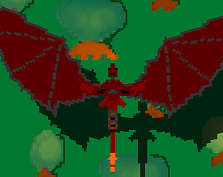
The game looks nice and plays really well. Those big clunky health bars could use some updates and the passing stars are a bit distracting, although they makes the game look better.
A volume option would be nice as well if this is not intended for mobile use only.
I would also pick something else than coins for the points. maybe just some glowing orbs. Coins kinda indicate you can buy something with them.
Other than that, great game :D
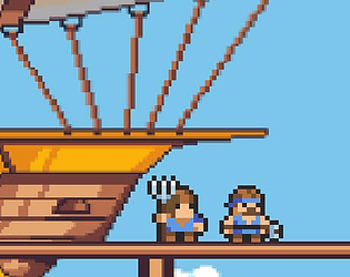
The game looks nice (very arcadey) and the gameplay feels ok...until you run out of ideas on what to do. I am sad to say, I never made it to any kind of combat :(
The Cards and sprite textures look a bit washed which makes things like "active" or "sleep" very hard to read even on fullscreen.
My biggest concern was that I was totally lost and didn't know what to do. I just flew around and my crew kept pestering me about changing speed or direction. I think a tutorial or some introductory handholding would benefit the game a lot. Even a short todo list might be nice to have instead of being dropped into a game without any explanation of what the objective is or what the player is supposed to do. What are those allocation values used for? What should I do first? Is there any urgency to do anything?
Leaving the player to explore a sandbox (if it is one), is great, but only after introducing the sandbox to the player.