Indie game storeFree gamesFun gamesHorror games
Game developmentAssetsComics
SalesBundles
Jobs
TagsGame Engines

Rosanna888

8
Posts
A member registered Apr 01, 2022 · View creator page →

Creator of

Recent community posts

Hi Jonathan, thank you for your comments. Many people found Pixel hard to read, it is a really good point, even though I quite like it haha.

I try to match the colour with the objects but maybe it is too busy, I will consider it for my next project!

Many thank!

Cheers

Rosanna

Hi Tracy,

Thanks for your comment!

Yes, I really enjoy the keyboard functions - makes our life easier.

For the shark scene, good to know that it will disappear when you press right and I would like to find out why. I noticed that when you press 'rotation', the shark will disappear sometimes because the background photos cover part of its body.

Overall, thanks for your comment again and I will do it better next time❤

Cheers

Rosanna 

Hi Rosa,

Thanks for your comments!

There are buttons to go back to the menu for every scene, not sure why is not showing in your computer, maybe try full screen? 

And for other scenes, the users need to find out the hidden button from the scene and the secret message will pop up, I did mention these in the pop up message and comment section but like you said, the text style is little bit hard to read. I quite like the style of the font though (it matchs with my Minecraft objects) and it is good to know the users may not find it the same way.

Thank you for your comment again and I will do it better next time😊

Cheers

Rosanna 

Hi Rosa, I really like your banner and the trees, they are matching with each other and it is very tropical. Also, the shape and colour of your dolphin are so smooth and astonishing. I think it will be good if the eyes can be bigger - it is just my personal preference - I like cartoons with big eyes and I found them so cute :)

Overall, I think it is a good user design with lots of details in the object!

Cheers

Rosanna

Hi Tracy, your website background is cute. It is colourful and fun, which makes me feel happy. Also, I like the instruction button on the main menu so the users can click on this button and look for help. Lastly, I like the colour combination and shape of your turtle, especially their eyes- looks so adorable! 

However, it will be good if you can add more objects/scenes next to or behind the title.  Also,  if you can put the name of your game on the banner, people then can know about the theme and topic straightway.

Overall, I do believe it is good user design :)

Cheers

Rosanna

(5 edits)

Many friends mentioned that I should have more instructions for my game, so they know what to do. Therefore, I would suggest some tasks below:

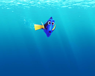
For Dory, Nemo & Shark, you just need to get familiar with the buttons, no tasks are required!

For Underground, you only can move Dory, and your task is to find out the hidden message from the helpers so that you can save Dory & Nemo!

For the fish tank, you only can move Dory too, and your task is to find out the hidden message from Tad so that you can help Nemo to escape (try not to be caught by the little girl ar!)

Thanks for my dear friends, again :)

(1 edit)

Hi Everyone,

You may find this game very simple and don't know what to do about it. Basically, it is just a prototype to show the basic characters and functions (up, down, left, right, bigger, smaller and reset). Unfortunately, it is not a 'game' yet and the functions are limited. However, your feedbacks are valuable and it will definitely help me to improve my final game in the future! 

REMEMBER: You can use both your keyboard & mouse to move the characters!

Cheers

Rosanna Yip

(1 edit)

Hi Jonathan, I really like your positioning - it is consistent! And the Ocean background  gives you the sense of peacefulness and it does match with the objects really well. The great barrier reef is on the right side, not too busy and that is good!

However, I think it will be good if you can set up your background photo and enable keyboard input though :) I personally found the colour of button strong but overall I think it is a good user design!

Cheers

Rosanna