

Aight cheers for the feedback:
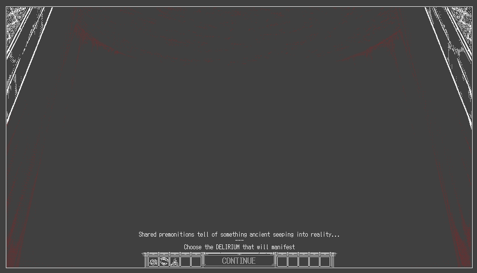
“I’m greeted with a black screen saying “CONTINUE” but clicking on it doesn’t do anything and it took me a while to realize there were tiny icons represeting the “Old gods”.”
-> I’ll probably add probably add some additional text + undither the Delirium select icons like this
“There’s so much text detailing the events RNG resolutions that I have no idea how they work.”
-> Currently there’s 3 different types of ‘checks’ (a hard statcheck, a stat-based roll and a standard random roll) that calculate success. Wasn’t too sure if keeping the information would be helpful info for the player. Might look into toning it back or cutting it altogether [maybe implement a suggested stats field instead] and just keeping probability of success.
“Like, I genuinely have no idea what “pass value” and “fail value” refer to compared to the numbers that are being displayed.”
-> Pass value is basically what you rolled (think DnD rolls), fail value is what the ‘event rolled’ (so you succeed if pass value > fail value and don’t if pass value < fail value). I’ll probably look into rephrasing it but pass/fail was just the most direct thing I came up with.
“Like, there’s the window with “potential traits” and a “confirm?” text with some squares (some empty, some crossed) so for a while I thought “Can I interact with these already? Am I supposed to click on it? Is it a toggle on/off thing with the crossed/uncrossed squares?”.”
-> I’ll look into dithering/masking that confirmation zone when traits aren’t available.
“The main icons to do stuff are quite hard to distinguish from another.”
-> I’ll probably look to increase the size of them in that case, probably something similar to 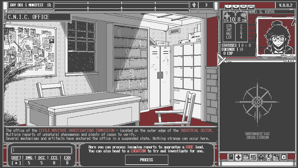
“Same for similar icons like the ones in character select screen”
-> I’ll argue on this because I think the immediate hover text field display during character select should help distinguish (unless there’s an issue with that, but I don’t think there really was; however I might look into doing the same undithered by default like with Delirium’s [though I’m on the fence about this since it’s a discrepancy in dithering behaviour with the left sidebar])
“ or the “Old god” (can’t remember what they’re called in this game) select screen.”
-> Distinguishing between them seems fine once I undither their zones by default so I think the above changes should be enough without the need for a size/icon alteration (might look into changing the icons of WE to distinguish it better from PSURLIHNUM)
“I had no clue what was going on during combat cause I was too busy typing instead of looking at the screen and the explanations were a lot to take in.”
-> It’s the most unorthodox system with the typing management + real time enemy actions that’ll take a bit to get used to (especially depending on your typing proficiency) but I’ll continue to monitor this aspect closely. Just as a final question for feedback what would you say is your average WPM/typing proficiency, just gauging on maybe scaling back/slowing down combat a bit to alleviate the stress.
Once again, thank you for the feedback