

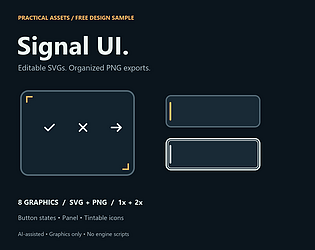
I made a small free interface-graphics sample and would like feedback from developers choosing UI assets for an actual project.
Signal UI uses dark panels, amber accents and visible focus outlines. It contains four states of one button, one panel and three icons: 8 editable SVGs and 16 transparent PNG exports at 1x/2x. A manifest provides dimensions and nine-slice margins. These are graphics, not working menus or engine scripts; engine integration has not been tested. The assets and documentation were created with AI assistance, as disclosed on the page.
Free sample and exact preview:
https://practicalassets.itch.io/signal-ui-free-sample
The feedback I need:
- Would this visual style fit a project you are currently making? What kind of project?
- Are the separate files, dimensions and resizing margins sufficient for your workflow? What specifically is missing?
- Which existing UI pack would you choose instead, and why?
If it fits your project, please try a button or panel and describe what worked or failed. A larger USD 9 kit is only a hypothesis; nothing is available to preorder. Critical feedback is welcome, and there is no request to rate, follow or buy anything.