
Indie game storeFree gamesFun gamesHorror games
Game developmentAssetsComics
SalesBundles
Jobs
TagsGame Engines

OwenBrandon

6
Posts
A member registered 18 days ago · View creator page →

Creator of

Recent community posts

So a couple of things. #1 I love the dithering style that you used for your game. #2 there are some things you can improve on that would immediately make this game 10x better than it already is.


Lets start positive. Your game is fantastic. The story, the visuals, the gameplay (Even as simple as it is). Fantastic!
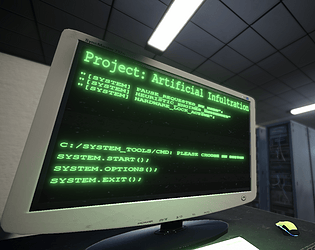
I'm glad I wasn't the only person to make a 3D game, and I wanted to use the dithering effect in my game as well as I think it makes the game look 10x better.

Some things you can improve on are to do with the lighting and the animation.
Lighting: The scene is too dark, I had to stop playing around the bathroom part because I genuinely couldn't see anything at all. This is a simple fix to either just add more lights, or up the gamma a little bit to where the player can at least slightly see in the dark.

Animation: The camera movement is great, but I'm confused about why the default camera state is slightly tilted to the right? Another simple fix but it can genuinely change how good your game feels to play immediately. 

Very cool project for the limited time we have though. Very well done

Genuinely one of the best submissions I've played so far!.

Although I had some issues with the game, there were way more positives to boast about that completely outshined all of the negatives.

One that I will start with is the creativity with the animations. Genuinely really cool! Also you had me laughing at the terminator black hole reference.

Here are some ways I would improve the game. 

1. Don't tell the players how to play, show them. There was a lot in the tutorial that made it difficult to understand how to play the game. That being said I also didn't really read through them because I just wanted to play the game and have fun. 

One way to fix this would be to take the player through a tutorial room that showcases the mechanics one by one against stationary targets. This removes the danger and lets the player learn before jumping right in.

2. The VFX could use some work. There is already a lot there, but some simple lighting systems and particle systems would make the game absolutely insane to look at. Some simple points lights around the candles would add to the atmosphere and likely even make for some suprise attacks from the heros.


Overall great game, and I look forward to seeing what you do in the next Jam.

I won't lie, I think this is the game I have the hardest time getting into (But that might just be because I haven't played many RTS games before.)

Some things I did like about the game were that it genuinely felt interesting to get used to. I had to use my brain and make sure that I wasn't using my energy on attacking when my character was at one HP which is definitely a good thing to have for a boss battle. 

Some issues that I had were this. 

1. Difficulty / Understanding: Regardless of if I was trying to understand how the game worked, I genuinely could not understand if it was my goal to kill the humans, or the boss. This also plays in tandem with how the mechanics worked. I didn't really know why the cards allowed me to calm the bosses rage until I was at the game over screen. In my opinion, this game would do well with a tutorial.

2. Theme cohesiveness: You stated this in your description but I wanted to put in some insight as to how you could improve this for next time and what I would have done.

- I would have made the player the boss dealing with rushes of these "Hero's" until you've either built up enough souls to unleash a fatal blast that kills every hero around you (Win state) or run out of HP (Lose State). This would have fit the theme perfectly while also likely making it easier for you to scale a boss battle that would have been more fun.

I hope this didn't come out as negative feedback but rather as constructive criticism as that is my goal with this post. 

I hope to see you again in future Jams!

The game idea is really cool and I think it fits the theme quite well. However I did have a number of issues with it on a personal level. 

Lets start with the good though (And I won't go over it all because there is too much good stuff in here to go over it all).
Your game sticks to the theme really well, realizing that your actions have consequences at the end when you realize that you are the main villain is great. It makes you think back to all of the shrooms you killed on the way there. 

Here are some areas you can work on for next time. The gameplay and controls, and the visual effects.
1. Gameplay and controls: An issue I had with the game immediately was that the player controls felt floaty and difficult to control. This is likely because the tuning for your accelleration and deceleration were off by a little bit which made this game feel more like it took place in space than "Earth". Not to mention that when it came to the boss fight, the hitbox on the player is so small that it was nearly impossible to actually hit them (Or at least it felt like it)

2. Visual Effects: the artstyle by itself is cool, but without lighting or anything adding to the scene, it just looks cheaply thrown together and out of sync with itself.  I also noticed that in your tags you added AI Art as a tag (Which I assume was done in the tileset.) This in itself can make the art look good, but in this instance it just doesn't look cohesive and instead makes the background visuals look out of place compared to the rest of the game.

Some other things you could add to juice up the game would be particles. A simple burst particle coming out of the mushrooms, or a trail of the purple fire sprites moving while being collected would make the game feel a lot better.

But overall great game, great submission, and amazing coherance to the theme!

Very cool submission. 
The most impressive part about this was the adaptation to your playstyle. I couldn't beat the boss because of certain things I found to be slightly unfair to the player, but that's the mindset that I'm going into while playing these.

I think the biggest plus that I saw in this project was how you were able to take a regular metroidvania style game and turn it into something that had me questioning my every move thinking it would make the boss battle harder at the end.

Some things I think you can improve on are the difficulty of the game and the overall gameplay.
Difficulty: There were parts where I was struggling to get through the lazers (Likely a skill issue) but then there were also times when it looked like the player character was well beyond the lazers yet I still died. Another thing you could do to subside this is to add checkpoints around the midpoints of the level. This could take away from the challenge too much, so you may have to balance it.

Overall Gameplay: Here is where I think your game both shines and sinks at the same time.
1. The characters' hitbox should be slightly inside of the player sprite to avoid the player dying by a couple of off pixels (Not sure if it is like this already, but it felt way too accurate.) If you want a good example of this, look at Geometry Dash hitboxes and you will see what I mean.
2. The lack of puzzles and rewards for exploring make this game feel way too linear and guided instead of rewarding players who explore and look for secrets with an easier time defeating the boss. To implement this, making the map would likely take the most time, the actual rewards could just be something like +1 dash duration, + 1 damage, + Shield, etc.
3. The enemies feel a bit too bland. There is a lot of missed potential with something as simple as a tracking bullet that can be destroyed by your own bullets, (This makes them feel like a tougher challenge even if you only have 3 in the whole game). Not to mention that there is only one kind of enemy, you could have added a second or third enemy type with polymorphism.

But with all of that being said, some of these additions would be out of scope for a Jam like this, so with the time we all had. I'm genuinely impressed by what you were able to accomplish.
Great job!

This is a genuinely cool game.

One thing I really liked about the game was the genuine difficulty scale, I genuinely had to think hard about which mouse to place and where in order to complete each new level. (Not sure if there is an end to the game since I didn't reach it)

Some things I think you can improve on are the UI interface, and the overall gameplay "juice"
UI: I think you should work on making a custom UI menu. Something that makes your game stand out among other indie games. Since your game is based around Rat's, you could make the UI based around cheese like a cheese wheel which gets a slice taken out when you can't afford an upgrade. This would add some more personality to your already lively game

Juice: Things like Animations, particles, VFX, lighting, etc would go a long way to making your game feel more complete.
Little things like a leaf particle explosion or a gelatin particle explosion on enemy death would make the game feel more alive.

Overall great submission! Hopefully you can use this advice to make an even better game next Jam!