

This is a great idea. Its basically typer shark for morse code.
I would love to see it evolve to be more than just individual letters, i would esspecially love to see inclusion of Morse prosigns in some way.
It appears that the delination between dot and dash is a solid range rather than a relative comparison, meaning there is a set maximum speed for typing which is unideal but for a jam that is likely easier to implement and few will be proficient enough to care anyways.
The audio layer is a bit too crisp and can be abrasive because of it.
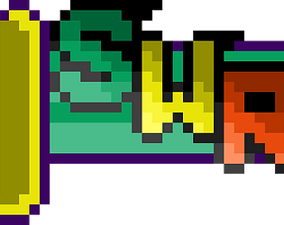
Pedantic Rant Incoming: The art is doing its best but the color pallette is where the real problem is. The theme isnt monocrhomatic but also isn't really trying to be multi chromatic. There are 9 distinct colors that each have completely unique hues, saturations and luminosities. The end result is a visual that has some elements that contrast on all three values and some that do not sufficiently contrast on any values. If you have an 80% difference in luminosity between two colors you dont need to vary the hue or saturation and yet the pallette consistently varies both. This creates too much contrast and makes everything less cohesive.
The ship and enemies have a contrast ratio with the background of 1.02:1. The morse reference card has a ratio of 15.28. and arguably the most important, the text on the enemys - 1.64. For text as large as you have you only need a contrast of 4.5:1 for maximum visual impairedness accessibility. If it was smaller text, like you would find in a EULA you still only need 7:1.
Limit your colors. Dont change all three variables at the same time. and aim for all elements which touch to have 4-8:1 level of contrast and it will significantly improve your visuals. WebAIM: Contrast Checker is a good resource for this.