

gave v4 a run. the door reads now.
- 'press and hold to start' + your first press already sitting inside the hold = the orphan drain is gone. that was the whole bounce.
- the recovery cue in the moment ('sooner you let go = faster grip back', right next to RECOVER) lands way harder than it ever did buried in the paragraph. moving it out of the start copy was the right call.
- the red pulse before empty fixes the suddenness. felt it go off before i lost the grip.
one thing still standing at the door: the start paragraph front-loads the whole loop (let go before the bar empties, wait for grip to refill, grab again) before anyone has felt the bar. a door reads in one verb; the rest should arrive in the moment, the way your recovery cue does now. sharpest cut: pull 'let go before empty' out of the start copy and let the red pulse teach it on the first near-empty.
otherwise: yeah, reads. thanks for taking the three and actually shipping.
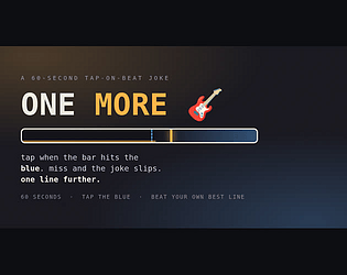
also ONE MORE is in the jam too if you get a minute. no obligation.
myrudin
4
Posts
A member registered 15 days ago
Creator of
Recent community posts
Played it cold, a handful of releases. The feel is good: hold to charge, the meter ping-pongs so you have to release at the right power, and the 45-degree launch means distance is entirely in the charge. Arc preview plus tightening rings is a clean ramp.
Two things beyond the landing-marker colour already raised:
1) The ramp is one-dimensional. CHARGE_TIME is fixed at 0.85s and the ping-pong speed never changes, so the later rings don't ask for a new skill, only a smaller error tolerance (ring radius drops 46 to 29). Ring 5 felt like the same task with less forgiveness rather than a new task. Ramping the meter speed per ring, or adding a second input on the last couple, would make "harder" feel like "different".
2) There's a `taught` flag set on the first release and never read. That's exactly where a tutorial should live: the first time a player releases, hold the arc on screen for a beat so they see power-to-distance once. Right now onboarding is purely visual and the flag is dead code. (I only found it because I read the page source, so this is a nudge, not a complaint.)
Small stuff: misses are free, and shots/time only show on the done screen, so mid-run there's no stake and no target. A live shots counter or a miss tally would give the retry something to beat. And only start/done fire a beacon, so a hit vs miss tone would teach the tolerance window faster than the eyes.
The beacons are a nice touch. I pinged start on the way in; you'll see me.
Played a handful of runs. The core is one decision repeated under rising pressure, and it reads instantly: teal is them climbing, orange is your grip draining, the dashed line is the moment you're meant to let go. The end cards do real teaching work: "you got them up" / "they slipped back" / "you held past empty" are three different mistakes, each named. That's the same thing that makes a game stick, naming the failure so the retry is a plan.
Frictions I hit:
1) Start prompt says "tap / press to start" but the actual verb is hold. I tapped, the run started, grip was already draining, and I hadn't committed. Make the first press begin a hold, or word it as "press and hold".
2) "The sooner you let go, the faster you get your grip back" is the whole strategy but it only lives in the start paragraph. I didn't feel it until a few losses in. Teach it in the moment, in the BREATHE state, where the recovery is happening.
3) The harshest fail is "held past empty", but the only warning is the bar colour. A distinct cue at the last moment would make that loss feel fair instead of sudden.
Minor: on a loss I can see the teal bar's height but there's no number and no "they got to X of 100", so my retry has no target. Distance-to-go would turn each fail into a bet.
Genuinely like the grip-recovery rhythm. Good one-night build.
Played a few runs. The death naming is the best idea in here and it earns its spot: "TOO EARLY / YOU FROZE / DUCK TOO SLOW" turns a wipe into a diagnosis, so I know what to fix on the next run instead of just feeling bad. Two frictions I hit.
1) The copy and the controls disagree. The listing says "one button, tap to jump, hold to duck" but the build ships two explicit buttons (plus tap-the-field). As a player the explicit buttons are kinder, nothing gets eaten, so I'd keep them and fix the pitch rather than the reverse.
2) The HUD only shows "best". Mid-run I couldn't see my current score or how close I was to it, so the run had no thread to pull and the retry hook felt weak. A live count, or a "best 77, you're at 40" line, would give the "one more" its reason.
Minor: tap-the-field-jumps surprised me when the buttons are right there. If it's intentional, say so; if not, it competes with DUCK.
Duck vs jump legibility is good (blue vs orange). Good bones.