neat graphics, sweet sfx and addicting gameplay. despite having very little to provide, it still manages to offer a fun yet simple gameplay experience for you past time
A member registered Mar 16, 2024 · View creator page →
Recent community posts
itch.io Community » Creativity & Art » 2D Art · Replied to Rojatzo in [pixel art dilemma] do y'all fw 1 or 2?
itch.io Community » Creativity & Art » 2D Art · Created a new topic [pixel art dilemma] do y'all fw 1 or 2?
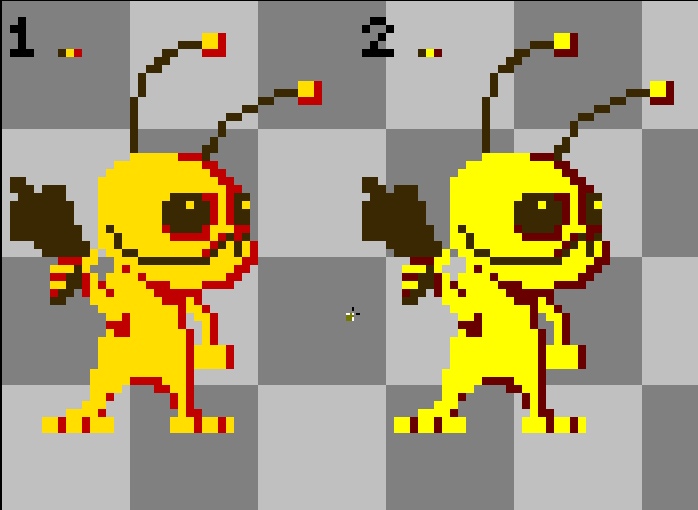
decided to make a few simple and short pixel idle animations!
feel free to criticize, cuz trust me, i could really use some feedback!!!
i'm going for a rather limited color palette for my style, around 3-4 colors, a NES-esque style if you will (willy wonka is the only exception to this rule since i wanted to play around with pixel shading a bit which i feel like it failed a little lolz)
will definitely release a second batch some day!
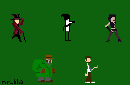
Top Row (left to right): Willy Wonka (Charlie and the Chocolate Factory), Onodera PunPun (Goodnight PunPun), Dr Frank-n-Furter (The Rocky Horror Picture Show).
Bottom Row (left to right): MF DOOM, Abraham Lincoln (Clone High)
itch.io Community » Creativity & Art » 2D Art · Created a new topic need feedback with a pixel art piece
so, i made this pixel art for a friend of mine.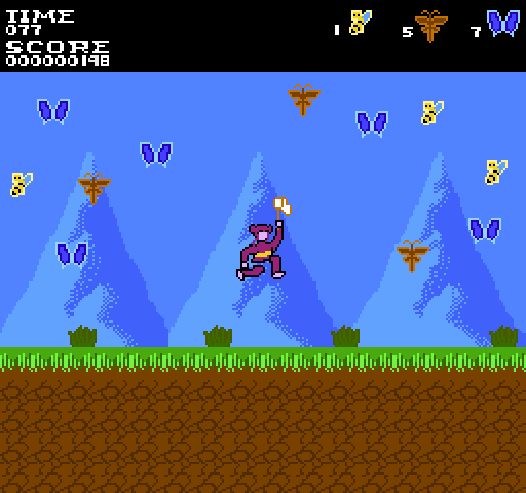
(i am aware it's HUGE i'm still trying to figure out the whole size thing when it comes to pixel art..)
context: the character in the middle is a 12 year old ghost who's really obsessed with bugs and tries to catch them with her net. i intended this mock up to be constructed as a bonus round for a supposed NES game. i'm currently in the 'do-i-leave-it-at-that-or-add-more' phase with this piece and i could really use some suggestions!!! do i leave it as it is? does it need more bugs? more stuff on the background to feel more alive? any feedback appreciated!!
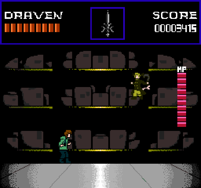
itch.io Community » Creativity & Art » 2D Art · Created a new topic I made this NES mockup and I could use some feedback
So, long story a short: a friend of mine is working on a manga and next week will be its first year anniversary (November 2nd). I decided to make an NES mockup based on the latest chapter as fanart for the occasion and I'm in need of honest critique in terms of originality- how close it looks to an NES videogame, or what needs to be improved to look like one.