
On Sale: GamesAssetsToolsTabletopComics
Indie game storeFree gamesFun gamesHorror games
Game developmentAssetsComics
SalesBundles
Jobs
TagsGame Engines

Mark

43
Posts
32
Topics
52
Followers
9
Following
A member registered Apr 05, 2024 · View creator page →

Creator of

Recent community posts

(4 edits)

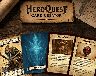
Version 0.6.2 of HeroQuest Card Creator is now available.

👉 Download v0.6.2 here https://mark-forster.itch.io/heroquest-card-creator

This release ended up taking a very different shape to what I originally expected.

On the surface, it introduces some of the most requested card-authoring improvements since the earliest version of the application launched. Body text has become more flexible, long descriptions can now automatically scale to fit available space, and custom stat labels behave much more predictably when working with longer translated text.

But underneath those visible improvements, a huge amount of work has gone into strengthening the foundations of the application itself.

Over the past few releases I’ve been steadily moving toward larger goals such as PDF export, richer card systems, future blueprint improvements, and more advanced workflows. To get there, some of the application’s oldest systems needed attention first.

As a result, 0.6.2 became a release focused on two things:

  • giving creators more flexibility when building cards
  • making the underlying architecture stronger and easier to evolve

And nowhere is that more visible than in card text itself.

📏 Scale To Fit

If you’ve seen my recent videos on social media, you’ll probably already know where this is heading.

One of the most common pieces of feedback I’ve received since launching the first version of the application has been around card descriptions running out of space.

Historically, I’ve deliberately tried to preserve the original HeroQuest font sizes as closely as possible. That decision was intentional because authenticity has always been an important part of the application. If you create a card in HeroQuest Card Creator, I want it to feel as close as possible to something that could have come straight from the original game.

But sometimes a card simply needs another line or two.

Version 0.6.2 introduces Scale To Fit.

When enabled, body text can automatically shrink and reflow itself to fit within the available card space rather than simply clipping once it runs out of room. The text is only reduced as much as necessary and wrapping is recalculated as the font size changes.

It’s a compromise between authenticity and flexibility, and one that I think strikes a good balance.

If you’d like to see it in action:

🎥 Feature Preview: https://www.youtube.com/watch?v=zy3-45AOnzE

🎥 Development Deep Dive: https://www.youtube.com/watch?v=v-jmeKBTM7w

✍️ Richer Text Formatting

While working on Scale To Fit, I also took the opportunity to improve the body text formatting system.

Body text has supported markdown-style formatting for quite a while:

  • **bold**
  • *italic*

Those features aren’t going anywhere and remain fully supported.

However, I also wanted to introduce text colour support. That required a more capable text parser, and once that work was underway it felt natural to expand the formatting options available at the same time.

Version 0.6.2 introduces support for:

  • text colour <color=red>, <color=#f00>
  • rich-text style tags such as <b>, <i>, and <u>

alongside the existing markdown formatting.

The goal wasn’t to turn HeroQuest Card Creator into a full word processor. Instead, the aim was to provide a small set of useful formatting tools while keeping cards easy to author and predictable to render.

Most importantly, existing cards continue to work exactly as before.

🔤 Better Support For Longer Stat Labels

Version 0.6.1 introduced improvements to typography and numeral rendering.

Version 0.6.2 continues that work with improvements to stat label fitting.

This change was largely driven by localisation feedback, particularly from users creating cards in German where compound words can become significantly longer than their English equivalents.

Custom stat labels now handle manual breakpoints more intelligently and produce more predictable wrapping behaviour. Labels such as long translated attack and defence names can now be guided to wrap where the creator intended rather than relying entirely on automatic fitting.

It’s not a huge headline feature, but for users creating cards in multiple languages it makes a noticeable difference.

🗂 Smoother Collection & Pairing Workflows

Several long-standing workflow frustrations have also been addressed.

Collection membership changes made from within the card editor now refresh correctly throughout the application, ensuring collection views immediately reflect the changes you’ve made.

Pairing workflows have also been simplified.

When pairing fronts and backs, the application no longer treats existing pair relationships as conflicts simply because a card is already used elsewhere. Since Decks introduced broader many-to-many workflows, that warning no longer reflected how the application actually works.

The focus now remains where it belongs: protecting users from destructive actions rather than warning about perfectly valid relationships.

🏗 A Major Persistence Upgrade

While most users won’t notice it directly, one of the largest pieces of work in this release sits beneath the surface.

The application’s storage foundations have been modernised using Dexie, a library specifically designed to make browser-based databases easier to manage and maintain.

On its own, that may not sound particularly exciting.

But it provides a much stronger foundation for future development while preserving compatibility with existing libraries, cards, and backups.

Alongside that work, card data itself has been restructured internally.

Previously, cards were stored more like a single large record containing everything about the card in one place. Internally, cards are now organised around their individual visual components. Titles, text blocks, images, icons, statistics, and other card elements can now evolve more independently.

Most users will never see this change directly.

What it means in practice is that adding new capabilities to specific parts of a card becomes significantly easier moving forward without continually expanding one enormous card definition.

None of this changes how existing cards work today.

But it lays important groundwork for where the project is heading next.

🧩 A Huge Amount Of Structural Work

A surprisingly large amount of development time in 0.6.2 was spent on code that most users will never directly see.

Assets.
Decks.
Preview rendering.
Backup workflows.
Navigation.
Inspector workflows.
Persistence services.

Many of the application’s largest modules have been broken down into smaller, more focused systems.

That doesn’t create exciting screenshots, but it does have practical benefits.

Smaller, more focused systems are easier for the application to update efficiently, easier to maintain, and easier to extend in future releases. As the project grows, that becomes increasingly important because it helps keep existing workflows feeling responsive while reducing the complexity of adding new features later.

In short, a lot of this work is about ensuring the application can continue to grow without becoming increasingly difficult to maintain.

⚡ Stability, Testing & Polish

Like most releases, there are also dozens of smaller improvements spread throughout the application.

This includes:

  • editor navigation improvements
  • unsaved-change protection
  • loading-state fixes
  • empty-state fixes
  • rendering refinements
  • backup improvements
  • persistence reliability improvements
  • expanded automated test coverage

Individually they’re easy to overlook.

Collectively they make the application feel more stable, predictable, and reliable to work with.

Why This Release Matters

0.6.2 isn’t defined by a single giant feature.

Instead, it’s a release where a lot of important pieces come together at the same time.

Creators gain more flexibility through richer text formatting and Scale To Fit.

Several long-standing workflow frustrations have been resolved.

And beneath the surface, large parts of the application’s architecture have been modernised to support future development.

It’s the kind of release that hopefully makes the application better today while also making it easier to build tomorrow.

And I think that’s a worthwhile combination.

As always:

Please back up your library before upgrading.
Please report anything strange if you encounter it.
And please keep sharing the cards, campaigns, expansions, and systems you’re building.

A huge amount of this project’s direction continues to come from community feedback, testing, feature requests, and conversations.

Thank you for that.

👉 Download v0.6.2 here https://mark-forster.itch.io/heroquest-card-creator

👉 Full release notes here https://itch.io/t/6515989/-heroquest-card-creator-version-062


🧭 Executive Summary

Version 0.6.2 introduces some of the most requested card-authoring improvements since the current version of HeroQuest Card Creator launched, while also delivering one of the largest behind-the-scenes architecture updates in the project’s history.

The headline additions focus on giving creators more flexibility when working with card text, including:

  • rich text support
  • text colour support
  • underline formatting
  • Scale To Fit body text
  • improved stat-label fitting

Alongside these visible improvements, this release also modernises the application’s persistence layer, restructures how card data is stored internally, improves collection and pairing workflows, and includes a broad range of stability, reliability, and maintainability improvements.

While much of the work in 0.6.2 happens beneath the surface, the end result is a more flexible editor today and a stronger foundation for future releases.

✍️ Rich Text & Body Text Improvements

Rich Text Support

The body text system has been expanded with support for richer inline formatting.

Previous versions already supported markdown-style emphasis through:

  • **bold**
  • *italic*

Version 0.6.2 extends this with support for:

  • underline
  • text colour
  • rich-text style tags
  • mixed markdown and rich-text formatting

Examples include:

  • <b>
  • <i>
  • <u>
  • <color=#RRGGBB>

Existing formatting remains fully supported, meaning older cards continue to work exactly as before.

This provides greater flexibility when creating abilities, rules text, flavour text, and other longer descriptions while keeping the authoring workflow simple.

Scale To Fit

One of the most requested card-authoring features is now available.

A new Scale To Fit option allows body text to automatically shrink and reflow when space becomes tight.

Previously, long descriptions would eventually exceed the available area and be clipped.

When Scale To Fit is enabled, HeroQuest Card Creator will:

  • reduce the body font size only as much as required
  • recalculate wrapping as the size changes
  • attempt to fit the content within the available bounds
  • preserve existing formatting and layout behaviour

This provides a practical middle ground between preserving authentic HeroQuest typography and giving creators additional flexibility when working with longer card descriptions.

Scale To Fit is controlled per card and remains disabled by default.

🔤 Improved Stat Label Fitting

Better Support For Long Custom Labels

The stat-heading fitting system used by Hero and Monster cards has been improved.

This change is particularly useful when working with translated card content or longer custom labels.

Improvements include:

  • improved compound-word handling
  • visible hyphen breakpoint support
  • more predictable wrapping behaviour
  • better two-line fitting results
  • improved support for long German-style stat labels

Users can now provide intended breakpoints using visible hyphens, allowing labels to wrap more naturally inside the available stat-heading space.

🗂 Collection & Pairing Workflow Improvements

Collection Membership Refresh

Collection membership changes made from the card editor now refresh correctly throughout the application.

Previously, collection updates could be saved successfully while some collection-driven views continued displaying stale information until a later refresh.

Version 0.6.2 now ensures collection-backed views update immediately after membership changes.

This creates a more predictable workflow when organising cards into collections directly from the editor.

Simplified Pairing Workflows

The pairing workflow has been updated to better reflect how pairing behaves in modern versions of the application.

Older pairing workflows displayed warnings when cards already participated in existing pair relationships.

Since the introduction of Decks and broader many-to-many pairing workflows, those warnings no longer reflected how the application is intended to be used.

Version 0.6.2 removes obsolete pairing-conflict indicators while preserving all existing protections around:

  • destructive unpair actions
  • deck-impact warnings
  • pair-removal confirmations

The result is a cleaner and less confusing pairing experience.

🛡 Editor Workflow Improvements

Unsaved Changes Protection

Card editing now includes route-level protection against accidental navigation.

If changes are pending when navigating away from an editor session, HeroQuest Card Creator can now warn before edits are lost.

This helps protect in-progress work during longer editing sessions.

Improved Navigation Structure

The application’s navigation and route ownership model has been significantly reorganised.

While largely invisible to users, this improves the consistency of navigation behaviour throughout:

  • Cards
  • Assets
  • Decks

and creates a stronger foundation for future workflow expansion.

💾 Storage & Persistence Improvements

Modernised Database Infrastructure

One of the largest pieces of work in 0.6.2 is the migration of the application’s database layer to Dexie.

Dexie is a modern library built specifically for working with browser-based databases and provides a cleaner, more maintainable foundation than the previous implementation.

This migration includes:

  • card storage
  • assets
  • collections
  • pairing data
  • decks
  • application settings

Existing libraries, backups, and upgrade paths continue to work as before.

No manual migration is required.

More Flexible Card Storage

Alongside the Dexie migration, the way cards are stored internally has been significantly restructured.

Rather than treating a card as one large record containing every possible property, the application now stores card components in a more flexible structure based around the visual elements that make up a card.

This affects areas such as:

  • titles
  • text blocks
  • images
  • icons
  • statistics
  • other card components

While this change is largely invisible to end users, it creates a much stronger foundation for future card features and makes it significantly easier to expand individual parts of a card without continually increasing the complexity of the overall card model.

🧩 Application Structure Improvements

A substantial amount of work in 0.6.2 focused on restructuring some of the application’s largest internal systems.

Major areas that received architectural cleanup include:

  • Assets
  • Decks
  • Backup workflows
  • Preview rendering
  • Blueprint rendering
  • Navigation
  • Inspector workflows
  • Persistence services

These changes do not introduce new workflows directly, but they help keep the application responsive, easier to maintain, and easier to extend as the project continues to grow.

⚡ Stability & Quality-of-Life Improvements

Several additional improvements have been delivered throughout the application, including:

  • improved loading behaviour
  • fixed Assets empty-state flicker
  • fixed Stockpile empty-state flicker
  • improved startup reliability
  • improved rendering consistency
  • expanded automated test coverage
  • improved persistence reliability
  • backup workflow improvements
  • broader regression protection

Many of these changes are subtle individually, but together they contribute to a smoother and more reliable editing experience.

🧱 Foundations For Future Releases

Although 0.6.2 introduces several user-facing improvements, a significant part of the release focuses on preparing the application for future development.

In particular, this release strengthens:

  • card data architecture
  • persistence infrastructure
  • blueprint foundations
  • editor workflow ownership
  • rendering systems
  • long-term maintainability

These changes will make future features easier to build while helping existing workflows remain stable as the project continues to evolve.

❤️ Thank You

A huge thank you to everyone continuing to use HeroQuest Card Creator, report issues, suggest improvements, test new releases, and share the projects you’re building.

Many of the improvements in this release came directly from community feedback, feature requests, and real-world usage, and that feedback continues to play a major role in shaping the direction of the project.

I’m excited to see what you create next.

Version 0.6.1 focuses on improving and refining the workflows introduced across previous releases.

While this release does not introduce a major new product area like Decks, it delivers substantial improvements to the parts of the application users interact with every day, particularly Assets, language support, typography, and overall workflow reliability.

The largest area of focus is the Assets experience, with improvements spanning browsing, uploading, selection, inspection, loading feedback, and overall usability.

Alongside those workflow improvements, this release also introduces three new supported languages, modernises the application's translation infrastructure, improves typography and numeral rendering, and includes a broad collection of quality-of-life enhancements and stability fixes throughout the editor.

🖼 Assets Workflow Improvements

Improved Asset Browsing

The Assets grid has received a substantial usability pass focused on making artwork easier to browse and identify.

Improvements include:

  • larger asset thumbnails
  • cleaner visual hierarchy
  • improved title truncation
  • removal of distracting technical metadata from grid tiles
  • improved category label placement
  • more consistent thumbnail presentation
  • cleaner asset display names

Common image extensions such as .png, .jpg, .jpeg, and .webp are now removed from displayed asset names, helping the grid focus on the information users actually care about.

Together these changes make the Assets area feel more like a visual browsing surface and less like a technical file manager.

Recently Uploaded Assets

Finding newly uploaded assets is now significantly easier.

After a successful upload, the Assets panel temporarily creates a dedicated Recently uploaded section containing the latest upload batch.

This section:

  • appears above the normal asset groups
  • highlights only the most recent successful upload batch
  • works in both the Assets route and asset picker dialogs
  • automatically scrolls into view after upload

This makes it much easier to locate and use newly uploaded artwork without needing to search through the wider library.

In picker workflows, uploading a single asset will also automatically preselect that asset, helping streamline common upload-and-select workflows.

Improved Asset Selection

Asset selection workflows have been expanded and refined.

The Assets grid now supports:

  • additive Shift-range selection
  • improved multi-selection workflows
  • more reliable selection ordering
  • improved batch-selection behaviour

These changes make managing larger asset libraries significantly more efficient, particularly when performing bulk operations.

Improved Multi-Select Preview Navigation

When multiple assets are selected, the inspector preview carousel now correctly preserves the currently viewed asset.

Previously, navigating between selected assets could unexpectedly reset back to the first selected item.

Multi-selection preview navigation now behaves more predictably and remains stable as long as the underlying selection has not changed.

Safer Replace Image Workflows

The Replace action is now only available when exactly one asset is selected.

This better reflects how the replacement workflow operates and removes ambiguity when working with multi-selected assets.

🔍 Asset Inspector Improvements

Zoomable Asset Preview

The asset inspector preview can now be opened into a larger dedicated preview window.

This allows artwork to be inspected at a much larger size without leaving the Assets workflow.

The enlarged preview reuses the same rendering pipeline as the standard preview, ensuring visual consistency between both views.

Open Cards Using An Asset

Asset usage is now actionable.

When viewing an asset, the usage count can now reveal the actual cards that reference that asset.

This allows you to:

  • see which cards use an asset
  • preview those cards directly
  • jump straight into editing a related card

This makes asset management, cleanup, and replacement workflows considerably easier.

Improved Loading Feedback

Assets now provide much clearer visual feedback while images are loading.

Loading indicators have been added to:

  • asset thumbnails within the grid
  • the selected asset preview

This helps distinguish between assets that are still loading and assets that are unavailable, while avoiding unnecessary visual flicker for very fast image loads.

Reorganised Asset Actions

The Assets layout has been refined to better separate browsing actions from management actions.

Searching and filtering remain at the top of the panel, while actions such as:

  • Upload
  • Delete Selected
  • Cancel
  • Select

now live in a dedicated footer toolbar.

This creates a clearer distinction between browsing the library and acting upon it.

🌍 Language Support & Internationalisation

New Supported Languages

HeroQuest Card Creator now includes support for:

  • Danish
  • Norwegian Bokmål
  • Russian

These languages are available through the standard language selector and fully integrate with the application's existing language detection and persistence systems.

Improved Language Selection

The language-selection experience has been refined in several ways.

Improvements include:

  • localized language hover names
  • clearer presentation of detected browser languages
  • improved language menu behaviour
  • broader translation coverage across supported locales

These changes make language selection easier to understand, particularly as the number of supported languages continues to grow.

Improved Translation Infrastructure

Behind the scenes, the application's translation system has been modernised and expanded.

While largely invisible to end users, these improvements provide a stronger foundation for:

  • future language additions
  • translation quality improvements
  • ongoing localisation efforts

🔤 Typography Improvements

Improved Carter Font Support

The application now uses updated Carter font resources, improving overall font fidelity throughout the editor.

Numeral Alignment Controls

Numeral rendering can now be configured for card titles and statistics.

These controls improve the consistency and readability of numeric values, particularly on Hero and Monster cards where aligned statistics are important.

Typography preferences are persisted between sessions and can be customised through the application settings.

🃏 Card Inspector Improvements

Inspector Mode Tabs

The card inspector has been redesigned to use a tab-based mode switcher.

The inspector continues to support:

  • Properties
  • Pairing
  • Decks

but now presents them through a cleaner icon-based tab system that better aligns with the visual patterns introduced elsewhere in the application.

The new layout improves space usage and behaves more consistently across different languages and screen sizes.

Collections Management

The card inspector now includes a dedicated Collections tab, allowing collection membership to be managed directly from within the card editor.

Previously, organising cards into collections often meant leaving the editor, returning to Stockpile, finding the card again, and then updating its collection membership separately.

Collection membership can now be viewed and updated without interrupting the editing workflow. Existing memberships are displayed directly within the inspector, cards can be removed from collections immediately, and a dedicated membership dialog makes it easy to add or remove cards from multiple collections while remaining focused on the card being edited.

This creates a smoother workflow when creating, duplicating, and organising groups of related cards.

Split Stat Format Improvements

The split-stat format chooser has been rebuilt to avoid clipping issues inside the inspector.

The format menu now behaves more like a floating popover, ensuring all options remain accessible regardless of scroll position.

📚 Stockpile Improvements

Improved Loading Behaviour

The Stockpile view no longer briefly displays empty-library onboarding content while cards are still loading.

Instead, the loading state is handled explicitly, creating a more stable and predictable experience when opening larger libraries.

Collapsible Filters Panel

The Stockpile filters panel can now be collapsed and re-expanded.

This allows users to reclaim additional horizontal space when browsing cards while still keeping filtering functionality easily accessible when needed.

The open or closed state is remembered between sessions.

Improved Thumbnail Reliability

Several improvements have been made to thumbnail caching and thumbnail lifecycle management.

These changes improve reliability when working with larger libraries and reduce situations where thumbnails could disappear unexpectedly during browsing.

🎨 Decks & Workflow Refinements

Improved Deck Stability

A visual stability issue affecting the Deck Groups board has been resolved.

This removes an unwanted vertical scrollbar and improves the overall smoothness of Decks interactions without changing any Decks workflows.

⚡ Stability & Quality-of-Life Improvements

Several additional refinements have been delivered throughout the application, including:

  • improved modal Escape-key handling
  • better popover behaviour
  • cleaner grouped-header presentation
  • improved hover interactions
  • stronger thumbnail lifecycle handling
  • more consistent loading states
  • improved inspector behaviour

Many of these changes are subtle individually, but together they contribute to a smoother and more reliable editing experience.

🧱 Foundations For Future Releases

Although 0.6.1 focuses primarily on refinement rather than large new features, it also lays important groundwork for future improvements.

In particular, this release strengthens:

  • localisation infrastructure
  • typography systems
  • asset-management workflows
  • thumbnail and caching systems
  • UI consistency across editor workflows

These foundations will help support future releases while keeping the application easier to maintain and extend over time.

❤️ Thank You

A huge thank you to everyone continuing to use the HeroQuest Card Creator, provide feedback, report issues, suggest improvements, and share the projects you're building.

Many of the improvements in this release came directly from community feedback and real-world usage, and it's always incredibly helpful seeing how people use the tool in practice.

I'm excited to see what you create next.

Version 0.6.1 of HeroQuest Card Creator is now available.

This release is a little different from some of the larger updates that have come before it. There isn't a major new system like Decks or a dramatic workflow expansion that fundamentally changes how the application works. Instead, this release exists because while working toward 0.7.0 (PDF Export), I found myself accumulating a growing list of improvements that felt too worthwhile to leave sitting in the backlog for months.

Some of these came directly from user feedback and feature requests. Others were things I had noticed myself while using, testing, and developing the application. Individually, many of them are relatively small. Collectively, they make the application feel significantly better to use.

So rather than waiting for a larger milestone release, I decided it was worth packaging those improvements together into a dedicated refinement release. And nowhere is that more obvious than in Assets.

🖼 Assets Have Received A Major Refinement Pass

Every card image, every icon, every artwork pack, every custom expansion eventually passes through the Assets workflow. Over time I found myself building up a growing list of little improvements I wanted to make. Some came from community requests and others were simply things that felt awkward once I noticed them.

Version 0.6.1 tackles a large number of those improvements together.

Browsing Assets Is Easier

One of the goals for this release was making the Assets area feel more like a visual browsing experience and less like a file-management screen.

Asset thumbnails are now larger and names are cleaner. File extension and resolution are hidden from display and titles truncate properly rather than spilling outside their containers while still.

Technical metadata that rarely helps during browsing has been moved out of the grid and left in the inspector where it is actually useful. The overall result is a cleaner layout that places the emphasis where it belongs: on the artwork itself.

Finding Newly Uploaded Assets

This wasn't something users had specifically pointed out at all but simply one of those workflows that started bothering me once I noticed it months back.

You upload an image; The upload succeeds; And then the image immediately disappears back into the wider library where you have to go looking for it again.

Technically everything was working correctly but practically it felt clumsy. To improve this, newly uploaded assets are now surfaced in a dedicated Recently Uploaded section.

The latest upload batch is automatically highlighted, brought into view, and made easier to find whether you're working directly in the Assets route or selecting artwork from inside a card. In picker workflows, uploading a single image will also automatically preselect that image, making the common upload-and-use-immediately workflow feel much smoother.

Better Selection Workflows

Several selection workflows have also been improved.

The Assets grid now supports Shift-range multi-selection, making it much easier to build larger selections for batch operations. Multi-selection preview navigation has also been fixed so the inspector no longer jumps back to the first selected asset while you're browsing through a group of selected images. Image replacement workflows have also been made safer and clearer by ensuring replacement actions only apply when a single asset is selected.

These aren't huge features individually, but together they remove a surprising amount of friction from day-to-day asset management.

Better Asset Inspection

The asset inspector has gained several useful capabilities.

Assets can now be previewed at a much larger size through a dedicated zoom view, making it easier to inspect artwork without leaving the workflow you're already in.

Asset usage information has also become much more useful. Rather than simply telling you how many cards use an asset, you can now see exactly which cards reference it and jump directly into editing them.

This makes it much easier to understand relationships inside larger projects, especially when cleaning up artwork libraries or replacing assets.

Better Feedback While Images Load

Another area that received attention was loading feedback.

Asset thumbnails and previews now communicate loading progress more clearly rather than briefly appearing as empty or dark placeholders.

A surprising amount of work went into making this feel intentional. Loading indicators now avoid unnecessary flashing for very fast loads while still providing useful feedback when images genuinely take time to appear.

It's the sort of thing most users will never consciously think about, but it contributes significantly to how polished the application feels.

A Cleaner Layout

The Assets layout itself has also been reorganised.

Searching and filtering remain focused at the top of the screen. Actions such as Upload, Delete, Cancel, and Select now live together in a dedicated footer toolbar. This separation makes the interface easier to understand because browsing controls and action controls are no longer competing for the same space.

🌍 Expanding Language Support

Making the application accessible to more HeroQuest creators continues to be important.

Version 0.6.1 introduces support for:

  • Danish
  • Norwegian Bokmål
  • Russian

These languages are now available directly through the language selector alongside the existing supported languages. Language selection itself has also been refined through improvements to detected-language handling and localised language naming.

A Lot Of Work Happened Behind The Scenes

The visible language additions are only part of the story.

A significant amount of work also went into modernising the application's localisation infrastructure. Most users will never see this work directly, but it provides a much stronger foundation for future language support, translation maintenance, and continued localisation improvements.

It's one of those investments that doesn't immediately create flashy screenshots but pays dividends over time.

🔤 A Long-Standing Typography Improvement

There is one improvement in this release that has been on my list for a very long time.

Since some of the earliest versions of the HeroQuest Card Creator, the stats that appear on Hero and Monster cards have never looked quite right. The official HeroQuest cards use aligned numerals, but the version of Carter Sans used by the application (W01) rendered numbers differently. The result was subtle, but once you noticed it, the stats could feel slightly uneven compared to the original cards.

This was never a feature-breaking issue, so it always sat lower on the priority list than new functionality and workflow improvements. The cards were still perfectly usable, but it bothered me that they didn't quite match the visual feel of the official game cards as closely as I wanted.

I had a few ideas about how it might be solved eventually, but none of them felt like the right long-term approach. Then a community member pointed out that the newer Carter Sans W04 fonts included support for the typography features needed to address the problem properly.

That finally gave me an opportunity to tackle something that had been sitting on my personal wishlist since around the 0.3.0 era. Version 0.6.1 introduces updated Carter font resources along with configurable numeral rendering controls for card titles and statistics.

The result is cleaner, more consistent numeric presentation that more closely matches the appearance of the original HeroQuest cards while still allowing users to choose the style they prefer.

📚 Improvements To Stockpile

Stockpile has also received several targeted refinements.

Loading behaviour has been improved so the library no longer briefly appears empty while cards are still loading. The filters panel can now be collapsed when additional browsing space is needed. Thumbnail handling has also been strengthened to improve reliability when working with larger libraries. None of these changes dramatically alter how Stockpile works.

They simply make it feel more stable, more predictable, and more pleasant to use.

🃏 Inspector, Modal & Workflow Improvements

Several smaller improvements landed throughout the rest of the application.

The card inspector now uses a tab-based navigation system. This change actually started as a bit of an experiment after seeing how successful the tab system had been within Decks.

Initially I wasn't completely convinced it belonged elsewhere but the more I worked with it, the more it made sense.

It improved consistency, reduced pressure from longer translations, and generally felt cleaner than the older segmented-control approach.

The inspector also gains a new Collections tab, allowing collection membership to be managed directly from within the card editor. Previously, adding or removing cards from collections often meant leaving the editor, returning to Stockpile, finding the card again, and then managing collections there. Collection membership can now be viewed and updated without breaking your editing flow, making it much easier to organise groups of related cards while you're actively working on them.

There are also improvements to split-stat editing, modal behaviour, Escape-key handling, and various interaction patterns throughout the application.

Most of these are relatively small changes, but they collectively make the editor feel more consistent and reliable.

⚡ The Less Visible Work

Like many refinement releases, some of the most valuable work is the least visible.

A considerable amount of effort in 0.6.1 went into:

  • translation infrastructure
  • thumbnail reliability
  • loading-state handling
  • modal interactions
  • typography support
  • interaction consistency
  • workflow polish

These are rarely the features people get excited about when reading release notes. But they're often the things that make the difference between software that works and software that feels good to use.

And increasingly, I think those improvements matter just as much as adding new features.

Why This Release Matters

This release wasn't planned as a major milestone and it exists because there was a growing collection of improvements that felt worth delivering rather than holding back until 0.7.0.

Some came directly from community suggestions and some came from bug reports. Some came from simply spending time inside the application and noticing things that could be better.

Together they form a release focused on smoothing rough edges, improving everyday workflows, and making the existing experience more enjoyable. There are no giant headline features here but there are dozens of improvements that make the application feel more polished, more reliable, and more comfortable to work with.

And I think that's worth releasing.

As always:

Please back up your library before upgrading.
Please report anything strange if you encounter it.
And please keep sharing the cards, campaigns, expansions, and systems you're building.

A huge amount of the direction of this project continues to come from community feedback, testing, feature requests, and conversations.

Thank you for that.

👉 Download v0.6.1 here
https://mark-forster.itch.io/heroquest-card-creator

🧭 Executive Summary

Version 0.6.0 introduces one of the largest additions to HeroQuest Card Creator so far: Decks.

Until now, the app has primarily focused on creating and managing individual cards. This release expands that workflow into something much larger - the ability to organise cards into structured, reusable decks made up of grouped sets and front-face entries.

Decks introduces a completely new workspace dedicated to building, organising, managing, and eventually exporting playable collections of cards.

Alongside the new Decks system, this release also includes:

  • drag-and-drop deck building
  • grouped set organisation
  • quantity controls
  • deck-aware inspector features
  • export preparation workflows
  • safer removal and recovery flows
  • deep-link navigation support
  • major interface and interaction refinements

A large amount of work in this release also focused on stability, consistency, and long-term workflow foundations - particularly around drag-and-drop behaviour, data integrity, and preparing the app for future PDF and print workflows.

In short, 0.6.0 represents a major step toward turning HeroQuest Card Creator from a card editor into a complete deck-authoring platform.

🃏 Decks

Dedicated Decks Workspace

HeroQuest Card Creator now includes a completely new Decks workspace.

This introduces:

  • a deck grid view
  • focused deck editing workflows
  • grouped set organisation
  • contextual editing panels
  • deck preview fans
  • deck-specific actions and controls

The new workflow is designed to make managing larger collections and playable card sets significantly easier.

Deck Grid Management

The Decks grid allows you to:

  • create decks
  • rename decks
  • duplicate decks
  • delete decks
  • search decks
  • multi-select decks for bulk actions

Deck previews now display visual card fans, making it easier to identify decks at a glance.

Search also understands deck contents, helping surface decks based on included cards rather than only deck titles.

📚 Group and Set Organisation

Structured Deck Building

Decks are built using a new structure:

  • Groups
  • Sets
  • Front-face entries

This allows cards to be organised in a much more deliberate and flexible way.

For example, creators can now:

  • separate treasure sets
  • organise hero abilities into categories
  • build encounter decks
  • structure expansions into grouped sections
  • keep large projects manageable

Groups automatically clean themselves up when empty, helping keep decks tidy during editing.

Drag-and-Drop Deck Building

Deck building is now heavily drag-and-drop driven.

You can:

  • drag sets between groups
  • reorder sets
  • reorder entries
  • create groups through insertion controls
  • drag front-face cards directly into sets

A substantial amount of work in this release focused on making these interactions feel more stable, predictable, and visually clear.

This includes improvements to:

  • drop targeting
  • hover guidance
  • insertion behaviour
  • drag previews
  • empty-state handling
  • reorder consistency

🎴 Front-Face Entry Management

Entry Workflows

Within sets, you can now:

  • add front-face entries
  • reorder entries
  • remove entries from sets
  • multi-select entries
  • perform bulk remove-from-set actions

Importantly, removing entries from a set no longer implies deleting or destroying the underlying pairing relationship.

This makes deck editing safer and more flexible.

Quantity Controls

Entries inside sets now support quantity values.

This makes it possible to:

  • duplicate cards within a deck
  • control encounter frequencies
  • create weighted treasure distributions
  • manage repeatable card counts more easily

Quantity controls are integrated directly into the deck editing workflow.

Recover Paired Cards

The Decks system now includes workflows for recovering paired cards that are not currently present in a set.

This helps prevent cards from becoming “lost” while editing larger decks and makes deck management more forgiving during experimentation.

🧭 Inspector & Deck Awareness

Deck Membership Visibility

Cards can now expose where they are used across decks.

The inspector now includes:

  • deck membership visibility
  • deck usage counts
  • links into related deck contexts
  • deck preview fans

This makes it significantly easier to understand how cards are being reused across larger projects.

🖼 Right Panel & Source Browsing

Improved Source Filtering

The right-side source panel has been redesigned to improve deck-building workflows.

Enhancements include:

  • front/back face modes
  • improved searching
  • collection-aware filtering
  • clearer used vs available card visibility
  • larger previews
  • improved active-state behaviour

The panel also remembers its state between sessions for a smoother editing experience.

📤 Deck Export Preparation

Deck Export Workflow

Deck export actions are now available from both:

  • the Decks grid
  • deck detail view

This release focuses on establishing the export workflow and deck structure needed for future print and PDF functionality planned for later releases.

Export actions now include:

  • confirmation prompts
  • clearer safety messaging
  • deck-aware export flows

⚠️ Safer Editing Workflows

Improved Remove & Delete Safety

Several workflows in Decks were redesigned to reduce accidental destructive actions.

Changes include:

  • confirmation dialogs
  • clearer warning states
  • improved remove wording
  • safer unpair behaviour
  • recover-oriented workflows

These changes are especially important when working with larger interconnected deck structures.

🌍 Localization Improvements

Decks-specific UI and workflows have been localized across all supported languages.

This includes:

  • confirmations
  • hints
  • labels
  • metadata/details panels
  • insert controls
  • empty states
  • recovery workflows

Additional terminology refinements were also made to improve clarity and consistency throughout the interface.

🎨 Interface & Visual Refinement

A significant amount of polish work was completed across the new Decks experience.

Areas improved include:

  • hover behaviour
  • toolbar consistency
  • spacing and alignment
  • placeholder styling
  • empty-state presentation
  • drag guidance
  • panel consistency
  • deck fan presentation
  • light/dark theme behaviour

Many of these changes are subtle individually, but together they make the Decks workflow feel more deliberate and stable during longer editing sessions.

⚡ Stability & Reliability Improvements

A large portion of development time for 0.6.0 focused on improving interaction reliability and long-term stability.

This includes improvements to:

  • drag-and-drop consistency
  • reorder persistence
  • delete/unpair cleanup behaviour
  • deck metadata updates
  • selection behaviour
  • navigation synchronization
  • empty-state handling
  • deck integrity safeguards

Additional regression coverage was also added across Decks workflows to improve long-term reliability as the system evolves further.

🧱 Foundations for Future Releases

Although Decks is fully usable in 0.6.0, this release also lays important groundwork for future functionality planned later in the roadmap.

In particular, the new Decks structure is intended to support future:

  • PDF export workflows
  • print layout generation
  • larger-scale deck management
  • improved collection/export tooling

This release focuses on establishing the organisational and workflow foundations needed before those features can be introduced cleanly.

❤️ Thank You

Decks has been one of the largest and most challenging additions to the project so far, and a huge amount of iteration went into making the workflow feel flexible without becoming overwhelming.

A big thank you to everyone continuing to test the app, provide feedback, share ideas, and experiment with custom HeroQuest content.

It’s genuinely exciting seeing the kinds of systems, expansions, campaigns, and homebrew content people are building with the tool - and Decks is intended to make managing those projects significantly easier moving forward.

(1 edit)

I'm really excited to finally say this Version 0.6.0 is now available.

This release introduces something that's been part of the long-term vision for the project for a very long time:

Decks.

Not as a quick add-on feature. Not as a reactionary system. But as a foundational part of where the Card Creator has always been heading.

Looking back, a lot of the work across earlier releases was quietly preparing for this moment:

  • pairing becoming first-class
  • collections becoming more structured
  • export workflows becoming safer
  • navigation becoming more deliberate
  • larger library management improving
  • card relationships becoming more meaningful

    0.6.0 is where many of those foundations finally come together into something much bigger.

And honestly... it feels important.

🃏 Decks - Finally Arriving Properly

From very early on, I never really saw the HeroQuest Card Creator as just a way to make isolated cards.

The long-term goal has always been larger than that.

Because once people begin building:

  • quest packs
  • spell schools
  • treasure systems
  • hero classes
  • monster ecosystems
  • campaign expansions

...you eventually stop thinking in terms of individual cards.

You start thinking in terms of complete playable systems.

Decks is the first major step toward supporting that properly.

📚 Structured Deck Building

Decks are built around a structured workflow using:

  • groups
  • sets
  • front-face entries

Which means cards can now be organised intentionally rather than simply stored together.

You can separate:

  • treasure pools
  • encounter categories
  • hero abilities
  • spell groups
  • expansion chapters
  • progression systems

in ways that actually reflect how the content is used during play.

That distinction matters a lot to me.

This release starts shifting the app away from simply "holding cards" and toward helping creators build cohesive tabletop systems.

🖱 Drag-and-Drop That Feels Deliberate

A huge amount of development time in this release went into interaction behaviour.

Probably far more than most people would ever guess.

The challenge wasn't making cards draggable.

The challenge was making deck building feel:

  • stable
  • predictable
  • understandable
  • flexible
  • difficult to accidentally break

Groups can now be reordered. Sets can move between groups. Cards can be inserted dynamically. New groups can be created while building.

And importantly, the workflow now feels much more intentional and structured rather than fragile or temporary.

That was the goal the entire time.

🎴 Quantity Support Quietly Changes Everything

One feature I'm particularly excited about is quantity support inside sets.

It sounds small initially.

But it fundamentally changes what Decks can represent.

You can now create:

  • weighted treasure decks
  • repeat encounters
  • rarity systems
  • balanced card pools
  • duplicated spell distributions
  • structured loot tables

Suddenly the app isn't just organising cards visually.

It's starting to model actual gameplay structures.

That opens a lot of possibilities moving forward.

🧭 The App Understands Relationships Better

One thing I've been steadily working toward over multiple releases is making the app feel more relationship-aware.

0.5.2 introduced proper front/back pairing.

0.5.3 improved collection structure and library organisation.

0.6.0 builds on that idea further.

Cards can now understand where they are used across decks. The inspector can surface deck membership. You can jump directly into related deck contexts.

The app is slowly becoming more aware of how projects fit together rather than simply storing disconnected records.

And as projects grow larger, that becomes increasingly important.

📤 This Release Lays Important Foundations

Although Decks is fully usable today, a lot of the work in this release also exists to support where the project is going next.

Especially around:

  • export workflows
  • print preparation
  • PDF generation
  • larger-scale deck management

Decks needed to exist before those systems could really make sense.

So while 0.6.0 already changes the workflow significantly, it's also an important foundational release for future versions of the app.

⚠️ Safer Editing & More Confident Experimentation

As projects become larger and more interconnected, safety becomes increasingly important.

A lot of this release focused on making experimentation feel less risky.

You now get:

  • clearer confirmations
  • safer remove workflows
  • recovery-oriented behaviour
  • stronger cleanup handling
  • better integrity safeguards

Creative tools should feel safe to explore in.

You shouldn't constantly feel worried about accidentally damaging the structure of your project.

That's something I care about a lot.

🎨 A Huge Amount of Polish Behind the Scenes

This release also contains an enormous amount of smaller refinement work.

Hover behaviour. Spacing. Toolbar consistency. Panel alignment. Fan rendering. Selection logic. Empty states. Theme consistency. Insert guidance.

Individually these things are subtle.

Collectively they make the Decks workflow feel calmer, clearer, and significantly more stable during longer editing sessions.

A lot of the hardest work in this release isn't flashy.

The app should simply feel harder to confuse and harder to break.

And honestly, those are some of my favourite kinds of improvements.

Why This Release Feels Important To Me

0.6.0 feels less like a feature release and more like a milestone release.

Not because it introduces one giant flashy mechanic.

But because it finally reveals the shape of where the project has been heading for quite a while.

The Card Creator is steadily evolving toward supporting:

  • complete expansions
  • interconnected systems
  • structured campaigns
  • reusable deck ecosystems
  • larger tabletop workflows

Decks is a huge part of that vision.

And while there's still a lot more I want to build, this release finally feels like the point where those longer-term foundations become visible.

As always:

Please back up your library before upgrading. Please report anything strange if you encounter it. And please keep sharing the incredible things you're building.

A huge amount of this project continues to be shaped by community conversations, ideas, testing, and feedback.

Thank you for that.

Onwards.

👉 Full release notes here: https://itch.io/t/6422703/-heroquest-card-creator-version-060

👉 Download v0.6.0 here: https://mark-forster.itch.io/heroquest-card-creator

Thanks, please do share what you create.. i'd love to see it! As a developer part of the fun of creating an app is knowing people use it and see what they create