
Indie game storeFree gamesFun gamesHorror games
Game developmentAssetsComics
SalesBundles
Jobs
TagsGame Engines

lucinthakama

2
Posts
A member registered Sep 20, 2023 · View creator page →

Creator of

Recent community posts

Overall, while the greybox prototype shows promise, some areas need improvement to enhance its functionality and create an ideal grey box prototype.

  1. Functionality Evaluation:
    • Grow Button Issue: The non-functioning "Grow" button detracts from the interactive experience. Adding functionality to this button or replacing it with interactive elements like toggles could provide users with meaningful actions to engage with.
    • Interactive Objects: Introducing interactive objects such as toggles would significantly improve user engagement. These objects could control various aspects of the game environment, adding depth and interactivity to the prototype.
  2. Visual and Environmental Considerations:
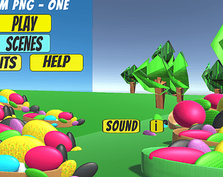
    • Skybox Default: The visibility of the default skybox due to the background image not being fully scaled affects the overall aesthetic appeal of the prototype. Ensuring proper scaling or positioning of the background image.
  3. User Experience Enhancement:
    • Feedback Mechanisms: Implementing feedback mechanisms such as visual cues or audio cues can help users understand the impact of their actions within the prototype.

In summary, while the grey box prototype demonstrates potential, focusing on functionality, visual clarity, and user engagement through interactive objects like toggles can elevate it to an ideal grey box prototype. Striking a balance between functionality and immersive environment design is key to creating a compelling user experience.

(1 edit)

Thinking about the eBook, indicate whether you agree or disagree with the following statements: Strongly Disagree Disagree Slightly Disagree Neutral Slightly Agree Agree Strongly Agree Not  Applicable
Do you think the navigation gave you a good user experience? ¨ ¨ ¨ ¨ ¨ Yes, the prototype navigation is simple and good. ¨ ¨
I found the visual effects consistent ¨ ¨ ¨ ¨ Good visual effects except for first page, I prefer a dark shade of background. Otherwise, visual effects, is good


¨
Do you think the eBook had a good User Design? ¨ ¨ ¨ ¨ ¨ Yes. The design is good but needs adjustment on the objects overlapping.

¨
Did you find the ease of access between the pages easy? ¨ ¨ ¨ ¨ ¨ Yes, it was easy navigating through the pages but I prefer a lighter shade of font on the dark-blue buttons just for better readability.
¨
Was the interaction with the elements in the eBook interesting? ¨ ¨ ¨ ¨ ¨ ¨ Yes,the buttons change colors when hovered of clicked on.
Do you find the chosen colour scheme for the storybook compelling? ¨ ¨ ¨ The choice of colors is okay¨ ¨ ¨
Did you have difficulty trying to distinguish between UI elements and the text? ¨ ¨ ¨ ¨ ¨ Yes. The UI objects have overlapped on to the texts and buttons. I suggest use grid to align the objects when developing Also, consider the page layouts.
¨ ¨
Did you find the User Experience of the storybook interesting? ¨ ¨ ¨ ¨ ¨ ¨   Overall, this eBook has simple design yet, a good experience as user navigating through the pages.  ¨