Indie game storeFree gamesFun gamesHorror games
Game developmentAssetsComics
SalesBundles
Jobs
TagsGame Engines

LazyPeacock

18
Posts
1
Followers
A member registered Jun 18, 2019 · View creator page →

Creator of

Recent community posts

Glad to hear you enjoyed the game!

It's kind of wild how much impact even simple sfx can make. They add so much clarity that something is happening even if you can't see or understand exactly what.

You're not the first person to complain about the background corruption (it's a texture split into tiles that I sort of 'painted' over the terrain tile layer), and I can see I didn't go far enough with darkening and desaturating it to make it clear even with the enemy bullets outlined in white, so that's already planned to be reworked.

Glad to hear you liked the game!

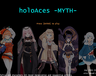
I really appreciate the compliment on my "artwork" since, as you have identified, I am very much not a trained sprite artist. (I've also been kicking myself for forgetting to include even a single visible explosion, it's practically genre sacrilege!) Any expansion to this project would definitely require outside help on that front, especially since the genre is so greatly defined by flashy visual effects.

As for the medal scoring mechanics, a brief on-screen explanation/demonstration would probably go a long way (but ultimately would have required a day or more beyond the jam timeframe to implement and refine). That, in conjunction with a gameplay UI widget that tracked the value of the next medal, and a visible callout when a medal is dropped, should probably be enough to communicate the mechanics to most players.

The hidden characters are indeed very hidden, and making them highly unlikely to be uncovered without intentional experimentation was by design, though I do think the last two (Ame and Calli) would benefit greatly from having a conspicuous (and literal) signpost like the other three (but again, time constraints). The fact that I could only manage one stage within the timeframe exacerbated the issue since there were as many secrets as there were types of trigger conditions, which meant the discovery of one secret doesn't really help the player figure out how to trigger the rest. In a more complete game the conspicuous signpost would highlight roughly where in the stage the secret was hidden, and the smol tracker UI widget would indicate the holomem whose reference hints at the trigger condition. Between that and knowledge of the types of trigger conditions (the five used in the first stage are the entire spread), players would (hopefully) have enough information to narrow down which of those trigger conditions should be used in that part of the stage to reveal each smol (though perhaps not always enough to immediately identify the exact condition on the first try).

I knew I was taking a bit of a risk with the German pop-ups, so I tried to hold back from changing anything that would be important during gameplay (like the score and lives display). I knew "Game Over" and "Stage Clear" were completely safe, and also did the boss warning message since it was more cosmetic than anything else (and there was no threat during its appearance). Maybe also changing the end of stage bonuses was pushing it, but I wrote those in the manual too.

I think you're the first person to mention reading it, actually...

Oh, I just noticed that the Jam Submission page for this game has its own download button, but doesn't show my desperate plea to read the manual first, and now I'm starting to wonder if nobody else did. I hope that hasn't affected my ratings too badly...

The current state of the corruption tileset is mostly due to painting myself into a corner within the limited timeframe. At first I wanted it to be mostly dark grey, but then when I started drawing enemies their black ended up being too hard to see. I tried adding outlines to the enemies but it didn't look great, so I brightened the corruption instead, and it ended up being green to help the purple bullets stand out more. I did lower the contrast and brightness a couple times, but I guess it only helped a little.

If I were to expand this project I'd get an actual artist to draw some enemies that aren't featureless black shapes so I could make the corruption mostly dark again, which would probably be much easier to look at.

I've been giving autofire toggle a bit of thought on how to implement since I read this, especially since I don't want to add any sort of settings menu to the game at the moment. Additionally, autofire was already a last-minute addition due to a charge-shot function being cut very late, so if I end up implementing that later I'd need to move autofire to a separate input since both tap and hold would be taken up on the Shot button. I think the best solution would be to have a dedicated autofire key that would respond to a tap by toggling on/off, and a held input (>0.25 sec) would act as it currently does.

Wasn't expecting to see a rhythm game in the running, especially not one with so many tracks. The choice of perspective was messing with my ability to time the notes, though, as rapid notes in the same lane would often obscure each other. Furthermore, notes in the side lanes were practically off the screen when they hit, and they were so far apart that looking at one side put notes from the other in a blind spot.

Nice precision platformer concept. Got tripped up time and again by lighting stars via contact preventing me from dashing, but I powered through to the end.

Bug Note: I ran into the same intro Right-click bug as others, and also found that on room 15 I could use the dash from below the top-right star to hang beneath its platform for as long as I wanted.

Pretty solid delivery on the concept. I wasn't aware of missed anomalies getting 'folded in' until I saw the other comments after playing, if later reversions are also considered anomalies that's real clever design.

Pretty solid delivery on the concept. I wasn't aware of missed anomalies getting 'folded in' until I saw the other comments after playing, if later reversions are also considered anomalies that's real clever design.

Pretty solid delivery on the concept. I wasn't aware of missed anomalies getting 'folded in' until I saw the other comments after playing, if later reversions are also considered anomalies that's real clever design.

Decent little action platformer. The disparity between visuals/collision and the lack of audiovisual cues for attack/block/hit/damage compound on each other, which makes the game feel worse than it actually plays, but fixing both would make this a solid foundation even for a larger game.

Chill and entertaining recipe-following game. I feel like I lack context for half the references but I can tell they're there. The patient likes to rotate even with the mouse clicks on other buttons/objects, which doesn't cause problems but can be a bit annoying.

Interesting inversion of the standard "minesweeper" puzzle where stepping on the "mines" as quickly as possible is required. Later rooms can get a bit rough with only 3 sanity, there's at least one where you can easily get a layout where you might lose without making a "wrong" move (blind diagonal wall-crossing onto a 1 is the worst offender).

The atmosphere and concept show a lot of promise (heh). Gameplay starts off strong, but loses some steam from unimplemented bits like shop/treasure cards. Would look forward to an expanded version, as what is there already feels fun and interesting.

Bug Note: Having Mumei reduced to 0 HP didn't seem to affect her much. Not sure if it's character-specific or just a general case.

Solid execution on the base concept, and the stinger at the end was fantastic. The optional content was also quite entertaining. Would have liked just a bit more depth/variation to the clicker gameplay though, by halfway through I started to feel more like I was waiting out the game than playing it. Clicking on buttons/apps occasionally took 3 or 4 tries, but I can't tell if that's a bug or just part of the "malware corruption" effects.

I like the concept of "spot the difference" into RPG battles, and the atmosphere is solid. The transition on reset is a bit abrupt, though, and sometimes makes it unclear what exactly caused you to drop below 0 Tranquility.

Bug Note: There's some collision distortion/duplication if you make multiple attacks in quick succession.

Game's a bit rough around the edges, as you admit in your description, but the underlying skeleton is a novel and interesting take on a 'base defense' style game that I'd like to see more fully realized. The visuals and references are top-tier, as well.

I miss Early Internet so much.

I'm glad you liked the game! I was worried some of the silly non-reference things I included wouldn't land, but those fears seem to be unfounded.

I just pushed an update that fixes what bugs I could find, and slightly tweaks some things (including a minor scoring change), so it might be worth a quick second look.