

1920x1080. The main icons to do stuff are quite hard to distinguish from another.
Same for similar icons like the ones in character select screen or the "Old god" (can't remember what they're called in this game) select screen.
I'm greeted with a black screen saying "CONTINUE" but clicking on it doesn't do anything and it took me a while to realize there were tiny icons represeting the "Old gods".
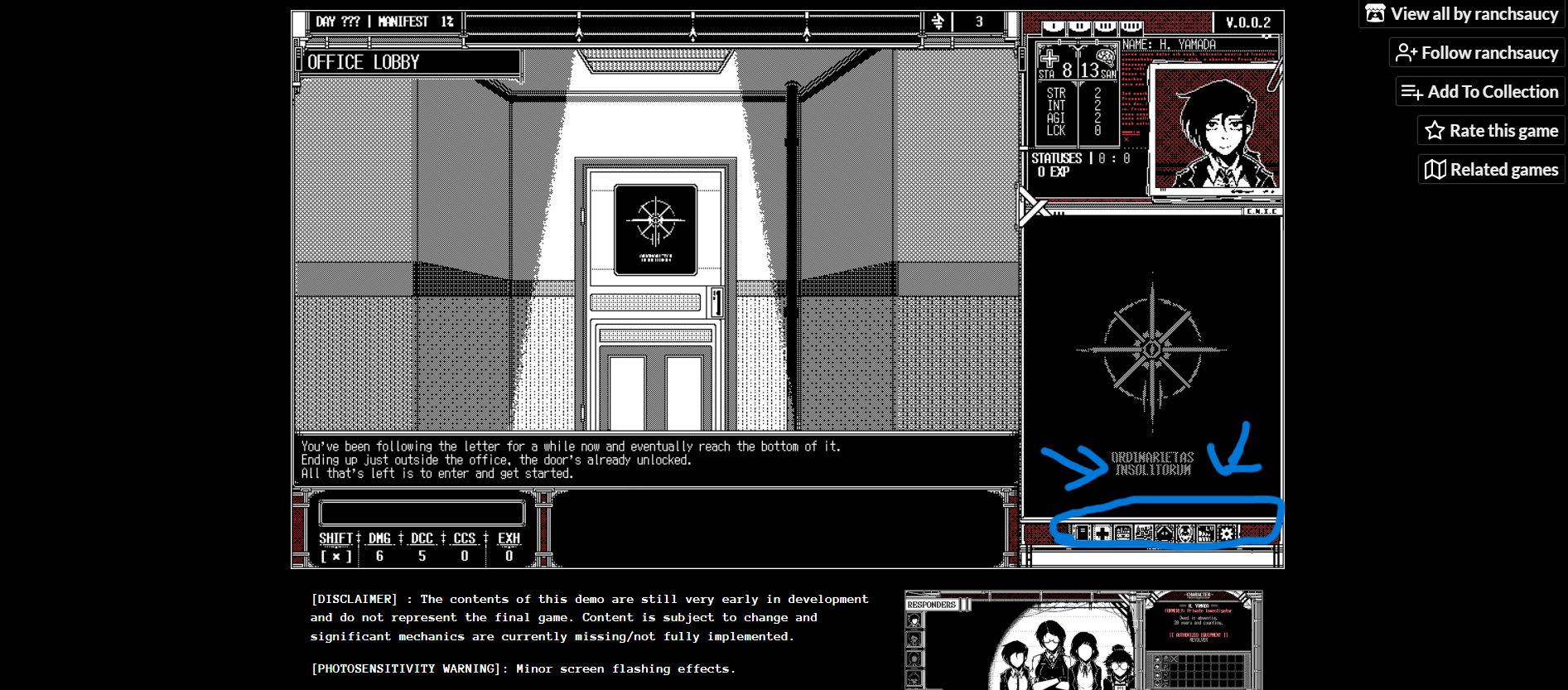
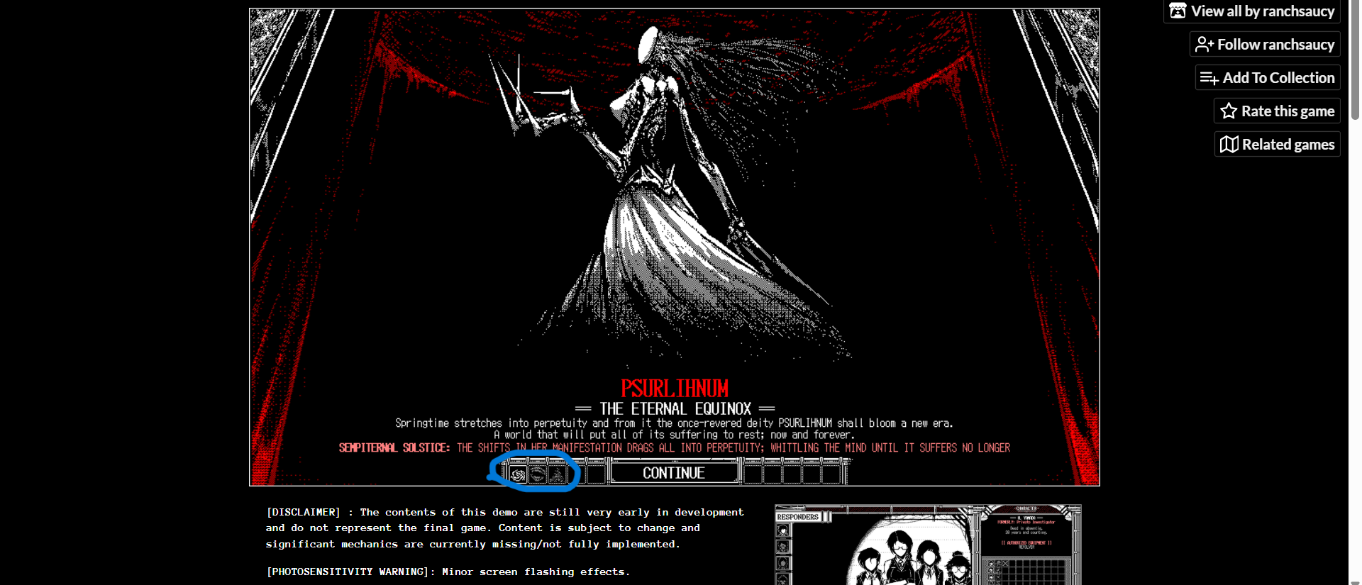
To be honest, I had a lot of trouble with the UI in general.
It adds so much stuff all at once compared to World of horror that I found it to be very overwhelming, at least at first.
Like, there's the window with "potential traits" and a "confirm?" text with some squares (some empty, some crossed) so for a while I thought "Can I interact with these already? Am I supposed to click on it? Is it a toggle on/off thing with the crossed/uncrossed squares?".
There's so much text detailing the events RNG resolutions that I have no idea how they work.
Like, I genuinely have no idea what "pass value" and "fail value" refer to compared to the numbers that are being displayed.
Same for the "checks" below.
Normally, other games simply go "this is the mininum RNG value required and this is what you rolled hence the success/fail".
There's 4 characters instead of 1 and the combat is now in real time and typing based.
I had no clue what was going on during combat cause I was too busy typing instead of looking at the screen and the explanations were a lot to take in.
The small icons and text didn't help either haha. 😅
It's just the unfamiliarity of it all that really confuses me as I have no other game that does things similarly as a reference.
The game does so many things in completely unorthodox ways all at once that it's very exhausting.
It's a lot of "firsts" for me as I'm used to much friendlier UI.
I hope the game introduces stuff more gradually later down the dev cycle.