
Indie game storeFree gamesFun gamesHorror games
Game developmentAssetsComics
SalesBundles
Jobs
TagsGame Engines

jonathangonzalezbotero

3
Posts
A member registered Mar 25, 2022 · View creator page →

Creator of

Recent community posts

Hi Bashudev.
Good effort on your project.

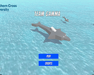
Although the colours that you used on the buttons are very consistency, the text's colours are not, you should use same colours for both menu scene and game scene.

In addition, using different fonts and sizes for the tittle 'ocean world' in the menu scene, does not make me feel comfortable in a player's role perspective.

On the other hand, the background image of the menu scene looks amazing however you did not use any for the game scene, the green object does not make  me feel I'm in an ocean topic game.

Hi Rosanna, well done, it's a good effort to make this game playable. I would like to suggest you not to have a lot of different range of colours as you have for the scenes, although they are necessary when hovering or so, probably two or maximum three colours along the game would be enough considering the size of our project.

On the other hand, personally I didn't like the font that you use  in general for the project, the description as well as the comments on itch.io seem difficult to read and understand.

I want to remark how nice the background of the underground scene looks, good job Rosanna.

Wow Thanks Rosanna, I really appreciate your feedback :)