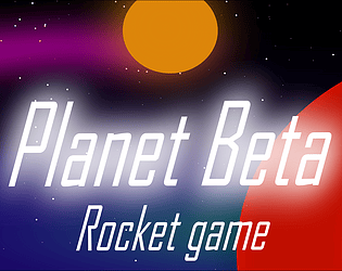
Indie game storeFree gamesFun gamesHorror games
Game developmentAssetsComics
SalesBundles
Jobs
TagsGame Engines

JKDN

3
Posts
1
Followers
A member registered Mar 30, 2022 · View creator page →

Creator of

Recent community posts

Home page

Score

10

Comment

The graphics were fantastic as they gave me an idea of what I would experience in the game. My eyes were directed to the start button which I thought was fantastic as you created an animation behind it that drew my eyes to it, so I knew how to start the game.


Credits page

Score

4

Comment

Accessed the credit page through the homepage, after looking at the credits I was unable to go back to the homepage. I felt that this would impact the user experience as I accessed it through the homepage I thought after looking at the credits I would be able to go back to the home page.


Help page

Rating

9

Comments

The page gave me all the required information to play the game. I loved the button was interactive as the text changed colour once my mouse hovered over it.


Game scene

Rating

8

Comments

I enjoyed the game, the continuation of the large text at the centre of the screen which displayed “Missed” or “Bonus!!” was not required that temporarily distracted me, to me it was obvious that I had missed the penguin, or I had just collected a coin and fell that it is unnecessary for the text to remain there. I think that the text displaying whether the user has either missed the penguins or collected money should only be there temporarily before disappearing.

The ability to access the home, help, pause and audio button made this a very user-friendly page however I personally struggle to see how I could change the audio during gameplay as it is a fast-paced game.


Home Page

Buttons

The spacing between each button is not equal this is not a good idea due to the lack of consistency. The lack of information as to what button to press also would increase the cognitive load for the user as they would be confused as to what button to press.

Suajanyas spacecraft page

Buttons

Once clicked on a button the button remains white post-click which may confuse some users as white is also the colour of the button. 

Overview

Tracey, you have made an interface that largely follows the rules of UX if I were to nit-pick I would say that the spacing between each button on the student page is not the same and the animations provide a distraction as my eyes are drawn away from the buttons to look at the animations.

Home page

Buttons

Interactivity

The sound effects and animations both worked well to gather to make a good user experience this was because of added interactivity and enabled an audio channel for the game.

Colour

I found that the colour of the background went well with the background as a dark colour (grey).

Location

The buttons were at the centre of the page, with the combination of the buttons and title provide a good amount of whitespace within the page.

Title

I felt that the title had a colour that had contrasted with the dark background which “popped” out of the screen because of the background the purple title was easy to see for users with poor eye sight.

Background

Theme

The background of the game was a space-related image which goes well with the theme

My project page

Buttons

Interactivity

The buttons all made an interactive sound once clicked which this improved the usability of the buttons. Each button changed colour (lighter grey) once hovered hover, this colour would work for the visually impaired and

Colour

The colour was grey which clashes with the murky blue as the background as the colours we are supposed to do have contrast which positively affects user interest in the product.

Location

The location of the buttons was at the bottom of the page, and the structure of all the buttons was not continuous as the buttons were in three groups, the lack of continuity could negatively affect user experience. The middle group of buttons is also at a different height compared to the button groups at the left and right of the screen.

Overall I do not have many negative things to say because it is a good design. Great Job!

Resources

https://uxplanet.org/color-matters-6-tips-on-choosing-ui-colors-260f56197a7b