love this game - the idea is classic and works well.
The gameplay is simple but effective and gets fun to play.
Nice work!! :)
A member registered Aug 02, 2019 · View creator page →
Creator of
Looping Orbital Moons was never this much fun... Was it?
Puzzle
Play in browser
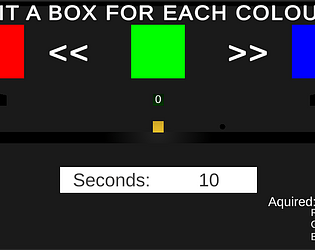
Generate Levels from Textures
Not really a game, but rather a test of control accuracy
Play in browser
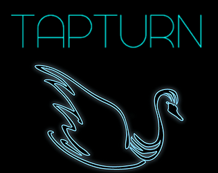
Love infinitely more difficult single button endless games? Then TapTurn is for you
Play in browser
Tree Succession Game used to accompany an educational session
Run in browser
Audio Analytical Visualiser - Insert your own tracks and see them morph into life with graphics programming
The Game Prototype is still tough to master in any case, but at least now you can actually play it!
Platformer
Control a hapless astronaut trapped in an off-world dilapidated power plant about to explode!.
Recent community posts
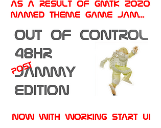
Out of Control [48HR Jammy Edition] GMTK2020 jam comments · Posted in Out of Control [48HR Jammy Edition] GMTK2020 jam comments

Out of Control [48HR Jammy Edition] GMTK2020 jam comments · Posted in Out of Control [48HR Jammy Edition] GMTK2020 jam comments