
Hey Konrad!
First, thanks again for sharing this project with me. I think you have a really cool concept on your hands and I’m eager to see you expand on it. I promised I’d take some time to give this a proper review and response earlier this week so here ya go. I want to be clear, my intent for this is to help bring up things that stuck out to me because I really like what you’ve got and I want to see this succeed. That said, I won’t be offended if you ignore everything and continue on as you have been. Now:
I noticed there isn’t any music playing on loadup, but there is an initial sound that goes off? If no music plays during main menu, maybe play some when changing music volume in the options menu? That way it’s easier to tell if we’re at a desired volume. Update: Music did start playing, after I clicked into calibration and then canceled calibration. Perhaps it was a bug? I don’t know for sure.
One thing I noticed was that when the beat indicator reaches the end of one of the rows, it’s not immediately clear how soon it’s going to either drop to the next row, or jump back to the very beginning. I recognize that a major design intention here is to indicate what attacks are coming up so the player can try and plan a little bit, while also providing a visual indicator of the beat.
My immediate recommendation is to consider dropping one of the rows displaying the beats and attacks, and perhaps have it run “infinitely” long. Meaning, instead of moving the beat indicator circle along the track, move the track instead. Have “old” beats fade away, and new ones fade in at the end of the track. This way the player can still see future abilities coming up, you get a little bit of screen space back, and you never have a situation where it’s not super clear when the beat is going to reset position.
I’ve mentioned this to you before, when I played it on stream, but I keep finding myself wanting there to be a dedicated button to swap to running. I think having to choose to sprint sometimes is a nice change from the typical run and gun of this genre, but having to wait a beat, while thematic, does make me panic a little.
I’m not sure what the correct balance for this is, but it feels like I’m getting swarmed particularly quickly. I know game balancing is a beast in and of itself, but I think maybe bringing down the enemy speed like, just a tad, would help immensely. Specifically, it feels like I don’t have enough time between when the enemy is within melee range to swing my scissors before I’m getting hurt by the enemy.
I want to say, for this next bit, I recognize this is an early prototype and that visuals are very subject to change, but I’d like to comment on them as they are currently. I think that the kind of eerie look you’ve got going on with this game is a lot of fun, and fits the concept you’re aiming for here a lot. That said, I’d love to see some further polish down the line. Things like: for assets where they’re kind of.. broken down? Like the minimap circle, I wonder what that might look like with a small animation? Meaning - instead of a static, unchanging broken down green circle, what if the parts of it that are broken change on the beat? That way there’s a kind of almost static-y feel to it, which is what the current design seems to be kind of aiming for.
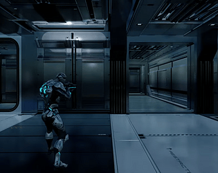
Additionally, for assets within the game, not the UI or HUD assets but physical things such as the character, the wardrobe, etc., they feel just a little too detailed sometimes. With the pixel art you’re using across the game, sometimes it makes certain objects hard to look at. Like the mirror in the beginning of the game, for example. It looks to me like the intent is to be detailed, but when it’s all pixelated, it starts coming across as messy at first glance. This isn’t the only example, but it’s the first one that pops into mind. On the one hand that does give it that “weird” look that fits with the game, but in a horde game, if it’s hard to look at something, that can be a detriment for the player. I think there’s a balance to be found here but I’m not artistic enough to really say what it is.
Finally for graphics, I really like the effect you use when selecting or highlight buttons in the main menu, but I noticed that it doesn’t seem to share the pixelated feel that the rest of the game uses. I do really like it though. Perhaps if you mixed that kind of effect into the HUD a bit it’d feel like it fits a little more? Like maybe trying to use it for the background elements of the health, the player level and currency areas, the todo list, maybe the minimap could look nice? Just having it used more consistently in the design, I think, would help it not stand out as much.
Just to reiterate, I really enjoy this concept. I think with some polish and some fine tuning, you’ve got a really solid game coming together. It was really easy to grasp conceptually, I loved the dynamic music, and I love getting different abilities based off which beat I’m on. I hope my commentary doesn’t offend, I mean it when I say I want to see this succeed and that’s why I bring this up. Please keep going with this.
Looking forward to what comes next Konrad!