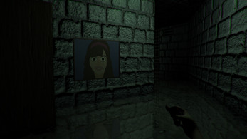
Hey, I saw Case_oh play this game! Unfortunately, he never finished it.
I just want to let you know that the normal maps on a lot of your materials are the wrong format!
Notice how those stone brick walls have shadows om top of them instead of beneath them, and the bottom parts are highlighted?

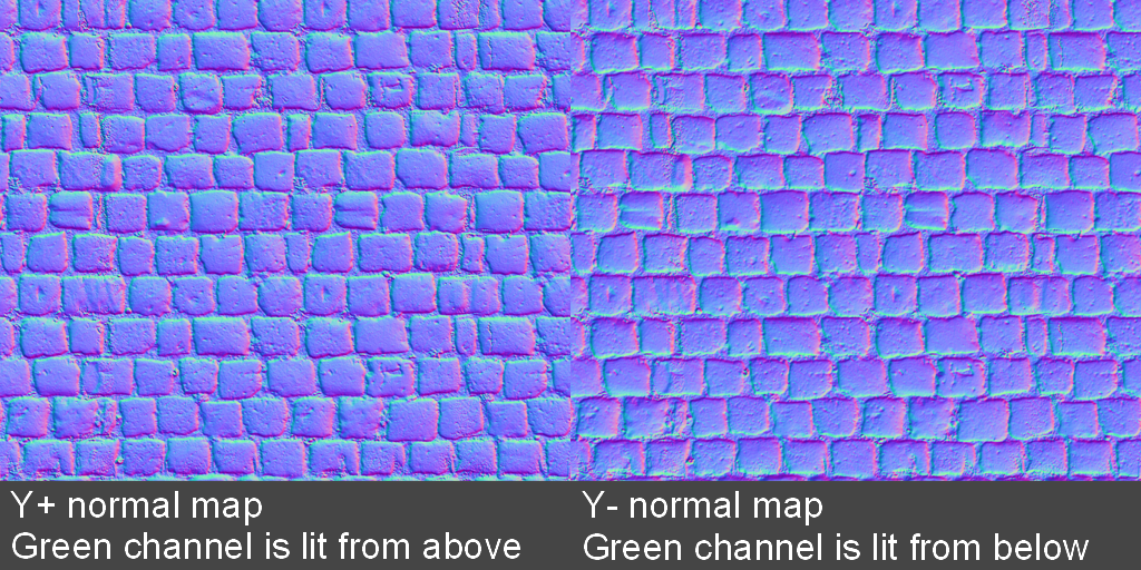
That means they're not using the Y+ normal map format that unity's renderer uses. This also means your application version uses DirectX over openGL, which is in my opinion actually preferable. Your normal files are using Y-. The turquoise should be on top and the magenta on bottom (Y+), which is the opposite of your textures.
You'll also notice that Y+ just looks more natural due to the brighter turquoise and darker magenta giving that same popped-out look that the final result has in contact with dynamic lights.

