Another player reported this issue, I've since released a fix and it seemed to help. Let me know if it occurs again. :)
Frajda Games
Creator of
Recent community posts
Oh, that's awesome, I'm so happy to hear that. There was a bug related to the CRT shader which made it try redraw everything every frame in an infinite loop when the game didn't have "correct resolution size" which I suspect sometimes happens on some browsers or in some specific circumstances.
Thanks for reporting the issue and I'm glad it's working now. :)
Thanks for the detail. Have you tried the game again since your initial post? I released a new build on April 13th that may fix some of the reported issues.
BTW I just tested the game on Windows 10 and Firefox and while I didn't encounter the text disappearing bug, I did notice that the game was running noticeably worse on Firefox (I had a direct comparison with Chrome running side by side).
Damn :/ Not sure how to proceed with that. I downloaded Ubuntu and Virtualbox and I'll try setting up a Linux environment on my older machine so that I can test it on an environment similar to yours. I could also try installing TuxedoOS. I'm sorry you encountered these issues, they never occurred to me when testing or developing the game and I don't know what could cause them.
I'll try to get to the bottom of this.
I'm thinking of adding ways to upgrade buildings which would unlock new functionalities. My idea was to make each Arcane Overload generate new currency, Orbs, which could be used to other stuff but changing units into new ones is a cool idea - I'll think about it. :)
Summoners could summon some creatures that shoot fireworks and disappear after some time and you could upgrade how many fireworks those creatures shoot.
Oh this is quite peculiar. I never head of Tuxedo OS before.
Thank you for the detailed description, it was very helpful. I think the issue could be related to how the CRT shader handles output screen sizes and how/when it checks for it. I just released an update that should fix that. I'd love to hear if it fixed it for you.
I don't have access to any linux machines, but I just tested the game on Brave browser on macOS and I didn't encounter any issues.
Thanks for playing and for the feedback :)
I'll look into that music volume change! I was thinking of making the volume slightly lower during transitions but I haven't gotten around to it yet.
I've gotten a lot of feedback regarding Observatory and I will definitely change it. I'm thinking of giving players ways to upgrade buildings and for Observatory, it would allow to generate knowledge automatically by hiring units and would also give new, powerful upgrades.
As for knowing which unit impacts booms generation the most - yeah, it's a good idea to add some sort of a chart for it although I don't quite know how to implement it. Might be tricky because Wizards impact Booms generation indirectly thanks to Barrage. Maybe Barrage could be counted as a separate source of booms generation though.
Oh wow, that looks awful. Sorry about that. Never encountered this during development or testing.
Would you mind sharing what browser you're using, which OS? Was it always like that or did it happen after switching the CRT effect on or off? Were you playing in full screen, on a 2nd monitor, anything special? Did you resize the browser window at any point and did it affect the bug in any way? You're not playing in full screen, right?
Thank you so much for sharing this, I'd love to get to the bottom of this.
I'm happy you liked it! And I'm sorry about the lag... the good news is - I just released an update that adds settings, and you can change the particles density, which would make the game run smoother. Previously all fireworks generated a lot of particles ("high" setting). Would you like to see how the game runs on medium or low?
That's great to hear, thanks for playing! :)
Do you refer to the pop-up windows above buildings? The one with upgrades and stuff? Yeah I noticed that during playtesting myself and I'll definitely change it. The primary reason is that the game checks if the player hovers on either the modal or the building sprite and most of the buildings are quite narrow compared to the modals so it's very easy to hover off of them when trying to hover over the modal. It's annoying - I'll definitely change that.
The intention with increasing area of damage was to speed up killing squares, since you could attack more of them with a single attack.
I haven't considered this perspective before but you're right, it actually discourages players from attacking multiple squares at the same time because they might die before getting resources from them.
Initially I wanted to add an upgrade that would increase damage based on the number of squares attacked at the same time, so that the more squares you'd attack the more damage you'd be dealing but I haven't implemented it.
This is great feedback, thank you :)
Yeah, the idea was that later in the game you could also increase area of damage (there's an upgrade for that) which would promote hitting multiple enemies at the same time and there could be upgrades that gave additional damage for each attacked square, for example +5% or so.
I'm glad you liked it and again thanks for playing. It was intended as a small project but hopefully next time I'll make something bigger and better and I'll take your feedback into consideration. :) thanks!
Right before releasing the game I lowered the cost of "auto attack" upgrade significantly but it might not be enough.
I designed the game specifically with "clicking first, then getting an auto attack upgrade" in mind. Now that I think about it, it might be better to design it without clicking at all in mind and optionally leave clicking for players that like it (like me). That would give all players a better experience and could allow me to balance the game better. Especially early game feels sluggish a bit and you only start feeling powerful when you get to Auto Attack upgrade level 10 or so when Auto Attack interval drops to 0.52s. It becomes REALLY fun when you get to 0.2s. Yeah, the more I think about it the more I should design the game with increasing Auto Attack speed first.
Thanks for playing!
Hey, thanks for playing! When it comes to the idle aspect, do you think auto attacking is enough or did you have something else in mind? For example closing the game and coming back to automatically generated resources?
I wanted the game to be played actively as I enjoy such games the most, that's why there are no "idle" elements. The only "idle" element I implemented is the auto attack functionality. Do you think it's enough? I think auto attacking upgrade doesn't progress fast enough though. It should give better results faster. What would you say if I designed the game around auto clicking instead of clicking manually? Or if there were more upgrades in the future that would automatically attack shapes?
As for saving - yeah, it's a basic functionality that should be there. I didn't add it because the game is so short but it's definitely something that should be added to the game.
Thank you! Glad you liked it :)
I'm planning to make a single level like in "Getting Over It". I'm not planning to add any other jumping mechanics because I wanted to keep the project scope small but still make it feel good. I agree that the starting level gets too difficult too fast. New concepts are introduced way too fast and I'll try to increase difficulty slower in the final release.
Yeah the trick with hitting the side of the green instead of landing is sort of something I think I'll change. It's because the "finish the level" hitbox is the exact same length as the landing platform and I suspect that when you hit the side of the platform, the collision with the "finish the level" hitbox also happens.
As for adding random geometry gaps I think it's a great idea and I'll add more of them :) initially their purpose was to allow falling down through them but make going up through them very difficult, but I think that if the player is skilled enough to go through it then that's great.
Thanks! I'll post the video on Twitter :) and again - very impressive you got such a good time in such a short period of time :D
WOW! You beat me so fast after I replied :D What's even more impressive is that time starts when you jump for the first time (I did it that way because it was the easiest to implement at the time) and given that you start jumping from the center of the screen and you have to avoid some obstacles, you could probably shave off some time if you started jumping from the right side. That's what I did in my speedruns. Additionally if the camera behaved better and would give you more space for you to see ahead you wouldn't have to stop at 0:10 and you could just jump non stop. Maybe a sub 8 seconds is possible.
Congrats :D I think it's pretty safe to say you might be the best Bravest Chicken player in the world right now :D would you mind if I posted a link to your video on Twitter? I'd love to share your speedrun :)
Thanks for playing and leaving a comment :) I agree the camera doesn't follow the player fast enough. I'll change it in the future. What do you mean by "controls do feel a bit hard to judge"? As in it's hard to predict where you'll go after jumping?
I'll release it on Steam for sure :) originally I planned to make the game in 3 months and release it at the end of December but I've realized that it's too ambitious and I'll be working to release it in the next 4-7 months. :)
That's so cool! thanks for playing :) yeah I think the game gets too difficult too fast. After watching a few playthroughs it's clear to me that many players get to a certain point and they absolutely can't beat certain obstacles. I'll try to design levels so that they teach the player how to beat the next challenge. Also, about the camera: yeah I think it doesn't let you see where you're going well enough. The camera system is fairly simple and it simply follows the player around without taking into consideration how fast the player is going. I've added this to the list of things to work on.
Oh no, I'm sorry :( I'm aware of this bug but it happened so rarely that I decided to release the prototype without fixing it. Unfortunately the only fix for now is to restart the game. :( The bug is related to some flat obstacle hitboxes that shouldn't be there. I'm adding this issue to my to-do list right now.
Hi, I love your art style! I really liked the chicken you made for the game so I started using it in my own prototype. I've noticed that in the "More information" section the "Asset licence" is "Creative Commons Attribution v4.0 International". Does it mean I can use the asset of the chicken in my own game as long as I credit you?
Hi, thanks for playing :) what would you say the biggest improvement to the UI could be? One player suggested dividing manufacturing items into tiers, so that you'd have for example 3 items in manufacturing grouped together as "tier 1", etc. I agree that not being able to upgrade max compute limit is annoying. Actually, it was a conscious decision I made because I didn't know if the upgrades would be too powerful or not. But upgrading fire generation to 1 fire every 1.57 seconds doesn't solve the issue that you're getting blocked by slow gathering of wood. Overall, I think that there needs to be a way of speeding up fire generation and wood gathering. One playthrough I won the game in 3.5 hours and about 1 hour into the game it's very clear that you're blocked by slow fire generation. I was thinking of 2 ways I could fix this: adding more upgrades to fire generation or resources gathering and allowing to have more than 1 droid work on a single task, so that you could have 2 or more droids perform fire generation and this would result in faster generation.
Thanks for playing! Yeah, UI is the part I've gotten most feedback about. I think it lacks basic quality of life improvements like right now you might not know where your droids are or what resources you're missing. Somebody in the jam's Discord server mentioned that it might be a good idea to split manufacturing into "tiers", like you'd have manufacturing "tier 1" items, "tier 2" items and they'd be separated. Do you think that would be an improvement, would you like to see some other changes to the UI?
Thanks for playing! I agree that past a certain point the game is slow, especially when you're forced to wait for fire to be generated. Do you think adding an ability to add more than 1 droid to a task would speed things up, or should there be an upgrade like "get 10% more resources when collecting"? If you have any other ideas as for how I could improve the game, please let me know :D
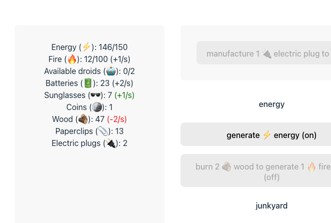
I'm very happy to hear this!! :D Would a simple "+x/s" be OK for displaying rates like in the screenshot below, or would you prefer something more detailed?
My idea for displaying rates is:
- display rates for resources that are "active" (resources you're gaining or losing)
- show red colour for the resource you're losing (and maybe green for resource you're gaining?)
Here's what it could look like. What do you think?


