
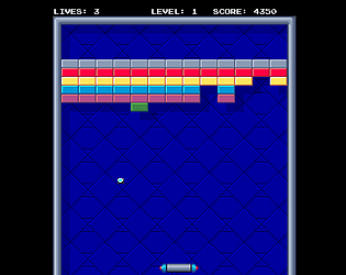
Yeah, speed was set like this on purpose, to keep this game challenging. IIRC original game used a rotating knob controller, which too would have limited the movement speed. I guess one could say that the idea anyway is to predict bounce direction and take advantage of that. But anyway - thanks for playing!
A member registered Apr 29, 2015 · View creator page →
Creator of

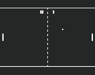
Single player pong-like tennis game similar to early 80s home console tennis games.
Action
Play in browser

A variation of classic snake game - eat food to grow and avoid eating yourself.
Action
Play in browser