
They should be there. Have you doublechecked your view settings to find out if guides/grids are on
A member registered Apr 03, 2019 · View creator page →
Creator of

A pulp-inspired fantasy adventure. Made for Cairn 2E.
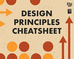
Printable cheatsheets for learning basic graphic design principles. Can also be used like a checklist.
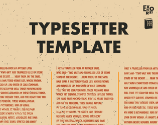
A semi-automated template for experimenting and finding the perfect type size and leading.
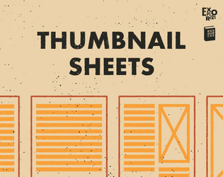
Printable sheets for sketching and mapping layouts.
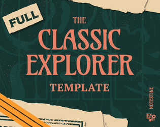
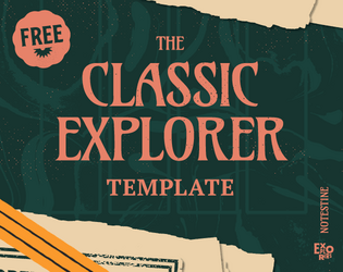
A time-slaying and grid-taming layout template for classic fantasy roleplaying games.
A time-slaying and grid-taming layout template for classic fantasy roleplaying games.