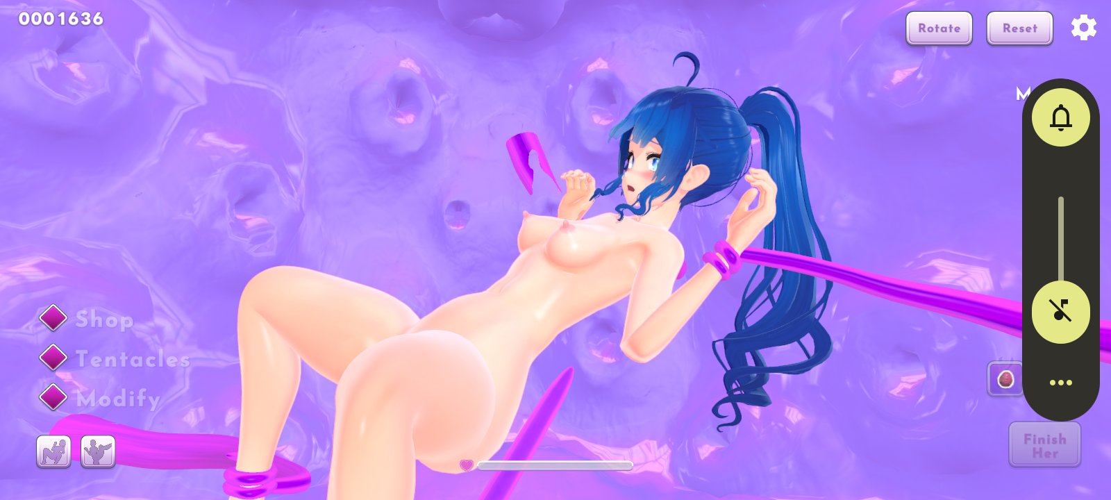
I found a bug: the buns hairstyle for the slime girl can't be deactivated to return to the defaul hairstyle, so it's necessary to have another hairstyle unlocked as well in order to switch back to default.
Also, I think that the belly bulge is way too prominent compared to the tentacle movement and the oral tentacles reach way too far back in the skull.They should stop a bit before the throat, or at the middle-front of it, not so far back.
entity01491
Recent community posts
Because it's a paid NSFW game. There are many articles on it: Itch.io hides 'NSFW' games following credit card company pressure
In the end, Itch.io made it so that NSFW games would either not be able to receive any money on their platform, or not show up in the search results, as seen here.
The word for phobia of long words is hippopotomonstrosesquippedaliophobia, I even tried directly copy-pasting it from the phobia wiki, but for some reason I keep getting told that I was wrong and that I suck at spelling?
I also tried Hippopotomonstroses-quippedaliophobia and Sesquipedalophobia but it's all wrong.
Does the game use something else for that phobia? Does it not actually matter what I write?
I'm going crazy here.
The "She is real to me" probably refers to how she is a robot, programmed to emulate and not a genuine human. Some would say it's just code, that none of her feelings and care are real, that it's all no more than imitation, simply fake. Like how during streams some compare her to a toaster. But to the protagonist she is more than just a lifeless machine. She is an important loyal companion and a lover who supports him even when he is at his lowest.
As for the psychotherapist interactions, I can't give any opinions about them because I never participated in them.
Not me.
The game is too focused, you can only see a tiny bit under your feet so it's really hard to predict where you will land.
The default non-charged jump height isn't ideal, forcing the player to stop to charge each jump. And the jump height charges slower than I would expect it to, there also doesn't seem to be a limit to it either, which makes it really hard to predict how high I'm about to jump.
All in all, this game needs some rework.
I don't like the colour of the paper with the rent written on it. It would be better if it was beige, not yellow. Also those speech bubbles are really just way, way too low quality compared to the rest. It really makes them stand out, making me wish that at least a few more minutes would be spent on them so that they could look at least a little bit more acceptable.


 I don't know what you're talking about. The link is still valid, and has been for a long time.