Indie game storeFree gamesFun gamesHorror games
Game developmentAssetsComics
SalesBundles
Jobs
Tags

draconic_cowboy

5
Posts
7
Followers
A member registered Jan 17, 2020 · View creator page →

Creator of

Recent community posts

(Unofficial) Industry Feedback.
Tristan McGuire:
Character Artist at Airship Interactive.
https://www.artstation.com/tristanmcguire


Research and Concept:

I love how you came up with your concept. It is great that you chose to make your character fit into an existing universe, as this is a skill you need when working in a studio. However, it is necessary to show examples of the existing art from that IP, because it’s hard for someone to judge whether your model looks like it is from Apex Legends if you don’t show a pic of Apex Legends! Remember that not everyone has played the same games as you.


High Poly:

It’s great to see that you know how to reshape a basemesh to work towards making a likeness, but next time make sure to really double check all of the structures. The lips seem very tense and flat, as if they are not curved with the shape of the jaw. And the way that the light hits the philtrum area isn’t quite right. Next time you do eyes, make sure that the eyelids feel convincingly thick and that they feel like they are really wrapping around underneath the eye. It’s good to see you added tertiary details, but would have been nice to see a close up shot of how you achieved that.

Using the double layered fabric and panelling has worked well in MD. Nice work. I just think that some of the extra small folds added in Zbrush haven’t helped the look of the model. Next time, either get the tiny creases in MD by doing a final simulation with a very low particle distance, or be more delicate when sculpting them manually. They just look a bit rushed compared to some of the other details.

For a cleaner look on the leg armour, try experimenting with using different subtools for each panel. However, with time constraints considered, the use of dam standard makes sense.

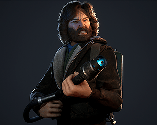
Your expression blend shape is a really nice touch and you executed it well. It’s good to see not just the mouth movement but also how the rest of the face is affected by the snarl! Would have been even better to see the left eye closed a bit too.


Props:

Excellent attention to detail in making the gun fully functional. You seem confident in your prop modelling skills, which is great.


Low poly:

Great that you thought about getting the loops in the right places to allow for deformation. Would have been better to show the whole low poly in this section, so I didn’t have to scroll throughout the document. The tri count is good, but you could have gone a bit higher to capture some more of the cloth silhouette. Facial topology is awesome, but I would add some more loops around the shoulders, just because that area has quite a large range of movement.


UVs:

Your UVs are really nicely laid out within the UV space. It is great to see use of aligning the edge vertices with the grid. Though it is not a problem that you have put your teeth on the same sheet as the head – these are often on a separate smaller texture in games. So next time, feel free to put them separate.

These are definitely some of the best UVs I’ve seen from a student, so you definitely get my thumbs up here!


Groom:

I have not used Fibershop before, but it looks great, so if it’s faster than Arnold and gives you good results that is fine by me. In industry, you will likely use Xgen or even custom in-house tools for this task. So as long as you know a bit of Xgen then you will be all fine.

Next time that you design your hair textures, break them down into more tiers of density. All of your cards are quite dense here. You can get really beautiful results from having quite a lot of cards on your texture (think 16-32 individual clumps) and making sure that there are lots of them with big patches of negative space so the lower tier cards will show through from beneath. (Do not use my portfolio for examples of this – I did not know much about that when I was a student. This is a skill I have developed whilst at Airship).

Using Zbrush to place your hair cards has worked well. Not seen that method before.


Textures:

You mention that the textures deserve a document of their own – so it would have been great to see a deeper breakdown of the process. Some closeups of the skin and clothes would have really helped to judge the model!

Would have been good to see the roughness and metallic maps too. But from the final renders I can see you’ve got some nice variation in the skin. I would just push that even more to add some greens and blues. The roughness splotches on the leg armour work great, but I think the jacket could do with some more finesse in its material definition. So next time you do a project, just have an extra think about making each material look very distinct from its neighbours to really make the model pop. The overall purple and black colour scheme is nice.

I know from experience that it is very hard to get ‘Kiroshi’ type eyes to look “natural”, because of course they are not natural at all. But I do think she looks a bit wide-eyed and it starts to tread the line where the characters starts to look creepy. Adding an occlusion mesh on top of the eyeballs to add a fake shadow under the top lid could possibly solve this issue. Or closing the eyelids slightly more (particularly in the snarl pose). This would help to sell the idea that even though the eyes are manufactured, they are still well integrated into her body.


Rigging:

I can’t fault the rigging. I use the same plugin and it is boss. So great stuff!


Unreal Implementation:

So nice to see that you managed to get your work into engine – this is something we love to see! Materials are solid and it’s good to see you understand material instancing. Lighting setup is well informed and great choice to use the render movie queue option.


Final presentation:

The two poses are great and the additional idle pose is perfect for presenting the turnaround of the model in a very professional looking way. The depth of field in the snarl pose works well to draw the eye of the viewer to the face and not the gun. Could have been nice to see the dash pose rendered as the full body and also the close up, but that’s only a minor note.

For the technical renders, it is a bit hard to see the blue wireframe on the grey render and the lines on the UVs are very thin. This is nit-picking, but it would be great to see those elements re-rendered to just be a bit easier to read. If you render out the UV snapshots at a lower res and then scale them up, that tends to work for getting the lines a bit thicker, or you can probably just thicken them in Photoshop.

Really nice final presentation overall. Just an extra tip – I would add your name and contact info onto every image, especially on your ArtStation project. That way, if a hiring manager has ended up with just one of your images, they still know how to get to you. Sometimes images get reposted to Pinterest or found via Google Images, so the studio may not always be directly on your ArtStation page.


Final thoughts:

This is a very strong project and I really hope you are proud of what you have achieved! You have tackled many technical pipeline steps like groom, rigging and facial shapes. This shows you are really knowledgeable of the whole pipeline. I would advice that for your next steps as an artist, look back over this project and self-critique it, then also read through any of the notes and pointers I included in this feedback and work out which areas have more room for improvement. Then in your next project, make sure to spend some extra time on those areas. I have no doubts in the potential of your art skills if you keep pushing yourself. So just keep really pushing and don’t slow down!

I look forward to seeing where you go in the future. Feel free to look on my ArtStation for examples of graduate level work (Silverhand was my FMP, so everything from that point and backwards in time was on my graduate portfolio). And don’t hesitate to reach out in the future.

(Unofficial) Industry Feedback.
Tristan McGuire:
Character Artist at Airship Interactive.
https://www.artstation.com/tristanmcguire


Research and Concept:

Great take on the prompt, nice to see that you went with your personal favourite dog breed rather than the more conventional choice. Nice to see that you used lots of references to inform your concept and even went into the details of the different corgi colourations! Your final choice of concept is well designed and I am glad to see you got external feedback to help make your choice.

It’s useful that you showed some examples of the art style you are going for, as being able to match art styles is a very important aspect of working in a studio. However I see that the examples all have sculpted fur, whereas you went for a strand based groom. It would be useful to hear how you came to that decision and to see some examples of what look you were wanting to achieve with the fur.


High poly:

Your corgi sculpt is nice – good use of exaggerating the forms to make the model stylised. Next time try including some sharp edges to contrast the smooth contours.

For the accessories, I think they would benefit from being a bit chunkier, to really push the stylised look. The harness hugs the body very closely, so it still has that feel of being a subtool extracted from the base body rather than being a separate item. Look to communicate which areas of the harness are under a lot of tension and which areas might be looser.


Low poly:

You have made a good start at including edge loops that will allow for good deformation, but next time do some more research into how to best handle the shoulder and hip areas. These areas have to be able to move quite a bit, so they are important to get right. Secondly, the overall tri count is way too high for a model of this style. A fully kitted out human in a realistic AAA game would be potentially 100k tris for cinematic-level shots. But stylised models like this are typically a lot lower. Try to keep your models to 100k tris maximum for your portfolio pieces.

When showcasing your topology, use a shader that shows the model as shaded but with the wireframe on top. It is very difficult to evaluate the quality of the model when you are seeing through to the other side.

For quadrupeds, place the pivot between all of the paws, beneath the body. Your pivot is placed too far forward.

It is good to see that you did some research into how to construct your eye. It would be even better to see you discuss the pros and cons of making eyes from multiple surfaces with real translucency, vs using single surfaces with faked refraction. This would help to show that you made an informed decision.


UVs:

The placement of your UV seams looks good. However you could have solved the face area with fewer cuts.

Would have been useful to see renders of the 2D UV layouts in this section.


Textures:

The textures unfortunately look quite rushed. They really feel like they were quickly painted on. Next time take a closer look at the way that other stylised models have been textured. A lot of stylised art relies on combining soft gradients with painted sharp edges. Adding some speckles of roughness variation to the plastic areas also helps to make the material look deliberately like plastic and not look unfinished.


Fur:

As mentioned before, your style references did not have fur, so it is hard to judge whether you achieved what you set out to do. In this section, I would have liked to see an explanation of why you chose to use a strand based groom and not hair cards and also a breakdown of the grooming process in Blender. As I have not personally seen or used Blender in a professional setting – it is very difficult for me to judge the technical aspects of this section.

Aesthetically the initial fur test does have a nice range of fur length and the clumping is nice.


 Rig:

The rig looks good for the style of model. One tip is that if you place the tips of the paw joints on the ground at the very edge of the geometry, that can help when setting up the controls so that your character can lift its toes whilst keeping the heel to the ground and for lifting the heel with the toes down. Your rig looks fine as-is though, that’s just a tip that came to mind.


Posing and Final Presentation:

I love your idea for the good and bad boi poses, but it is a shame that we only got to see the running pose. It’s great that you informed your running pose based on reference, as that really helps it look believable.

The fact that the rigging caused some issues with the groom and that the groom shader looks different across the two renders is frustrating but not the end of the world really. If you are wanting to be a character artist in a studio, then you would very likely have specialist groom artists and technical artists who would assist in the production of an asset like this. If you are wanting to become a groom artist – then feel free to keep exploring the depths of groom, but if you are wanting an entry level character art job, then I would not look to experiment more with strand based groom, as that’s not a skill you will particularly need in that position.

When looking for job at a game studio, we would really like to see your models rendered in a game engine. This shows you understand how to implement assets and that you understand what can or can’t be used in a game. So next time, please push to get your assets into Unreal, rather than relying on Blender for your rendering. And show off your models from more angles. We want to see that the model looks good in 360 and that you are not hiding anything. I can see that you attached a .blend file, but as we use Maya at work, I don’t even have Blender on my PC to open it. Including a turnaround video or a Sketchfab upload helps make sure your model is accessible to all.


Final thoughts:

This is a clever design and it’s great that you tried to tackle many technical pipeline steps like groom and rigging. To improve, take a look at topology of other quadrupeds and make your next model a bit lower poly. Showcase your technical renders more professionally by taking renders of your wireframes and not using viewport screenshots. And show off your finished model from all angles.

Feel free to take a look on my ArtStation for some examples of the kinds of technical breakdowns that are expected in a graduate portfolio (Silverhand was my FMP, so all the ones from that one and backwards in time were on my graduate portfolio). And also look around at the portfolios of other recent graduates or professionals with student work still hanging around on their portfolios.

Best wishes for the future and feel free to contact me again.

(Unofficial) Industry Feedback.
Tristan McGuire:
Character Artist at Airship Interactive.
https://www.artstation.com/tristanmcguire


Research and concept:

You are right in pointing out in your document that it is a mistake to not use or create concept art. This is because a very important part of being a character artist at a studio is your ability to translate 2D concepts into 3D models. It is hard to judge how successful your model is without knowing what it was meant to look like.

However, I can see from your text that you have thought about the world that your character exists within and where they fit into it, which is great.  Would just be beneficial to analyse some images from the cyberpunk genre and explain your chosen themes. Not to go off on a tangent here, but the cyberpunk genre is pretty vast and has a lot of subgenres, so it is best to explain more specifically what you’re going for. (okay, cyberpunk nerd moment over :p).


High poly:

Love that you showed a breakdown of your process. I would suggest sticking with a grey material in Zbrush though, the default red wax one is a nightmare for incorrectly exaggerating the crevices in the model and making it harder to evaluate the forms. A popular one is the one called ‘basic material’ found in the bottom part of the material palette.

There’s a nice amount of detail in the anatomy, but next time make sure to really double check your proportions. For example, the thigh bone should be the longest bone, but your character’s lower legs look longer than her upper legs.

For the face, it’s a good start, but I would have done a final pass to check that everything anatomically makes sense. Check the eyeballs are the right size (info on human eyeballs can be found on Google), then check that the eyelids are convincingly wrapping around the eye. Some areas still feel a bit lumpy and would benefit from you pulling some of the angular planes of the face back into the forefront. The thin neck also makes the head look a bit cartoony, where the rest of the features look more realistic. Make sure to keep the style consistent.

Would have been beneficial to see the finished high poly with the clothes and the hair close up. Unfortunately, the small screenshots make it really hard to evaluate the quality. I would suggest looking up images of folded cloth – look for the sharpness of the folds. The sculpted boots seem very soft, as if made of something that is melting down, rather than a firm material like leather that strongly holds its creases.


Low poly:

It’s great to see that you are starting to put the edge loops in the right places to allow for optimum deformation, however there are multiple areas where the density of the quads is quite inconsistent. For example on the side view of the face there are some large rectangular quads along the jaw, but in the front view there is a very dense patch running over each eye and under the chin. Next time, think about keeping the spacing of the vertices more even and only make them denser in areas where a lot of deformation needs to happen (eg the lips).

Due to the small images, it is hard to judge the topology of the clothes, but it is clear that they are too high poly. I am thinking that a lot of this may be Zremesher. Always do manual retopology and make sure your mesh is adequately optimised.

In future, make sure to show a clearer breakdown of every asset. I can see you made some cyber arms, but without any closeup shots of them, I can’t see the hard work you did!


UVs:

Before making your next character, take a look at the UVs of other models made by industry professionals. The islands need to be packed very tightly into the square due to the tight texture budgets we have in game development. A UV unwrap with all that wasted space would not be accepted in a studio environment unfortunately.

However I am glad you made an attempt to do some of the UVs manually, rather than them all being automatic.


Groom:

I am interested to see that you referred to hair cards as obsolete and instead used Xgen. In the industry currently, we very much do still use hair cards for the majority of situations. Xgen is the new up-and-coming thing. But make sure to also learn the card method. Unfortunately it is hard to judge the quality of the hair clumping without higher res images. The overall look is great though and knowing Xgen will be advantageous in the long-run.


Texturing:

When presenting the textures, it is easier to understand what you are looking at if you show the both the 3D model and the 2D textures. But from the 2D images, I can see you added lots of nice details like stitches and you thought about varying the colour of the skin on the face. Next time just look to add many more colours to the skin like blues and greens. Your texture has a very samey ‘pink’ hue.

Also, for games, you should be using normal maps not height maps. Height maps require the mesh to be subdivided/tessellated at runtime, which is not what happens in game characters. You must use the retopologised mesh as-is and simulate the additional lighting information with a normal map.


Rigging:

Joint rig looks good! Nice to have some knowledge of rigging so that you can pose your characters. But as character artists do not typically have to also rig once in the industry, I wouldn’t worry too much about any rigging issues. Just a shame that you couldn’t showcase the final poses – they would have really helped the storytelling.


Presentation:

It is a shame to not see the model in a game engine – next time make sure to allow enough time to troubleshoot any technical issues so that you can get it into Unreal.

Your renders do a good job of showing the model as a whole. Also try doing some images with more dramatic three-point lighting. With a cyberpunk theme I am surprised to not see some bold rim lighting!

Even though you did not pose the model, it would still be best to do some renders from non-orthographic angles. Look at the portfolios of industry professionals and look at how they do not present their models in this style, but instead opt for more aesthetically pleasing angles. And as I said before, please do much larger renders. 4k at the least. I want to be able to give more helpful feedback on the model, but I just can’t see it!


Final thoughts:

The presentation is the main thing that lets this project down. So next time you complete a project, do some nice big renders and look at ArtStation for inspiration of how to pose your model for turnarounds. Also do some technical renders where you really show off your wireframe, UVs etc rather than just showing viewport screenshots.

You mention in your document that you might keep tweaking the model. I would advise against spending lots of time adjusting this model and dedicate more time to making a brand new model that uses all the skills you’ve learned to make something ever better. Perhaps pose this one and do some additional renders for your ArtStation, but I wouldn’t adjust the model itself any further.

You have made a great start at doing each part of the character pipeline and you should be happy with what you know so far! Just do a bit more research into current techniques used in the game industry to make sure that your technical knowledge is all relevant. Then apply this to your next project. I’m sure you will be amazed at how much improvement can be made from one project to the next, so please do not be discouraged.

Feel free to look at my ArtStation for reference, as I post technical breakdowns on most projects. And feel free to reach out in the future for any further guidance.

Best wishes for the future!

(Unofficial) Industry Feedback.

Tristan McGuire:
Character Artist at Airship Interactive.
https://www.artstation.com/tristanmcguire


Research and concept:

Love the idea you came up with. It’s great that you did a bit of research into the symbolism of angels and demons. Would be great to have done a breakdown of what these symbols represent from an art perspective. Not just stating the symbols, but describing how they make the viewer/player feel and what they communicate.

Same goes for the concept art. It’s awesome to see a 3D artist who can also do 2D, but that aspect of your presentation could be stronger if you explained why you made the changes that you did. Describing artistic choices at a fundamental level (like discussing colour and shape theory) shows that you understand the theory behind what you are creating and are not just kit-bashing together existing imagery.


High poly:

Your anatomy sculpt is strong in the torso area, but next time take a closer look at the size and shape of the hands. Look for rhythms where straight lines oppose curves. These appear naturally in human anatomy and can also be exaggerated to create ‘idealised’ realistic forms. For example, look at how the tops of the fingers should be flat, but the undersides are curved. Your character’s hands don’t appear to be slim and angelic, nor gnarly and demonic – they are a bit too puffy. Next time, add the finger nails too – they actually help a lot in the appearance of the hands more so than you might expect.

Without a clear closeup shot of the face, it is difficult to critique. Some more detailed shots would really help to see all the hard work you did. Next time you present a project, make sure to show images of the fully completed sculpt too, not just individual aspects. For example, show the whole thing from the front diagonal and back diagonal views. As well as closeups of detailed areas like the face.

The approach taken to the feathers is nice. Would have been nice to see some more definition to the shape of each feather though. Like a line running down the centre and some more sharpness at the edges. These ones look like an in-between of realism and stylised. Not enough detail for realism, but not exaggerated enough to be stylised.


Low poly:

41k for a character with three pairs of massive wings is very low for a AAA standard of character. Feel free to go higher on the tri count in your next models. Tri counts always vary dependant on the project and platform, but anywhere from 50-100k would be fine for this model. For your portfolio, as long as the edge flow and tri distribution are good, you are fine to go for the higher end of tri counts.

The facial topology is really nice, but just a touch uneven. For example you can add another loop over the nose and cheeks, but remove some of the vertical ones on the forehead.

Some areas of the body are overly low poly like the shins and the toes. In the future, check that the silhouette of the high and low poly models match closely. The stubby toes will break the immersion of the player, but adding a few more edgeloops so that the toes are fuller won’t break the tri-count bank.

It’s great that lots of the edgeloops of the feathers line up. This is necessary for rigging to work well. Just would have been good to have seen more of them lining up. But it seems like you understand this theory but just perhaps ran out of time to finesse all of the loops.

There is an issue when viewing the demon wings from the back, due to how they are formed of just one layer of polys. So the bones are inverted in the back view. The feathers work great from some angles but not from others. So just make sure to constantly check your model from all angles next time.

The clipping between the cloth and the wings would pose an issue for rigging, so make sure to keep things apart in the bind pose.

I notice you didn’t show the UVs. It is best to show them so that assessors don’t think you are trying to hide them. (If something is omitted, we will assume it is bad).


Texturing:

Interesting choice to use UDIMs. In my personal experience, games have always used texture sets and not UDIMs. So make sure you are also familiar with the texture set workflow. It would have been useful to see a breakdown of exactly what the smart material did, vs what you added manually. Smart materials are great in a studio environment if you need to make something in a hurry or need to match a very specific style, but for portfolio projects it is beneficial to do as much as you can ‘from scratch’ to prove that you know what you’re doing.

When presenting your textures, show the un-packed versions of the AO/roughness/metallic. It’s hard to tell what’s going on when the map is fluorescent green. Just the greyscale ones are fine. The way you showed each texture set beside the relevant part of the mesh works well though.

The finished textures would benefit from more material breakup. Ambient occlusion on the wings would really help too. The white wings being lighter in the crevices and darker in the light is confusing for the eye. Even if doing a stylised gradient, opt for a darker value in the crevices.


Presentation:

Would have been nice to see this in Unreal, rather than just Marmoset. (I don’t know if that was a requirement for the challenge this year or not). It just helps to see that you know your way around an engine.

Posing the character would have also helped the storytelling.

It’s nice that you played somewhat with camera angles and effects in your final renders (the depth of field is great). But it is hard to escape the stiffness of a character in its bind pose.

And in your document, it would have been really helpful to have better technical renders, so the work can be more accurately assessed. Take a look at the portfolios of recent graduates or industry artists who still have some uni work on their ArtStation – look at how their tech renders are composed and then you have a good idea of what employers are looking for in a technical breakdown.


Final words:

This is a great project and VERY ambitious with those wings. I can see you thought about the storytelling in your concept, but unfortunately this didn’t all make it into the final model due to the lack of posing. The art style is not quite defined enough – next time make it super clear whether you’re going for fantasy realism, or fully stylised. On the technical side, this is really promising for a Rising Star entry! This is an impressive project and I hope you feel proud of what you have achieved.

Remember that all the crit I gave is to help you grow and get to the industry level when you graduate. The project is already great, I’m just here to show you how to make it even better.

Best of luck for the future and feel free to reach out for more advice.

Thank you so much! I am glad you could learn something from my documentation :)