Pretty cool. The tutorial text is a bit hard to read in the beginning and the interface itself isn’t quite intuitive. Also it would be nice if the timer only started when selecting the first shield so that I can first look around.
Dokkae
Creator of
Recent community posts
Thanks a lot for our feedback. I know that it should have been a bit bigger but sadly I messed up and choose the wrong approach. So I just spawned objects instead of painting onto the texture. Because of this it got really unperformant and we had to decrease the size of the splatter (amount of objects).
But maybe next time :)
I really like the game idea but lets say… Its not very “juicy”. Personally I think it lacks a feeling of space. What I mean by that is that in space you cant change direction so quickly. That would mean you have to think more carefully about where you are going. Also maybe consider adding some way of “hiding/running” from the bots.
Anyways this is a great game and it just inspired me to do something. Thanks a lot.
Now this is what I call a great present :)
I love the art style it’s exactly what I like and also the sound effects are quite nice. You could have added some background noise like a reactor sound or something like this. I really like the enemies they are just perfect. Anyways you probably have seen my game already somewhere but I’m also working on a similar game like this (just even more retro)
Thanks Santa.
-Dokkae



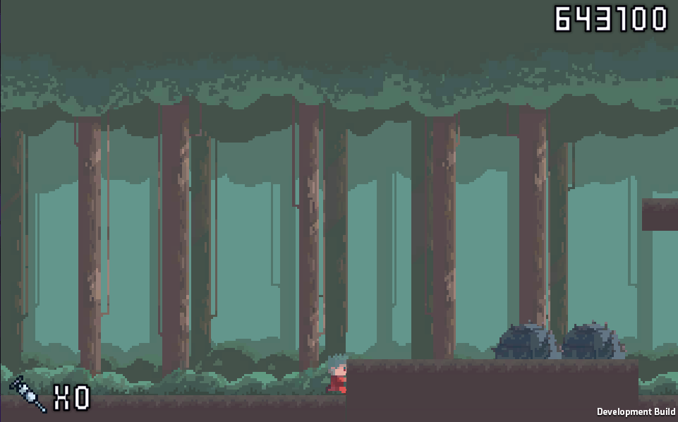 If you just walk to a “ramp” and get stuck (you cant move forward)
Then you you can just grind you score afk…