
Thank you so much!
A member registered Feb 12, 2023 · View creator page →
Creator of
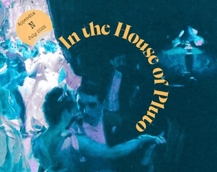
An upscale Heist for Cairn 2e

A 36-word game about volatility in pursuit of prosperity
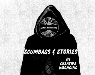
A Carried in Songs and Sagas OSR game of criminal exiles trying to escape a prison island
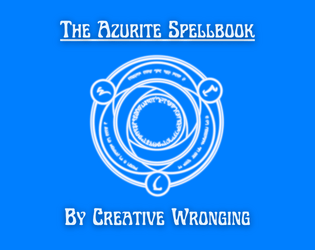
A System-Neutral Spellbook
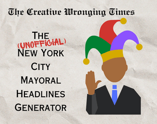
A Valiant Attempt at Predicting the Unpredictable
A Door-based OSR Adventure
A short roll table for unimaginative Executives
A d10 list of supernatural villains inspired by real-life social media figures & politicians