in the gameshow.
straight up spinning it.
and by 'it' haha well
lets just say, my pleasure
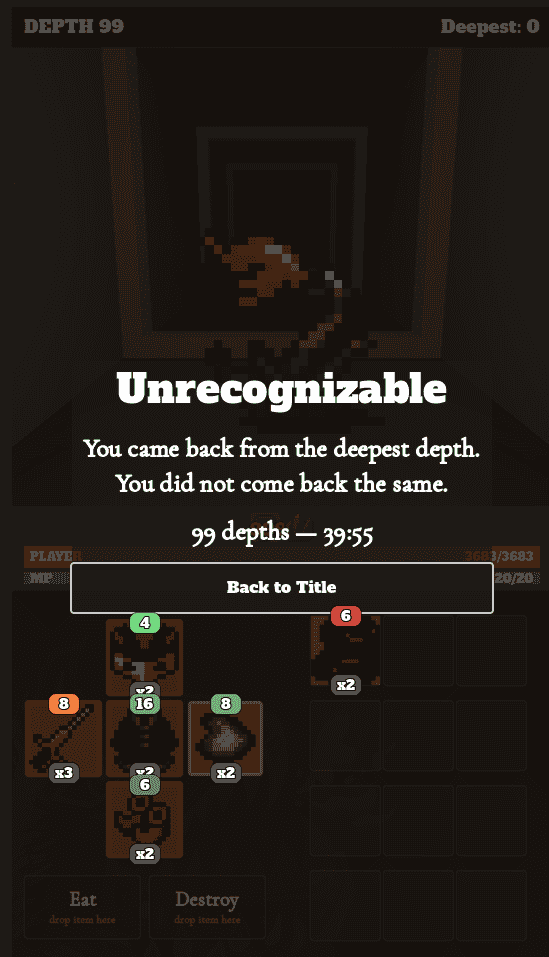
TL;DR: Fun game. Later stage of game is repetitive. I would personally recommend: Floor 50 is the game end screen, Floor 51+ is "New Game Plus" and now the upgrades also include the downsides you had before, so it's now an infinite survival mode to see how far you can last after beating the game's floor 50.
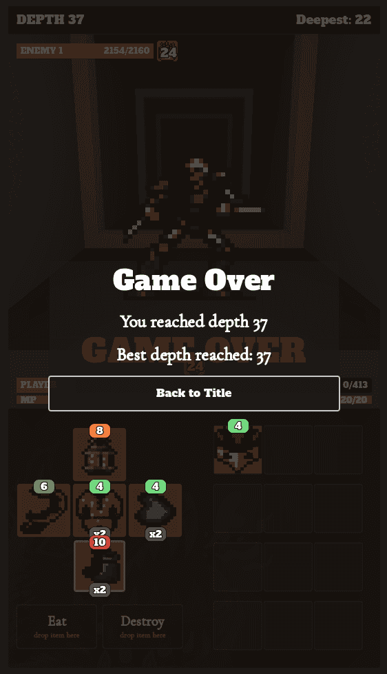
Finally beat it. Lost 1 run to dumb mistake (no healing) at 19th floor, then 2 runs both lost at floor 91.
Beat it using a brute-force heal build. Regen caps at 999 and roughly floor 91 does more damage than 999dmg/sec so you need to both max out regen AND have a lot of non-regen healing sources to get higher.
The poisontick and burning tick heals seem useless floors 50 onwards because of how slow the ticks/healings are.
The buff/debuff cooldown -1.0sec mod is interesting. It's very good early on (before floor 60), and useless afterwards because you usually have 100% cooldown buff'd by then (due to firing limits per tick, and also the regen cap, you still need to plan to beat floor 91 onwards though).