
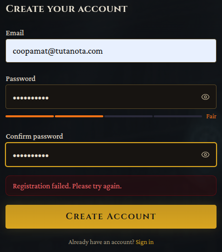
Well. Now I can register... and then it halts at an empty blue screen. I reload the page and do Login... and it just clears the fields and returns the login prompt. I get a strong impression that no effort has been made to test this thing. That being the case I have to assume the same care has gone into its code and design.
A member registered Jan 08, 2025
Recent community posts
The "Session not found" problem is not happening the same way now, but the banner appears on the itch.io version and looks like this:

As you can see it blocks the top menu (and never goes away). Anyway, apparently my session *does* get found now, so... whatever. Maybe it was some kind of cross-server issue, and now I've got all the right cookies in, or something. (And now I'm playing on replit.app so no more of those issues.)
Yes, I meant to mention that it seemed like the threat level is pretty high for a little level-1 guy such as myself. First encounter was with some dark sorcerer type who was clearly over my head, so I was polite and he went away. But he (maybe) had already started a forest fire that destroyed my village before I met anyone there, and while escaping that I ran into two wolves I couldn't handle, and now we seem to be involved in some kind of Dark Forces emerging to take over the world. When really I should just be beating up tavern basement rats or something.
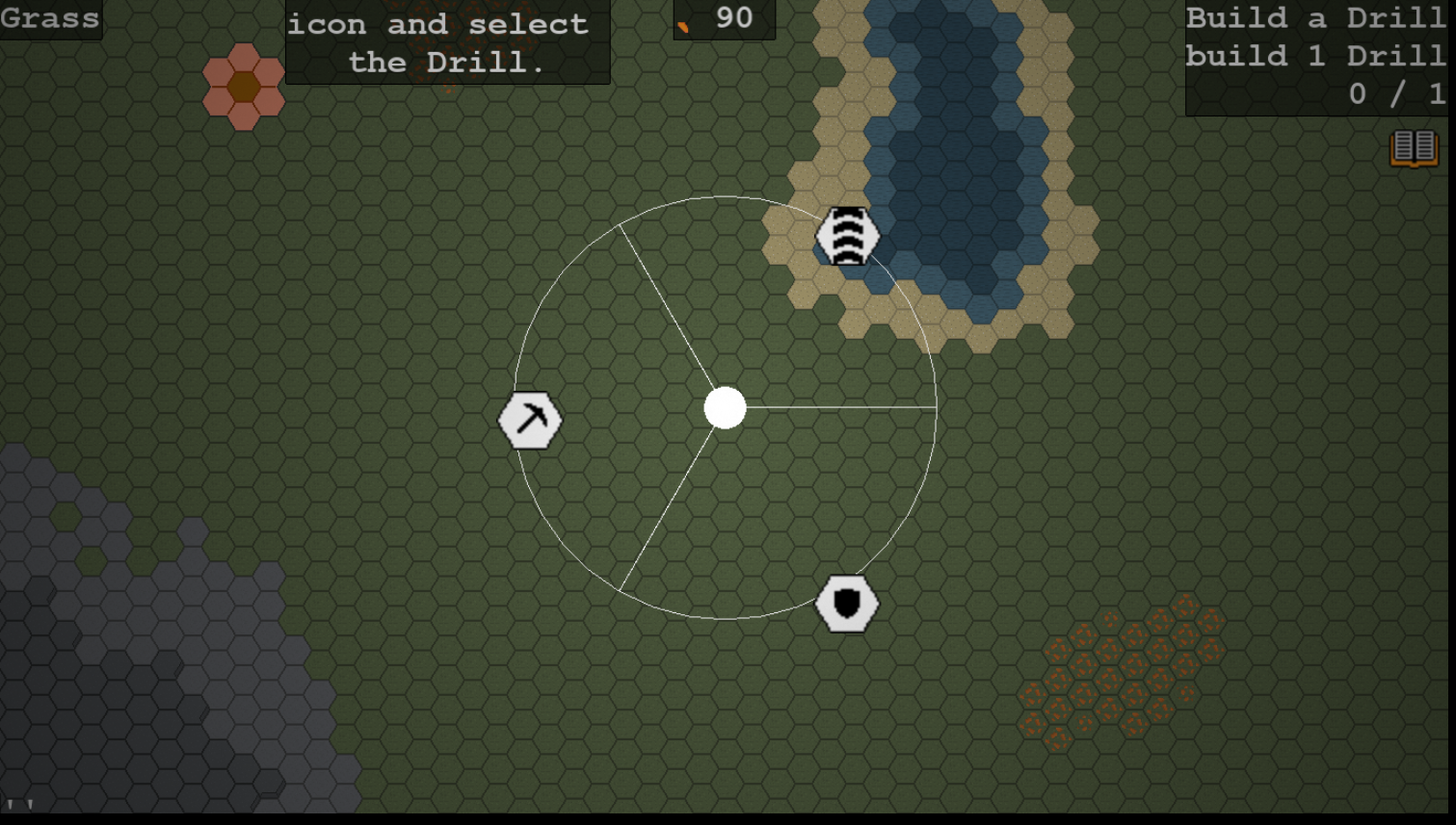
Graphics -- nice but not necessary, IMO; maybe for later. I think for now it'd be best to see how far you can get with making the AI do what you want. Personally what I'd like more than graphics would be a map -- but that might be a lot more complicated.
Yeah, that last page of character creation is super powerful! I get the idea of it and how it should work, but it's really a brand-new type of mechanic for games and it'll take me a while to figure out how to use it best.
A couple of years ago I tried making ChatGPT do a basic version of this and it was pretty bad. Decent at DMing locations and encounters but no object permanence, no memory of things that had happened, the reality was all very squishy. What you've got here is working much better than that. Great project.
Reposting. Long story shorter, this seems like a really good start. Dice rolls seem to happen when they should and to work right. Narrative pretty good. Some problems, some of which are probably more front-end and some more LLM; I don't know how fixable the latter might be.
In character creation I picked Heroic Realism and Elf Ranger; then in Stats my Core Attributes all started as 10s, as I'd expect for a human -- no adjustment for race (or profession, if that's a thing in GURPS). The Narrative part is great but daunting; might be nice to have a few readymades for appearance and backstory as you have that one for world.
In play there seems to be no notion of Equipment. I had set up with my wealth as normal but I started with no gold, and the system couldn't say anything about what I was wearing -- where is my armor? Got in a fight with two wolves; I said "Shoot the first wolf" and from somewhere I pulled out a bow and nocked an arrow. Then we were close in so I asserted a sword and there it was. How much other equipment could I assert into existence?
I did poorly with the wolves, and it ended like this:
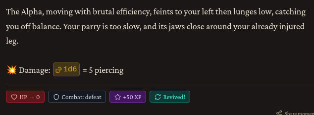
HP 0 and Combat: defeat make sense, but why the XP and how Revived? No new clue was given and I asked "Where am I?" I found myself in the same place with half my HP, still upright and still facing the wolves. I ran away.
In my village (immediately burned down by Dark Forces) there was one useful character named Get. I thought that was a funny name, but whatever. Later though I looked at the NPC list, which showed this:
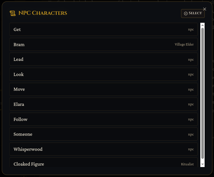
Somehow it's picking up verbs and designating them as NPCs -- which I guess includes Get even though I only used that word long before meeting her. Also Sunken Fen and Whisperwood are places, and Elara was killed before I encountered her. Bram is legit and the one not shown is a legitimate enemy.
The banner that says "For the best experience,open MyFable in a new tab" goes to a black page with a twirler and then says "Session not found".
All that said, this seems really promising! Hope you can solve these things.
Account creation and Email verification comments · Replied to Misha_myfable-game in Account creation and Email verification comments
Account creation and Email verification comments · Replied to Misha_myfable-game in Account creation and Email verification comments
Coming through itch.io using Brave on Ubuntu 22.4.
I use the "already have an account" link, get a login screen, (wrong pwd properly challenges again), that goes to this:
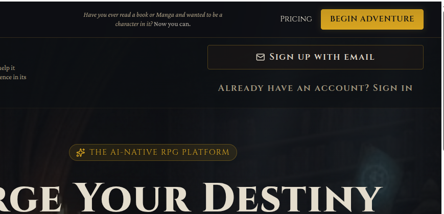
which looks like a repeat of first page. From this point following the "sign in" path again just loops through this page; clicking "Begin Adventure" goes to sadface "refused to connect".
Devilbreath - completely redesigned comments · Posted in Devilbreath - completely redesigned comments
Account creation and Email verification comments · Replied to clemclone in Account creation and Email verification comments

Pretty soon after getting started I had the UI looking like this:
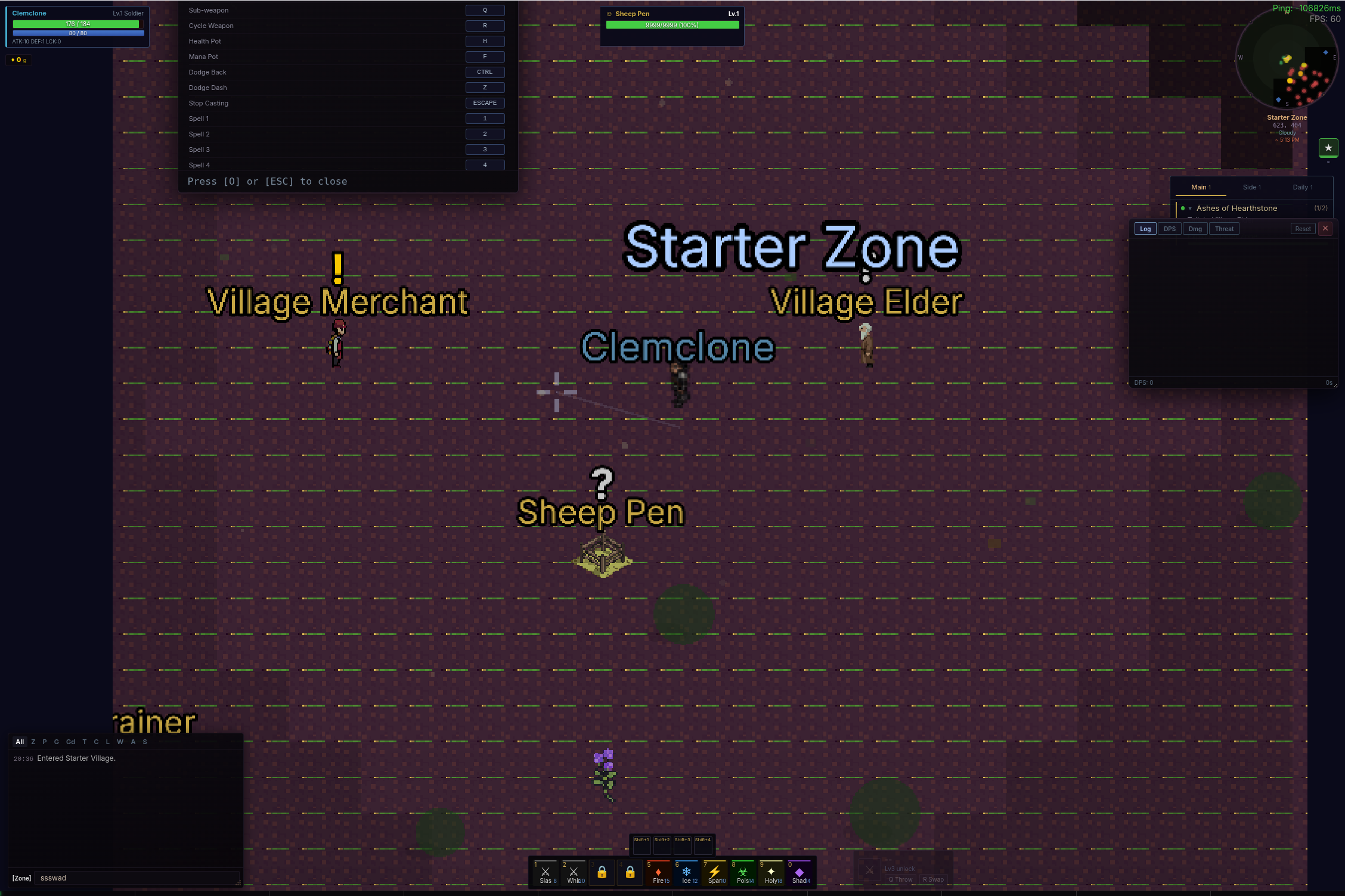
So there's giant labels all over, some concealing content. When I (Clemclone) click the mouse I jump and do something, but I can't tell what because I jump *under* my own label. Cursor is the crosshair but there's a faint line stretching from it to somewhere below my feet. Glitchy horizontal lines all over everything. Interface widgets all much too small and their text is miniscule -- and this is after I maxed out the font size... but that only applied to the labels, I think. And then the settings window said I could do O or ESC to close it so I tried ESC... which at least at itch.io pops you out of fullscreen, causing a reshuffle of UI widgets, leaving the settings window halfway offscreen and I couldn't figure out any way to get it back.
So this could be great but it's still a little rough.