Indie game storeFree gamesFun gamesHorror games
Game developmentAssetsComics
SalesBundles
Jobs
TagsGame Engines

Mecha Aster

3
Posts
27
Followers
6
Following
A member registered Sep 04, 2019 · View creator page →

Creator of

Recent community posts

Extremely good game. Fantastic. Maybe the world's first ever real-time visual novel web comic horror anthology zine, and probably the best one.

I'm curious if BB's head is supposed to look kind of like a bird, or if that's just a happy accident. Like, if you take her bow as a beak, then ignore her facial features other than her eye, there's very much some Falco (Star Fox) type bird energy going on.

(1 edit)

Sorry it took me so long to get back to you, I fell into a Fallout New Vegas-shaped hole for a while.

It's definitely possible to convert this into use for a vertical shmup, but it's not within the scope of the project at this time. Since using the UI Interactable mod for a HUD is very popular in the GB Studio community, I targeted specifically horizontal shooters since they'd have the most screen space for most users.

THAT SAID, here's a secret: you can totally do this with the engine as it is right now, you just have to get a little outside the box. When you format your player sprite for vertical shmup sections, have the right-facing sprite frames rendered as facing up, and make sure the player's facing is set to the right. Then you can simply have the fire button mapped to fire upwards. The only limitation here is that the firing arc stuff isn't designed to work with a vertical shmup.

Here's an example sprite I whipped up for what I mean (you're free to use it, if you like):

Since this method won't allow you to flip the sprite to face down on the fly without changing the player sprite, there's no reason to use the left two frames for the ship. It's a good place to put the death explosion animation for your ship, for instance.

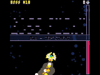
Looks like 4 Giga Boss Fights has text palette issues in tac08 - the boss kill counter is yellow when it's supposed to be white, and the white text for the title screen and boss name splash screens renders as the same black as the background, making them unreadable.

Thanks for all your hard work!