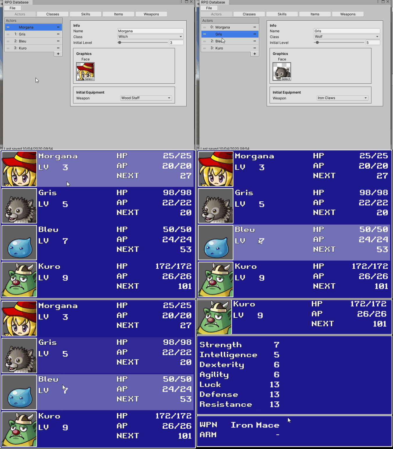
Lumen v3
- Added menu bar on top
- Added feedback when dragging classes
- Added multi element drag
- Added zoom UI
- Added option to recenter the camera
- Fixed issue when trying to load a project with too many items
I made a Sample for my RPGDatabase tool with your character assets. https://isfuturebright.itch.io/rpg-database

Hey, thanks for giving Yurei a go. So here's my feedback:
Art:
Really like it. Clean and easy to understand. The whole color theme is well used with the slimes. The transitions are polished, UI also does a great job. Some sounds when trying to buy a tower when you don't have money would be good.
Audio:
The music is great and the sound when the enemies appear is good as well. The sound when an enemy gets through and you take damage is kind weird like a glass shatter.
Design:
For starters the levels. The easy one should be made waay easier. Like, only have two towers types and one type of enemy. If you get your current easy level and break it into 3 and 4 levels with a good progression in-between that's gonna feel much better.
Also, the tower costs don't make much sense. If the grey one hits all colors but deals less damage it should be cheaper. You could also signal damage more clearly. Like "Low-Mid-High".
Being able to place a tower anywhere makes it difficult as well. If you went a route where each level has pre-defined spots of where towers can be placed would also make the game easier to get into.
Overall:
I liked it. I see a lot of potential and the use of color is a nice hook that opens up to new ideas. I'd recommend focusing on the design part before moving on with the game.
Hope it helped. Keep it up!
Nice. Feedback on it:
- Artwork is awesome
- It would be better if the player started close to one delivery right away
- After a while hint the direction of a new delivery
- Maybe pull the camera a bit when going faster could help avoiding unwanted collision
- Not sure if it was off on my PC but I couldn't hear any sounds or music
Cheers!