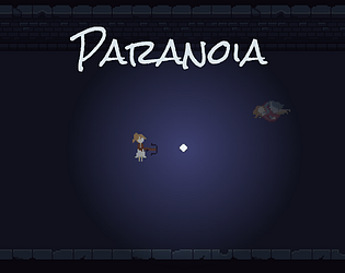
Just found this game from exploration and found it was in a jam. Just letting you know the Flesh Monolith died instantly after I shot it once, which I assume is a bug. [Window Version]
Ancient Meme
Creator of
Recent community posts
It has decent visuals and I got a slight scare on the first encounter, but then it turns into a mediocre shooter once you meet the enemy more than 3 times. As other said, this is much better as a shooter designed without the horror element. I would say adding a minimap that only updates when the player enter a cave area would be helpful as I got lost a couple of times when I play it.
So I just did a course last semester on how professional developers implement techniques to boost their productivity and efficiency. I decided to make a project during my break using Kanban to organize my workflow, and compare it to my experience in 2017 when I had no IT experience and no idea what I was doing.
During the project, I listed out various features I want to implement on the first day and estimate how much effort each one would take, then I put 3 to 4 features to the todo list for the day. I then go onto a cycle of coding for 1 hour, with testing for 30 mins, then take a break doing other stuff. It really made me focus on complete a feature one at a time and solves the problem on me wandering around in my codebase like I did 4 years ago.
As for designing the game, I started in day 1 and 2 out with core gameplay aspect. I made the character, then the fairy, after that it's the light/rendering system. With them all set I then move onto enemies, like goblins and shades so play can fail in a level. On the other hand, the winning logic of reaching the next room was also created as well.
On day 3 and 4, I made a few design for the shadow monster and picked out the most unsettling ones for me. I then code their behaviour and test them out in game, after that I designed the AI director that smartly spawns the shadows into the map. I also spent quite a bit time working on dungeon tiles, which took me 4 hours just to make the basic tiles saw in game.
Day 5 is when I become potato, not much done except some more artwork and redesigning the player character to match the theme of the game.
Day 6 I decided to add more features into the game as the todo list was mostly complete. I added a new shadow monster that gives player hallucinations and created the event where the idol player learn to rely on breaks, creating uneasiness. I also went onto bfxr and pray to rngesus that it gives me usable sound effects (which it did).
Day 7 is the final day where I did level designs. I watched a GDC talk about non-linear level and I wanted to try that out, so I plan out the map layouts and test out possible paths and how I should distribute point of interest (ammo) and obstacles (corpses and goblins). Additionally I added more scripted events that are all slightly different to spice up the player's first playthrough.
Overall I was feeling great with how the game turned out. The Kanban method really helped me focused and it is my first time finishing a personal project this efficiently.
Great atmosphere for a horror game! The design choice of not letting the monsters attack fits well with the plot and subverts the expectation of the player. The maze however is quite an issue as it is very confusing without much clue on what is going on. It kind of detract the experience a bit. Overall, a good horror game that can use some improvement.
The environment and presentation is polished enough as a horror game. Nonetheless, as other people pointed out, the one type of enemy made it a bit bland, and the melee combat could use some work such as adding a small knockback.
And this is just my personal preference, it's better to carefully craft levels the incorporates mechanics rather than just let rng do the work.
Played the game, and I quite enjoy the design of the tutorials as it demonstrates what the game wants from the player. The asymmetrical sections is also good as it spiced things up. The creepiness isn't really there so I would say it does not exactly fit the theme. One suggestion I have is the movement could be grid snapped. Overall, good fun, nice design, could work on more regarding the theme.
Glad you liked it! The design choice to make the light a physical object was to stop people from doing a quick scan across the wall to get information easily, which was pointed out in early testing. Nonetheless, I should have add some tips about the fairy not being able to phase through walls but alas, time constraints :P


