
I honestly didn't realise you'd credited me with the character animation on this until I Google'd "Alan Jack itch.io" because I couldn't remember my own username.
Technically, this makes this my most recent game credit, and I couldn't be more proud to be attached to an awesome project! :D
Alan
179
Posts
1
Topics
30
Followers
8
Following
A member registered Aug 25, 2019 · View creator page →
Creator of


A template platform game project used for GCU's Content & Level Design module
Platformer

This is one of the dumbest things I've ever made - a text adventure interface in Unreal
Adventure
Recent community posts
21/22 Y1C - Team 13 - Momentus comments · Replied to RemcoNiceman in 21/22 Y1C - Team 13 - Momentus comments
21/22 Y1C - Team 10 - Pinocchio comments · Replied to Jack in 21/22 Y1C - Team 10 - Pinocchio comments
Not psychic, just seen a lot of student projects!
You're not the first to learn that lesson the hard way, and I include myself in that (I balanced a client game perfectly for movement, designed 2 whole levels, then the client pointed out the purpose of the game was to sell the character so they needed to be twice the size on-screen). Got to lock that stuff down EARLY or it messes with everything later on.
21/22 Y1C - Team 8 Cheesy Adventure comments · Posted in 21/22 Y1C - Team 8 Cheesy Adventure comments
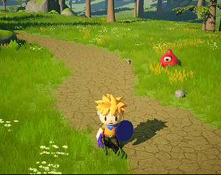
I was a bit surprised when I started playing this, because your self-deprecating commentary on the page had me expecting a disaster and, outside of the main character feeling a little bit generic (slippery enough that I can tell they're not quite the default controller but nothing to write home about) the first level of this was actually really good fun! The tilted camera gave it a nice feel, the lighting and colours are used well, there's a good rhythm and flow, and there was only one or two little spots at the start where I was pulling back on my jumps - and those were very clearly deliberate moments of pulling jumps short, and didn't feel sloppy.
In fact, I really wanted to dive into the build on level 1 - you clearly tried to highlight those moving platforms with lighting, and I think they'd really have benefitted from you slapping some dynamic point lights on the actor themselves, which is easy to do (even in a per-instance case).
Things do go downhill a little from there though ... not desperately - level 2's wall jumping is good, but I found it frustrating. The choice not to give any lateral boost on a wall jump is definitely a subjective one, but since you didn't have Celeste-levels of in-air steering I wasn't able to re-grab the wall if I didn't time the stick push away ... that got tiring for me, but that could definitely be a subjective point worth testing. More of note is that level 2 didn't have quite the same level of clean geometry - lots of tiny bits poking out and overlapping. Still, that's the sort of thing I only notice when there's nothing outrageously bad to comment on!
Level 3 and 4 unfortunately broke me, because there's one particular move - springboard-dash-walljump - that I clearly couldn't get right. It is also worth noting that by level 3 the lovely camera angle and stylish flat colours aren't the same, and by level 4 it felt like I was playing a different game!
I think there's 2 lessons here: one is to playtest A LOT. Maybe the walljump is a subjective take and I just don't like it personally, but it's testing that would show you that. The spring/dash/walljump combo might be the same, but my trained gut says that's just too devilish a combo based on how the mechanics are implemented ... The other lesson is to iterate and COMMUNICATE. When one of you (i.e. whoever did level 1) figures out something fun and cool (i.e the camera angle, the flat colouring and materials, the lights), they should share it with the team, and the team should listen and appreciate! Don't silo yourselves for more than a day at most. Share, and constantly play each others' work, and think about that collaboration as you go - make variant child actors, create a library of geometry, do whatever you can to improve the game as a whole while you work individually!
21/22 Y1C - Team 1 - Project Hot Sauce comments · Posted in 21/22 Y1C - Team 1 - Project Hot Sauce comments
It's such a shame I couldn't finish the rising lava level in this game! There's a lot to enjoy here. The character has a floaty, slow, weighty feel that's quite satisfying, and despite the challenge of slippery landings it feels like across the board the LDs have paid close attention to metrics and spacing and kept things consistent. The use of geometry is nice, with spaces feeling like they afford the mechanics of movement without being too confined, always guiding without pushing (except for the lava ...) and always keeping a nice flow. The touch with the glowing, floating indicator really adds to the sense of slow but consistent flow.
The one unfortunate bugbear I have is the constant positioning of checkpoints in places the player could, in theory, completely miss! It's a very weird stylistic choice that pulls me out my flow as I have to bump slightly off the critical path to hit them each time.
Beyond that, this has all the hallmarks of a nice game ... something I think could be great with a bit of a push to give the space a bit more meaning and purpose and interest, since right now it's basic blockout.
There's a lot to really like here! The slippery, flighty feel of the main character is surprisingly easy to get used to, and though there's a couple little spots where the timing of things has been hampered a bit by the long landing zones, the LD team have handled this admirably and you get a pretty nice, smooth experience with a decent rhythm for the most part.
Standout issues: level 3 just gets too tough after a while, and while level 4 has some really creative use of the spring mechanic (especially where you've turned it against the player and you have to NOT jump on them) it has a serious issue with its critical path! At one point I was actually a bit lost and had to pick a direction almost at random, and towards the end it seemed like I skipped about 1/3rd of the level to get to the end.
Oh, and your wall jumping ... well, it sucks to be honest. Took me a while to figure out that I NEEDED to press the opposite direction on the stick or it just didn't really do anything useful. That might have played into the difficulty of level 3, to be honest.
I think, despite the lack of audio, there's something charming and delightful about this. It's got some clever little level design, and it has to be mentioned that the little touches to the character and the environment with the bird-like appearance and the tree ending give the experience just enough metaphor and narrative to feel good overall.
Someone has really studied their 3Cs and responsiveness, because this looks amazing, and I really wanted to enjoy every moment of it ... but sadly didn't.
There's a lot to enjoy here. Some clever level design, some beautifully responsive characters and a reactive environment with all requisite feedback in place, but at the heart of it is a fiddly, complex boost mechanic that I just could never get my head around in its most basic form. The "hold to charge, release to boost" is a LOT of dexterity challenge when combined with jumping, falling, and wall-grabbing!
Oddly, the mechanic got a lot easier to deal with when I was using the collectible top-ups. The idea of boosting between pickups was a lot more familiar, and reduced the number of complex interactions I was having to work on simultaneously.
Without knowing the journey you've been on, it's hard to pinpoint the issue for feedback, but right now my gut says this is a case where perhaps pride, or desire to be creative, has scuppered some otherwise excellent work. If so, the lesson is to let go of a little of your own dreams and focus on what's entertaining the player - and if that means dumbing down your beautiful, creative, original feature into something that's more of a glorified dash, then that's what you do! Unfortunately you have to be in this for the player at the end of the day, and not yourself.
And if it isn't that ... I guess playtest a LOT more and be ready to pivot things? I can think of two or three different ways the mechanic could work a lot easier - I think the key is in the cognitive load of complex, dextrous actions you're asking of the player in one single moment. Try and reduce the number of presses, stick pushes, and screen elements to read, and/or give the player more time to think about things.
There is - I cannot stress this enough - some professional level work in feedback here, and some great and creative level ideas, and I'm sorry I'm not spending more time on them, but that's the importance of core mechanics for you!
This is a neat little platform game marred by a difficulty curve that crushed me in every level - I didn't finish 3 or 4 as a result. I also didn't learn about being able to dash through the lava until far later than I think I was supposed to (might explain my troubles with level 3), and the air steering didn't feel enough to really make the Celeste-style wall climbing feel natural.
There's a lot of neat ideas, you run through all the best standards (the drop-down dash, the inverted wall jumps, the circling platforms), but along the way there's a lot of little moments of pulling back at the end of jumps and dashes, or sequences of bounces where your commitment too early 3 jumps ago ends up costing you your progress. Don't be afraid to fudge some stuff sometimes to make the player experience better - you don't always have to use physics-based jumping, you could bounce the player predictably from the same spot as long as it's not too noticeable.
In general, this is a neat little platform game that could be beter with some tidying up of spacings of jumps, a little extra guidance with the mechanics, and maybe a re-think of a couple of wall jumping segments.
Difficulty shaming on the menu kinda makes you look like douchebags, which is a downright shame because this is some of slickest work I think I've seen in a Y1C project in years. Nice and simple, good well-spaced metrics, and someone's been studying their principles of feedback!
It's a shame that same someone didn't think about the consistency of timing on the switched items - there would be 101 solutions to that, but I'd start with a simple text-based timer rather than nothing. Similarly, no audio? You knew to add particles to death but no audio on jumping? :(
The levels are smooth, the curve introducing difficulty is nice, and I like the addition of the little "sensation" moments of outrunning falling spikes. A great rhythm and a nice, simple platform game. Overall really great work, but one of those cases where it's so good that I know it could have been just a little better! ;)
21/22 Y1C - Team 7 - Down Under comments · Replied to ChaoticCake in 21/22 Y1C - Team 7 - Down Under comments
Sorry about that! Went back and played level 4 ... a bit short, but I'm impressed at how you got a nice sense of setting and environment. Unfortunately also a bit of poor placement of things in this level as well - very specifically the final section of the teleport challenge on the bottom section of the level. Without being able to see where I'll teleport to precisely, it's REALLY easy to fly off the platform, and that became very frustrating!
After that, you've got the issue of a checkpoint that it's surprisingly easy to breeze past. You've got the timing/rhythm right in that there should be a little respite spot somewhere there, but you probably want the player to LAND in that respite spot after the teleport/teleport/teleport challenge that leads into it.
I'd also suggest looking at the spot (or two?) where you repeat challenges and making sure the geometry and set dressing isn't exactly the same, because I kept thinking I'd died and restarted really quickly! Players will ground themselves in the level based on variety in shape and background, so make sure there's plenty diversity in it.
There's plenty to enjoy here - some nice, by-the-numbers platforming challenges and some sensible features. Unfortunately throughout all the levels there's this awkward looseness where the level "flows" only if you hit things at the exact spot where they're intended.
The weird, slippery main character feels nice in isolation, but combined with these level setups it makes me wonder if the 3Cs were altered a bit late in development? If the slipperiness is by design, it's cool, but the LD needs to follow with a more forgiving setup, and that might need to be facilitated in feature design as well ...
Remember that you can absolutely cheat and lie to the player, as long as they don't really notice - for example, you could always "pop" the player to the middle of the green dots before they do their extra jump! That would give the LDs more control over how the player moves through the space while the player just has to think "press A when I'm on the green dot" and not worry about exactly where they are on the green dot.
It feels like you're doing everything by the book here but maybe missing the core point that it all needs to come together as a grand experience.
21/22 Y1C - Team 3 - PHARAOH'S TRIBUTE comments · Posted in 21/22 Y1C - Team 3 - PHARAOH'S TRIBUTE comments
This is some really nice work. To get such a strong sense of theme and place within a whitebox minimalist art set is quite an achievement. Also, thanks for confirming for me that my speakers do work by actually including sound FX, but I'd advise prioritising FX in future since the most necessary things (flames, crumbling platforms, the player) didn't have them!
Overall, there's just not much to criticise here ... it's a smooth journey with a few big difficulty spikes (sorry, I couldn't get past the rising lava in the 4th level!) but there's a great consistency and a neat rhythm to the experience, with good use of enclosed spaces and a steady beat of action/respite.
One major point, though, is the constant use throughout the levels of branching paths. It feels wrong to me - you're giving the player the option of missing out on some fiendish challenges. The optional paths don't feel challenging to find so ultimately why offer them? Be proud of your work and guide the player. You should be confidently stating to the player "here is my work, enjoy it!" not cautiously saying "here is a thing, maybe, you could try it, if you like". I didn't find any of the "optional" paths that I thought couldn't have been part of a system of progress gating that would force the player to collect everything and experience everything, and I think the game would have been better for it!
Good work, but be proud of your level design and make use of it.
There's a lot to like in this at first - it's quirky, it has a sense of humour, and it's really well presented. The central mechanics of movement and sliding and jumping do feel solid and pleasing.
Unfortunately, after a while they get frustratingly hard to control. There were a lot of spots where I passed challenges by repeating the same tactics until the dash-jump landed me in a safe spot. It felt less like I was learning to master the mechanics and more like I was getting lucky.
There's a few clever ideas that I saw in level design, but the spike in difficulty was just too much for me - I didn't finish any of the levels, and by the last level I actually couldn't figure out how to get past the vertical breakable wall - I suspect it's the Super Meat Boy trick of hitting it, then bouncing off, but I couldn't get to safety with the second jump and just had to give up.
It's a shame to see something well presented and clearly put together with care and just not be able to enjoy it. Perhaps I'm just not in the target demographic, but it feels to me like it could have done with a lot more smoothing out of the difficulty curve!
There's definitely an art of subtlety that it's important for all designers to learn. I love the design of the dash mechanic, with the slow-down effect and all, but ultimately this feels like everything turned up to 11 and nothing given time to breathe and mature.
The character feels so snappy and responsive that it's really easy to slip into hazards. The lights are garish and nonsensical (not to mention you haven't disable Unreal's default auto-exposure so the levels are just wildly consistent all the time). It's great you have your own HUD with a lives display, but since the "Retry" button puts you back at the last checkpoint, all it does is difficulty-shame the player and add a bunch of clicks to the UX that gets frustrating very quickly.
There's some creativity in the level design, and some attempts to present interesting problems to solve, but they seem overly reliant on the player making connections that you're not easing them into. That the dash is required for the first couple hazards right after it is easily readable from the level design, but that it's required for the up/down moving blocks isn't - they're on a flat plain, affording the use of the regular lateral movement mechanics, and their timing is only slightly too fast for that.
I eventually gave up at the blue wall in level 3 - I think this was an attempt to recreate the brilliant collapsing wall from Super Meat Boy (jump onto the wall to trigger it opening, jump back to the platform while it opens, jump through the gap) but I just couldn't get it to work.
Overall, this feels like a project from designers who need to learn to slow down, breathe, study things and act with mature purpose. Study lighting. Robert Yang's GDC talk is a good place to start. Study movement and purpose. Don't just jam stuff down because it's cool - unpack why it's cool and know everything you can about it before you use it.
21/22 Y1C - Team 14 - Platformer Game comments · Posted in 21/22 Y1C - Team 14 - Platformer Game comments
There is some really neat stuff in this game - unfortunately marred by a few little details.
The "collectible jump" feature is lovely. So lovely I was starting to worry when I didn't think it was going to appear in level 2! But once it did it felt like a strong pillar that pulled the game together. Shame to see it literally labelled differently in every level, that felt like a lack of consistency.
Level 2 showed some great innovation by forcing me to do the drop-jump half way up and learn NOT to double-jump. A little bit of a frustrating difficulty spike but some fiendish little challenge designs.
Level 3 then introduced the springs ... not quite so much creative level design, but a fun sensation. It did suffer from the curse of the "50% path choice". Not sure why you wanted to give me two equally weighted critical paths ... doesn't add to the experience, and doubles the work you have to do on balancing it!
Unfortunately the ladder level is the downfall - bit of a swing-and-a-miss on challenge research on that one. What does the ladder do for the game? How does it empower the player to reach their goals? Or hinder them in an interesting and challenging fashion? Unfortunately, like a lot of climbing mechanics in the past, it presents all the same challenges as regular platforms but with a slightly more akward control set. An amiable attempt, but a bit of historic research with a critical eye would show you there's been very few "fun" ladder mechanics in the past, and unfortunately this one didn't bring anything new to the table - I didn't even manage to finish the last level! Which is a shame, because it was very clear the designer on that level was trying their hardest to be creative with the feature and milk all the life out of it they could. Definitely put the effort in, but sometimes these things just don't quite pan out.
Still, that aside this is a neat little project with some very creative level design ideas.
Well hey, it's Portal the Platformer! Some VERY nice tech work on display here, and I like the feedback added to the crumbling platforms (though it's noticeable they don't reset on player death).
The character feels snappy and responsive - nothing exciting, a little "default" but it works and it feels nice. Unfortunately there's an across-the-board feeling of awkward jump sizes ... I hope that's not a symptom of the dreaded "last minute tweak to the 3Cs"!
Have to mention the camera ... a couple nice spots of dynamism (especially noticeable right at the start, a nice smooth transition early in level 1) but a lot of janky quick cuts in places too.
There's some clever puzzling on display in level 2, and there's a few smart tricks in levels 1 and 3, but - and this might be down to the nature of levels 1 & 3 being less intensive on the portal puzzles - there's a lot of awkward landings and head-bashing on corners in those spaces. Even if you're bashing levels out in whitebox, don't be afraid of slopes and even curves. Sometimes just knocking the corner off something makes a world of difference.
Overall, this one feels like some neat tech and some adventurous ideas, but that leads to less time spent on the experience and an end product that might have needed just a little bit longer in the oven to come out fully prepped! ;)
This is pretty neat! I like the very simple approach. Unfortunately in terms of features there's a bit of a lack of feedback - no audio whatsoever is a HUGE missed opportunity to add something to the experience.
There's an odd "floatiness" to the main character that took me a while to get used to. I'm hoping that's by design - it's odd, it's different and it's always nice to play something that doesn't feel like a default Unreal Engine character controller.
I did spot that in all 3 levels there's one or two spots where it felt like you were relying on me clipping platforms at the edges or otherwise "cheesing" a solution, but this is balanced out by some very nicely spaced sequences with sensible jump distances and good timings. For a game heavily reliant on moving platforms, I never once felt I was stuck waiting for them to sync.
Level 1 started slow then suddenly had a lot of spots that felt unnecessarily punishing, That said there was a few nice touches - I liked being put in the position of having to temporarily run in the path of a bullet towards the end.
Level 2 had a few smart moments and was generally the most balanced, and level 3 felt the most chaotic - the jump spacings weren't quite as solid as the previous two, but then there was a lot of creativity shown in the use of the drop-down dashes and (what I interpreted as) inverted wall-jumps.
One word of caution for level 3's designer: it felt like there was a deliberate lack of checkpoints, and that didn't sit with me personally. You need to keep in mind that difficulty comes in many forms, and consider what skills you're challenging and why that's fun. Most of the challenge in this game comes from timing (moving platforms) and dexterity (air jumping). A lack of checkpoints adds to difficulty, but it does so by testing stamina and patience, which felt a little out of place.
But for a nice, neat simple platformer this is really good work - just don't neglect audio feedback in future!
21/22 Y1C - Team 11 - Qbot in the Cyberspace comments · Posted in 21/22 Y1C - Team 11 - Qbot in the Cyberspace comments
Nice work!
There's a very noticeable inconsistency in the structure from the first "Level" (I guess?) to the rest - it kinda slides from an open, scrolling space focused on basic jumping slowly going into the more per-screen approach. Both parts are good, but they feel a bit like separate games.
Once it gets rolling the switch/teleport puzzles are neat, simple and fun for the most part. I noticed I was challenged more by the earlier ones, then when you introduce the switches there's a phase where it's all lining up nicely. Both are good, but again there's a question of consistency there - take a look at Micheal J Apter's model of "Types of Fun". The earlier parts are primarily "challenge" fun with a bit of "sensation". The middle bits are "sensation" with just a sprinkling of "challenge". Then came the timed switches ... I have to admit I tapped out at what I assume is about 1/2 or 3/4 through those ... fun, but punishing at times, and pushing from "challenge" into "submission" and the grind of repetitively trying to nail the timing ...
Overall, I get the sense there's a really fun game at the heart of this, but maybe a team that needs to learn to talk more about what their goals are and what type of game they're working on together!
General
- This is coming together nicely, but it needs a lot of feeling put into the interactions.
- It's almost a shame there isn't a narrative pulling this together right now! Focus on getting the last of the art in and polishing the interactions and environment, but if you get that done in time, it would be nice to go back to the idea of giving everything some sense of meaning through a literal narrative of sorts.
Arcade
- The corridor loop doesn't feel like a corridor loop when things are different at the other end! I see what you're trying to achieve, but maybe you could give the player an indication that these things have just stopped moving?
- When/if you fall in the "water", it would be nice to feel like it has some response other than a cheap fade - there's no splash, no water effects, etc ...
- The same with the planks and reaching the tape. Work on putting LIFE into those interactions. Planks that THUMP down with WEIGHT and SOUND and PARTICLES. Grabbing the tape should WARP you back to the bar
Disco
- The transition from the "hub" to the Disco felt sudden and awkward in a less-than-pleasing way
- Similarly, the transition from the walkway to the Disco felt off - I get that disorientation might be the goal, but having it hit right after revealing the last corridor felt like you mistimed it, rather than I was confused (if that makes sense)
- I love the balance of guidance and non-guidance at the start of the big Disco - I walked right past the stairs, just enough to get a bit lost, turned around, and saw my path forward.
- The opposite happened when I went down the stairs - exploratory area to the right, clear path to the left. Consider putting the door on the other side?
- The twist of position here felt a bit forced. Might be because I cheated and did the Bathroom section first, but it wasn't as natural as - say - the prototype of the twisting corridor I played before ...
- Is the repetitious and annoying nature of the disco tune deliberate? I was going to suggest it should warp with the environment, but just aggressively repeating that riff as though it's trying to deliberately be annoying is kinda cool.
- The last twisting corridor is the same issue as the first - a bit sudden.
- Ending is very bland.
Bathroom:
- Nice job of guiding the player, but the transition from the (awesome) dripping neon corridor to the bathroom is still a bit of a let-down. Also, would love to see something preventing me turning back the way (maybe doing an unseen teleport, so either end of the corridor will dump you in the same spot?)
- Fall needs impact! Sound, camera and control-sensitivity.
- Lost me a bit in the white floor room. Need to lure me forward to the pathway.
- Let me fall in the toilet a bit longer and experience more weirdness of the swirling tunnel