It was okay. But with a menu heavy game the ui has to be readable, and understandable. Kinda difficult to play the game when I can barely read the font.
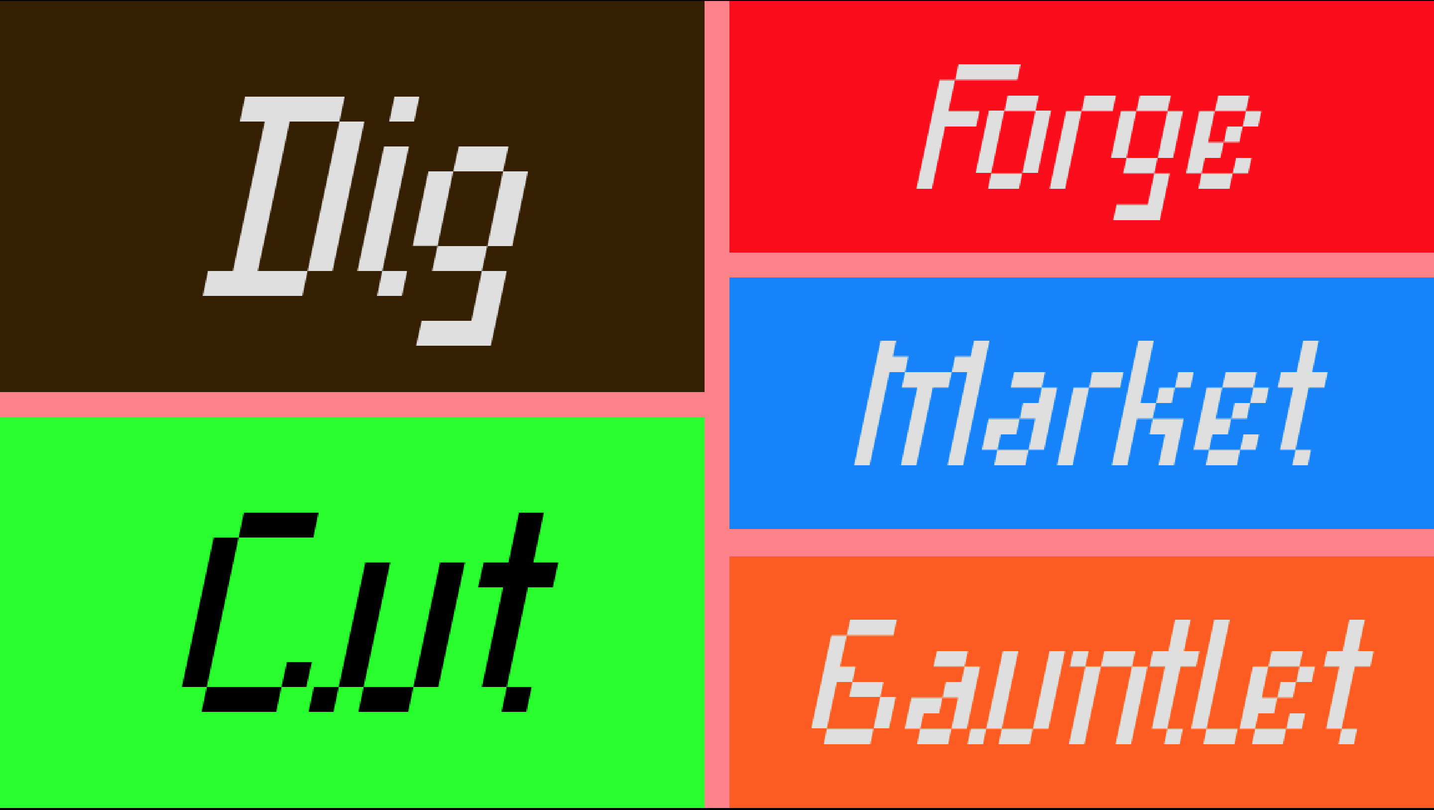
Did the font look like this?
Yeah, the color choices just kinda strained my eyes tho. Would have been better to have like black on white/light gray.
That’s true, but I tried that and it looked really boring. I could have used less bright colors though.