Indie game storeFree gamesFun gamesHorror games
Game developmentAssetsComics
SalesBundles
Jobs
Tags
(1 edit)

Thank you for the great post! What a joy to start the saturday morning with! 

The way to change course and speed looks really intuitive! 

I imagine making the line that indicates the path to the future position curved would give another visible hint to what the player is doing even if the point of origin is not visible.

On the other hand it's less realistic as you would project the course on the map with a ruler.

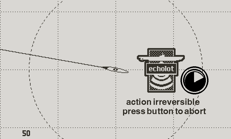
As to the echolot confirmation dialog: As I understood you wont use the echolot very often so if it's a bit disruptive it would be very rare.

Another way could be to delay the action for 3 seconds in which you have to keep the button pressed. During this 3 seconds a sound could be played (some click sounds as the operator is turning a knob) and after the 3 seconds you hear the ping. It could be accompanied  by a time indicator (shrinking circle or something like that), the warning text could be flashing, etc.:


As to expose the statistics: Sometimes its difficult for the player to learn what works and what not (I remember when I was about 13 years old playing a pirated copy of Silent Service on a monochrome Atari ST with very little knowledge of english). If you see the numbers there is no ambiguity.

So it could be an Idea to have a settings for difficulty (novice vs. captain) where in easy-mode there is an additional info (e.g. chance of detection: 20%, chance of torpedo hit: 30%), not to expose all data but some key-values that would train the player to associate the conditions depicted in bridge view (weather, lighting, ...) with chances of success of different actions. Or it is just used in the first tutorial mission, that would prevent that the game becomes a board game but speeds up the learning the conditions. 

Thank you again! I think I will fire up the emulator and give Silent Service another shot.

Quite a lot to unpack. Thank you for taking the time of giving such detailed feedback and suggestions.

The curved lines, like you said yourself, wouldn’t make much sense in the context of the map, and I’m afraid that this would generate confusion (even though it would look nice).


I think the Echolot confirmation works well as it is. Your suggestion is sound, but I feel that sometimes it’s best to stick to the simplest system that most people are familiar with, unless you have a very specific reason not to.  I also think that the window is a more elegant way to present the text.


You’re right about the numbers. They do offer certainty. I mentioned this as a reason to explain why they’re so popular in many games. But that’s precisely why I don’t think it’s right for what I want to do. One of the major themes of U-boat warfare is the tension; and this tension comes in great part from never having any certainty about anything. If you think of real life U-boat combat, there was never any way of knowing what were the chances of hitting, or being detected. Captains only knew what worked in their favor, and what worked against them, and their appreciation improved over time, with experience. That’s what I would like the game to convey. I had a similar experience with Silent Service, but I think that the struggle came from the game not communicating well the parameters that went into the resolution of any situation. Games were different back then. It was a do or die philosophy, with very poor quality of life. Atlantic ‘41 will be a modern game, that (hopefully), gently introduces the player to all the concepts needed to succeed, and conveys clearly all the variables. But I want the player to learn the impact of these variables with experience, like a real captain would do. The advantage being that you have the luxury of starting the war over as many times as you want. I realize that it’s a risky and challenging bet, and that it asks more investment from the player, but I believe in the idea, and I hope that there’s enough patient players out there that are willing to get their asses kicked a few times. ;)

After reading your last paragraph I'm even more intrigued by your approach.

It is clearly a "risky and challenging bet" as it targets a handheld console with a very small monochrome screen (the playdate made me realize that I need reading glasses -- I feel old now), few buttons and an audience that is accustomed to very short casual games -- nearly the opposite of "immersive".

But if I'm an indicator you already succeeded: Just reading the blog (your incredible profoundness of thoughts regarding the game design) and looking at the beautiful (!) artwork evokes an visceral reaction, a tingle of anticipation. I usually don't have that.

After reading your reply I think by not showing the numbers you allow a higher degree of immersion as the imagination occludes the restraints of the play date. It will only get better with added "focusing on the tension and the mood".

Looking forward to the next devlog entry!

(+1)

Yes I mentioned in a previous log how the Playdate seems a counterintuitive choice. But sometimes you got to follow your instincts. We’ll see how this all turns out :)