
Does this sword makes me look fat angry?
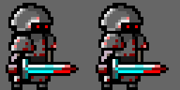 (second one is broken a little, sorry)
The attack doesn't look super natural since just the sword is moving, you ideally want the character's entire body to move a little bit to show the weight of the attack. For the second attack, you'd want the sword to start BEHIND the character, that gives you a much more impressive arc to swing it over. First attack also could benefit from that, I guess, the knight moving the sword back to charge up as much power as possible before stabbing with it.
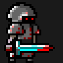
Example:


Notice how the character leans backward in the first frame and leans forward in the frames during and after the slashing motion.
I see sprite sizes more as recommendations than requirements ;) NES games still did this even with all their limitations, mostly by using more than one sprite, with the sword in one sprite and the character in the other... this also let the designers use a different color palette for the sword as a bonus effect. Check out the sword powerup in Kirby's Adventure, for an example of this... but Zelda 1 and Castlevania 1-3 all did this approach as well. (In modern days, you can of course have it all in the same sprite for convenience)