

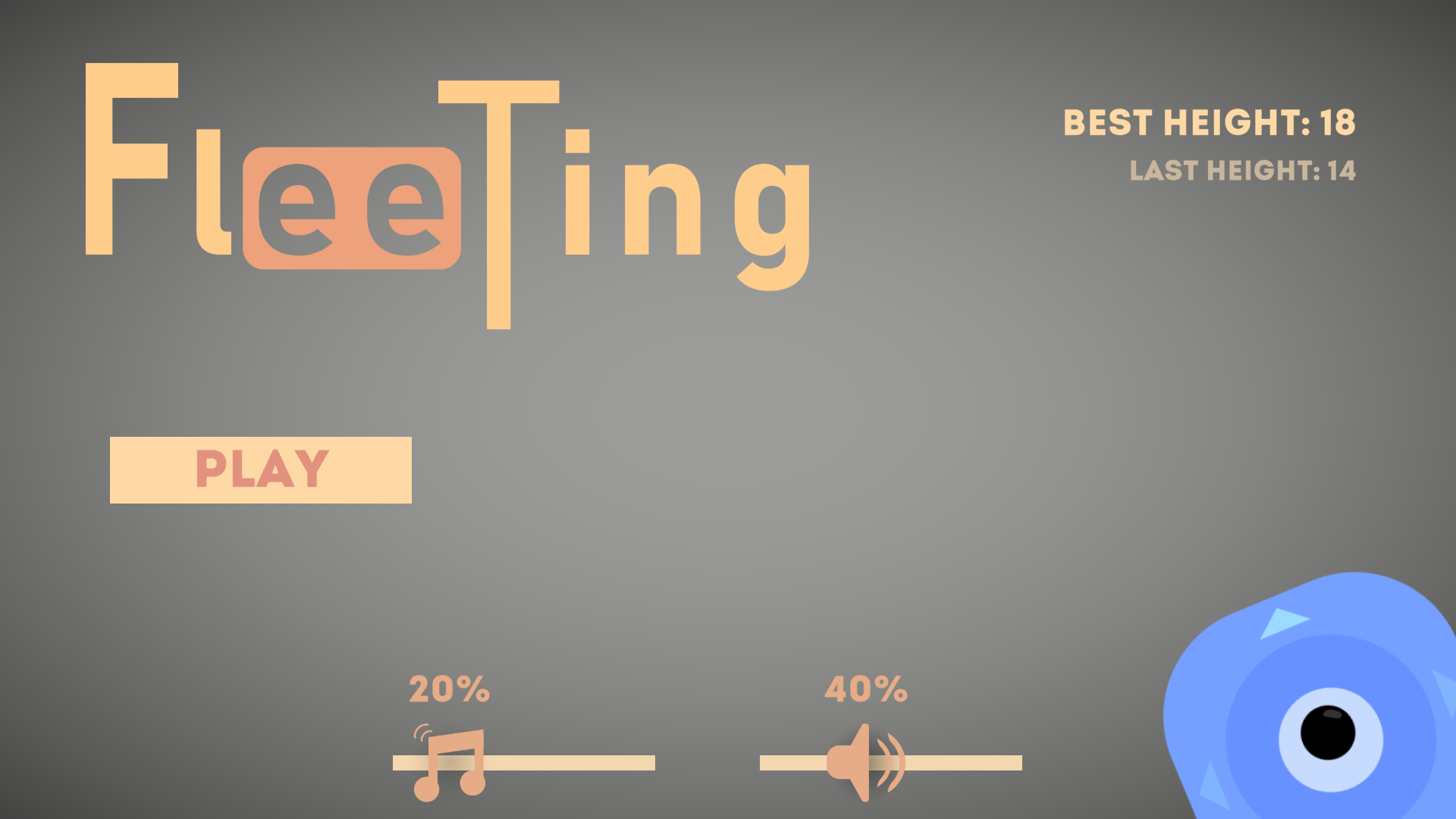

Play game
Fleeting's itch.io pageResults
| Criteria | Rank | Score* | Raw Score |
| Fun | #7 | 3.500 | 3.500 |
| Design | #10 | 4.000 | 4.000 |
| Ease of Play | #13 | 3.500 | 3.500 |
Ranked from 2 ratings. Score is adjusted from raw score by the median number of ratings per game in the jam.
Judge feedback
Judge feedback is anonymous.
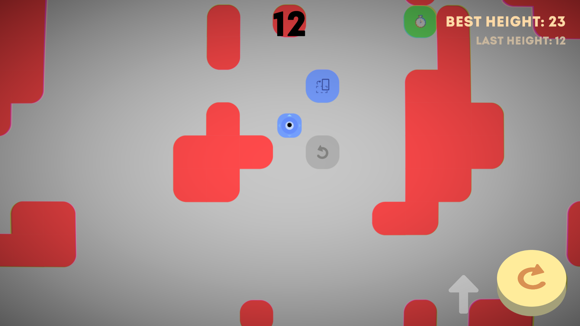
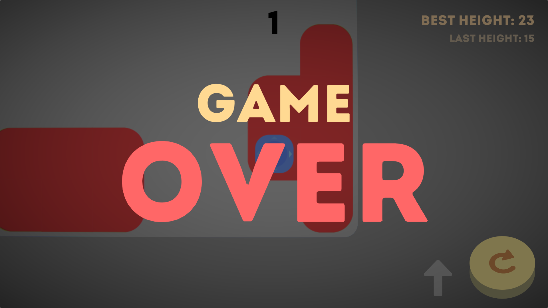
- Very fun and unique game. Love the visuals for this one. As others have mentioned, my only complaint is that sometimes the obstacles are spawned in a way that cause immediate death. Also, there are times where several power ups are placed in a sequence that makes it impossible to reach 1 of them. I saw that some had an issue with the turn button being in the corner but I didn't see this as a problem, at least for desktop. Thanks for participating!
Game Engine
Unity
Leave a comment
Log in with itch.io to leave a comment.
Comments
This was a fun and simple concept. The music contributed to a relaxing feel and the visual style was minimalistic and intuitive. I wonder if there is a more clear way to signal which way the cube is facing (I found the slightly highlighted arrow was not clear enough) because quickly switching directions could be very disorienting. I understand that it adds to the challenge, but I found it more frustrating. That and the obstacle problem that others have mentioned are really the only pieces of feedback that I have because on the whole, this was a really fun game to play!
Show post...
Visually nice, but the powerups and obstacles randomly spawn right in front of the player, making the game unfair and harder to play.
The button the bottom right hand corner is quite annoying for players on computer, which also gives a clear advantage to mobile players.
The concept is nice though, good job
Can you describe in more detail what advantage the button gives to players on phones?
Show post...
The players on computer have to move their mouse over to the corner of the screen to click the button, players on mobile can easily tap the screen in any place.
I really like your visual design and presentation. The clean presentation made is nice to look at and the visual representation, made things pretty clear.
The power ups felt powerful. However the gray panels felt pretty unfair. I didn't like losing control over what little I already had.
My biggest gripe is having to press the button at the bottom right corner of my screen.
simple and calming game
wish the obstacles don't spawn right in front of the player
good job nonetheless