Indie game storeFree gamesFun gamesHorror games
Game developmentAssetsComics
SalesBundles
Jobs
Tags
(+1)

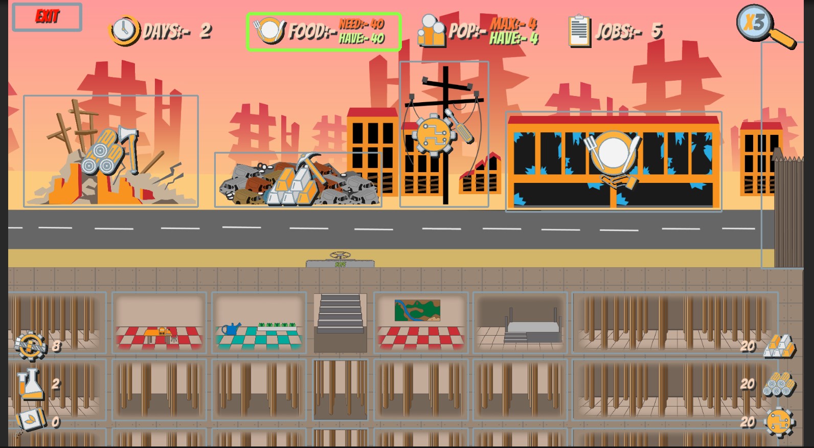
So the resource icons on the UI looks really similar and they don't stand out much from the game scene. It would help to make them look more distinct from each other. A good example I could think of are the resource icons in Age of Empire games where you could clearly tell gold, wood, stone, and food without having to look at it closely. I hope this helps :)

I was trying to keep it in theme with the game art style, but I'm no artist it's all Dev art so I could and probably are wrong. 

If I make a changes to the Ui after the testing time would you be able to give feedback on the changes done???

(+1)

Sure! And my co-dev could probably give you a more constructive feedback  considering she's the artist. I'll tell her.

would love the extra feedback from someone who is an artist.

(+1)

i have implemented a ui update and also a tutorial for the game. but wont be released until v0.32 post game jam version 

(+1)

Oh dang that looks so much better! We'll check it out once it goes live.

Great feedback allows me to have something good to work on and make the game better, so thank you very much for playing and taking the time to give very constructive feedback.