
Content update
Hi guys, today we want to show you and ask you some questions that have arisen with the development of the 3rd game of these 4 stories that we are preparing.
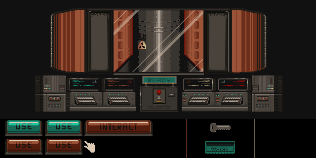
We show you a screenshot that is really a mockup still early, and that we will continue to develop. In it, a lone soldier in a missile silo during the cold war era receives the order to launch, something that no one in his skin would want to live, knowing that he has the opportunity to refuse or launch the end of the world. His big problem is that as a war veteran he suffers from post-traumatic stress disorder undetected by his country's psychiatric services at the time he was chosen for the job. So he suffers from grotesque hallucinations, which have a decisive influence on the execution mechanisms required by his obscure job.
We have this first mockup in which you can see one of the rooms, in this case, the launch room itself, after having passed through other rooms in the silo before reaching this screen.
Later, and at a given moment, the hallucinations begin: we will change the color palette and, apart from the hallucinations, the interaction buttons will change so that the player does not really know what he is pressing and that can have fatal consequences. That's where we will develop, we are still not clear about some things.
We ask you a question. It is about the aesthetics. as the previous stories have an 8bit flavor and this one as you can see has a color palette that does not follow the pattern of the previous stories, do you think it is shocking and breaks the aesthetics in a negative way?
Let's show you some changes, especially focusing on this particular screen:
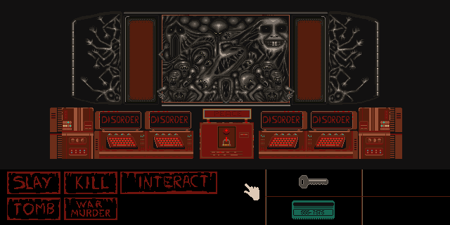
Here you can see one of the hallucinations, we are going to put it interspersing the original image with this one that we show you in a very fast succession. But, as you can see it has a considerable amount of colors, especially gradients. We have thought to change it and to put 8bit colors, what happens to have so much color, the image loses its essence, we show it to you:
A sample with Gameboy Color colors
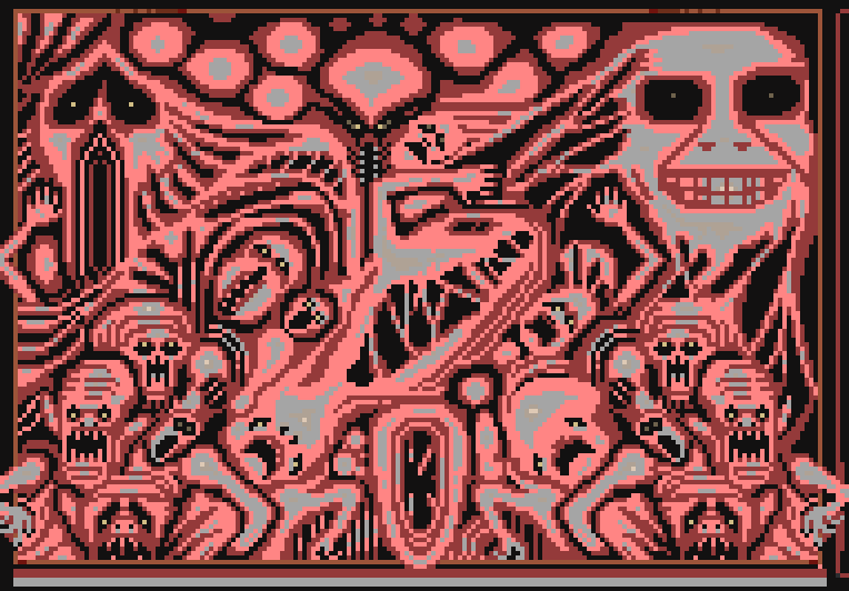
We are not going to put more tests so as not to lengthen the post, but as you can see, the drawing loses depth completely. However, we have thought to put a progressive palette of reds, like this:
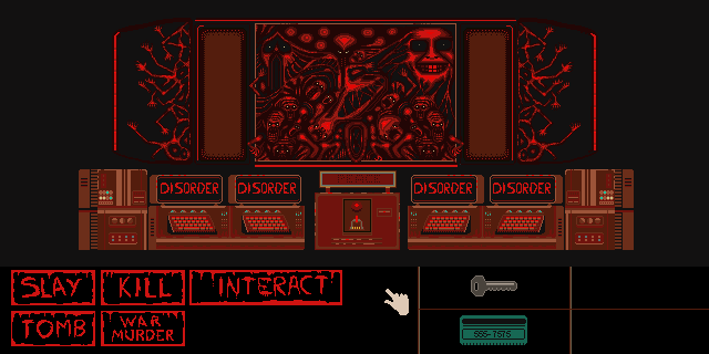
As you can see, it changes a lot. It improves, although the drawing as we already said, is a mockup that lacks a polishing, but you can see the way we want to go.
What do you think? do you think it would be better with the red gradient? we wanted to make it 8bit not to break the aesthetics but we have realized that it breaks the drawing we want to do.
Thank you very much for reading us, I hope you stay tuned for the next updates, remember that we already have our project Cards of the Dead and Furwind available on the Steam platform.