You welcome. Most games show 2 parts of the bar, how much and maximum.
Other games that don't show this are usually margin-centered to whatever it is placed within when 100%, assuming it fills from one end to the other and not from the center expanding both ways (edit: fixed image):
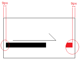
Agreed, when such UI are represented like this, the user can only approximate or guess where that maximum is at, especially if there are no reference to other on-screen UI to compare to.
Also, besides a continuous bar, when it comes to repeated icons like this (4/5):
●●●●
the empty are shown as outlines, or as silhouettes in a similar way (4 filled + 1 empty = 5 total icons):
●●●●○
or:
●●●●◌
If it were numbers:
- Every value displayed as digits are always distinct (even by a little), because it is based on symbols. It is also easy to remember the maximum if the max isn't displayed when the current value X is equal to max.
- Percentage is pretty obvious of where is the maximum is.
You welcome. I've seen lets plays of video games, as well as any UI in general to inform sufficient info to the user.
A lot of touhou games by ZUN until 10-11th on the series did a lot of changes on the UI, before that, most of the meters and such are outline-less and margin-based (with a few exceptions):-Boss Health bars are ring-shaped, and have outline around to show the max (even without the outlines, the beginning and end of the meter are at the same spot at the top due to being circular).
-Starting in Ten Disires, the lives maximum are now clearly displayed, but 1-less (9 is the true maximum but the game shows 8, ZUN must've confused between lives and extra lives (extra lives are the lives other than the one currently in use)). This is fixed in Double Dealing Character.