
6 SEP 2020:
Finally back from my NY business trip!
I watched a lot of game design videos which led me to one major conclusion:
Scrapship needs a LOT of work!
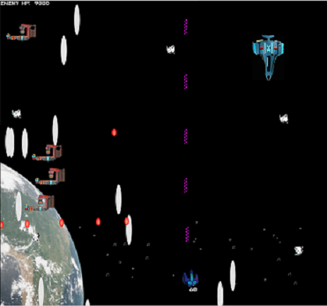
In particular I hadn't even bothered with taking color palette's into consideration. Check out these two screenshots:
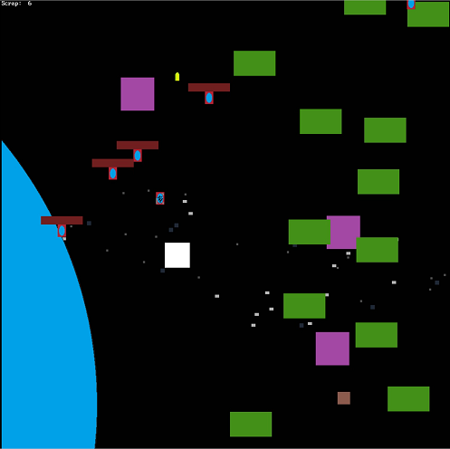
On the left we have the very first demo. Very primitive . . . but the colors really stand out because there are so few of them.
On the right is the latest demo (5). Looks fancier, but the spaceships don't stand out as much as they should. There is also a severe lack of consistency: Why are the fighters red and the cruiser blue? Why is the player almost purple? Why are some projectiles red, purple or white? The earth background further complicates the image.
So with that being said, here are some of the things I'll be focusing on:
-- Color Color COLOR! Going to work hard to find combinations that work together and really stand out.
-- The player only has 3 weapons (because I only have 3 sound effects for them). Nothing inherently wrong with only having 3 weapons, but they each need to have more purpose than simply "this one does more damage". I'll be working on balancing these 3 out.
-- Hit detection has always been a sore spot in Scrapship. Ideally I'd like "pixel-perfect" hit detection, so I'm going to see if that's possible or not.
Lots more on my mind, but that's the main gist of my thoughts. Stay posted for more updates!
The latest demo can always be played here: