

This was a fun read and grimly humourous, which fits! (Bonus points for pointing me to Fatherfog too) The setting is punchy, you could easily adapt it for other games, but it really fits the vibe; The writing is well executed and the layout is a real highlight, it is super professional looking.
There is a bit of weirdness with contrast between the text and the background, it is at times too harsh and others a bit hard to read, for example the nodes and paths on the map in black are a bit hard to read, I think slightly greyer text paired with the claret background of the last page would be a good balance for the main text.
Great work, I'm looking forward to running this!
1 day ago(+1)
Thank you for the read!
Definitely going to be more cognizant with my palette next time. I originally had all the pages as scarlet (like #FF2400) to go hand in hand with the title. My spouse walked in and looked at me like this: 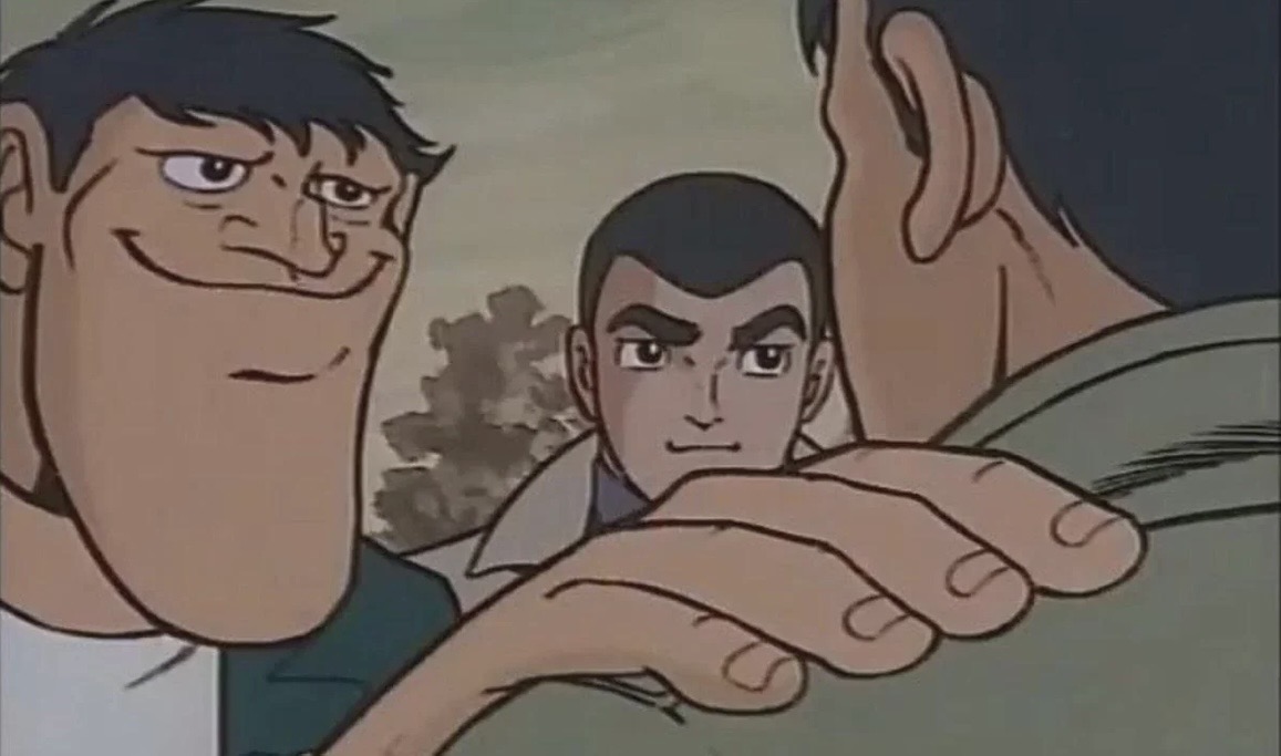
This has been a great learning experience for me (and it could have been a lot worse!)