

I loved the gameplay and really enjoyed it, I do think you could've made better choices with the pallette for readability but overall the art was pretty good as well!
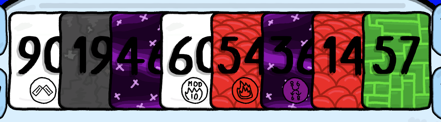
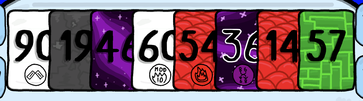
main problem imo is the space ones - as u can see the numbers on top of them are barely readable. easiest choise is to pick lighter colors (like you did with the pin color) but if we want to work with the existing one you'd have to make sure the design allows the player to read the number. you can leave out some space for the numbers, or just add a lighter stroke to the numbers to mak them pop.
a quick example (it doesnt look good but it makes the point clear i think):
another place where it's difficult to recognize the numbers is when u have a lot of cards in hand:
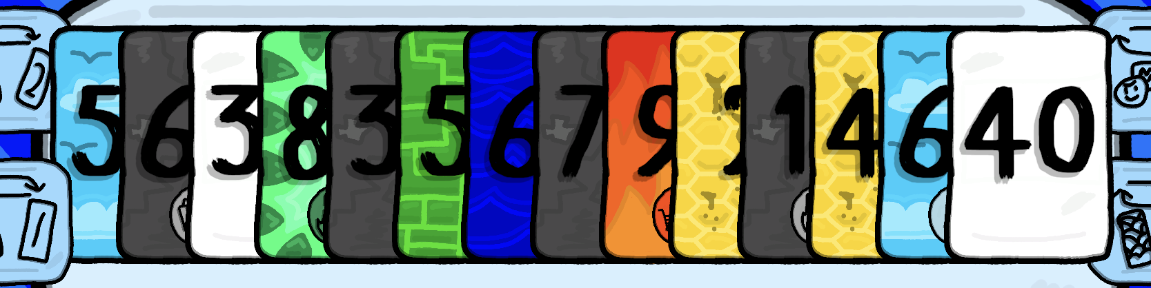
you could add those small numbers that most playing cards has on the top left and bottom right corners - they're there to allow you to know which cards you've got even when most of the card is hidden, or maybe just make the card i'm currently hovering to jump over the other cards.
there's also the background that is a bit too distracting imo but that's more of a design choice and after a few moments it becomes easier
2 days ago(+1)
For sure! I knew about the space card issue in development but then tricked myself into thinking it was just me so I didn't have to fix it. The issue with too many cards I can also fix. I'll probably wait until after the jam voting period tofix these issues avoid any disqualifications. Thanks for the feedback :)