
Indie game storeFree gamesFun gamesHorror games
Game developmentAssetsComics
SalesBundles
Jobs
TagsGame Engines
(+1)

For context, I played a bit of the web version. I didn't get too far because it felt like I was mostly bumbling my way through the game. To be completely honest, I didn't really know what was going on.

Some thoughts while playing:

- The intro is pretty cool. I'd appreciate it if left-click sped up the text scroll rather than skipping it entirely.

- A fullscreen option for the web version would be nice.

- Overall the presentation is pretty good, especially the use of the 3D dice during rolls. I would personally consider making the battle UI a bit more retro-inspired like the dialogue boxes, though. Right now it feels a little too modern, which is a bit jarring next to the retro pixel art portraits.

- The AI-upscaled portraits used in the dialogue and map look great. Why not use them in the battle UI too?

- There's some serious lag during scene transitions, to the point where my browser would hang for a few seconds when entering and exiting battles. Even opening the dice menu would sometimes lag.

- Maybe it's just incomplete, but I found it a little odd how hand-holdy the tutorial was leading up to the first battle, telling me exactly which buttons to press, and then it just... stops. I get into the fight with the dark elf and suddenly the entire battle system opens up. I'm not familiar with this style of dice-rolling game, so it felt pretty alien to me. I basically clicked random buttons until I won. The dice gameplay felt a little too RNG-heavy, with very little player agency, but that could just be because I didn't understand the systems well enough.

Overall I liked the presentation and the world seems interesting. I think the biggest thing the game could use right now is a smoother on-boarding experience so new players can understand what makes the combat system fun.
Thank you for the feedback, this is really helpful.

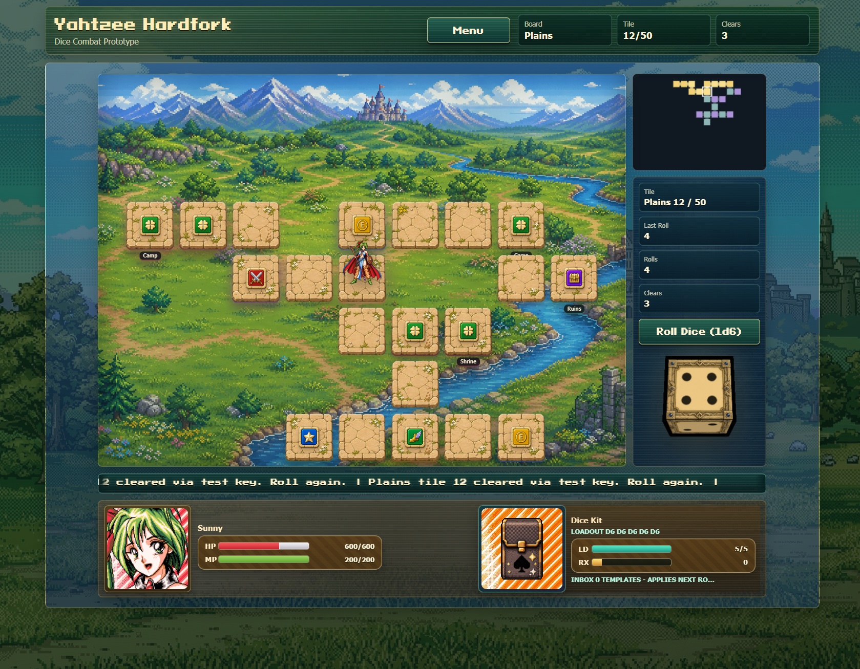
I agree on the battle UI. In the days leading up to AGDG Demo Day, I had just overhauled the overworld UI and added the tutorial for navigating it, but the dice combat UI has not had the same pass yet. That is why there is some visual drift there right now. Bringing the battle screen more in line with the retro dialogue/map presentation is one of the next things I plan to work on.

The lag is also noted. The main build is Electron, and I honestly had not thought much about a web version until I joined Demo Day and realized itch.io made that an option. So the browser version definitely exposed some performance issues I need to clean up.

On the portraits, the larger dialogue/map portraits are ones I created myself in Krita for this project. The smaller combat portraits are closer to the original Software House Parsley style/assets, so there is a mismatch right now. My plan is to create larger bust-up portraits for Sunny’Na and the enemies and use those in the battle UI too.

You are also right about the tutorial. The overworld tutorial was added first because that part had just changed a lot, but the dice combat tutorial still needs to be built. I want to improve the battle UI first, then tutorialize that version instead of teaching players around a screen I already know I am replacing.

The RNG-heavy comment is also useful. There is supposed to be more player agency through dice choices, rerolls, equipment, and special dice effects, but if that was not clear, then the game is not explaining itself well enough yet.

I also agree on left-click speeding up the intro text instead of skipping it, and a fullscreen option for the web version would be nice.

Thanks again for playing and writing this up. This gives me a clear direction for what needs attention next.

This is what the overworld looked like a couple weeks ago.