
As the programmer-developer of Cards n’ Zombies (Coming Soon), I hope that highlighting here some of the steps on our development path might be good for other aspiring indies like us.
Cristi @16bitnights has already pointed out the main big steps achieved up to now: paper concept → to image canvas → to in-engine prototype. Let’s zero-in today on the beginnings: the design of the cards.
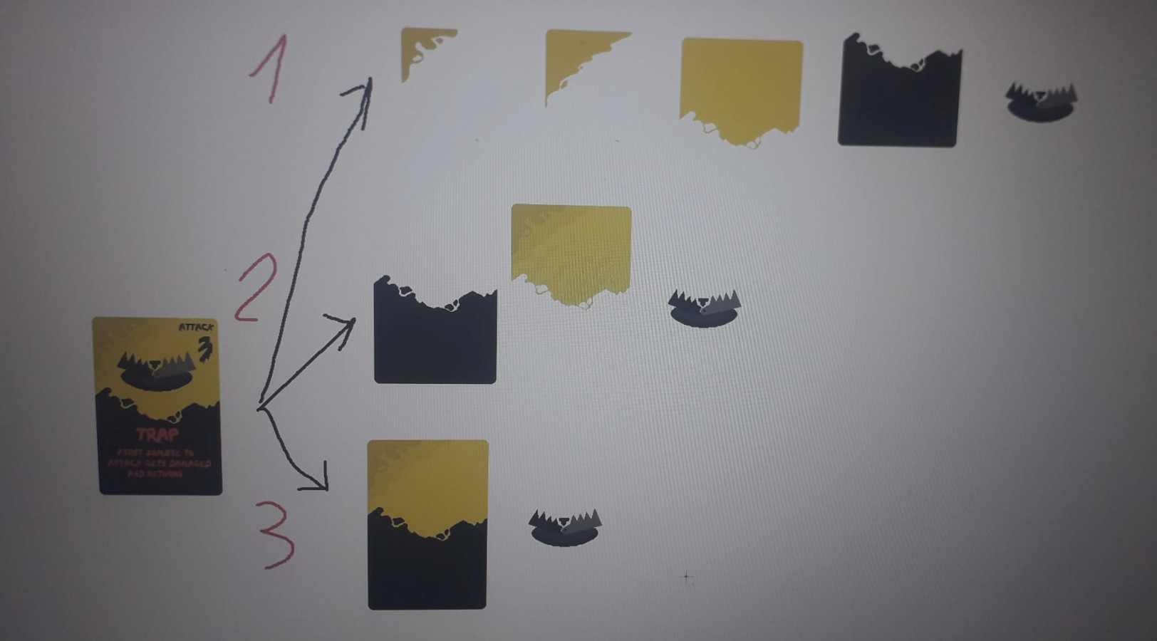
The design was a process, with Cristi only knows how many iterations. Border, no border? We decided to go without borders or clearly identified square sections on the card, feels more organic this way. How many visual components ? Of course we didn’t use this many parts for each card, in the end the background was merged. But the main sprite (like the trap jaws here) and the text are separate, so in the end a basic card has actually 3 main components: background, text and main image/sprite.
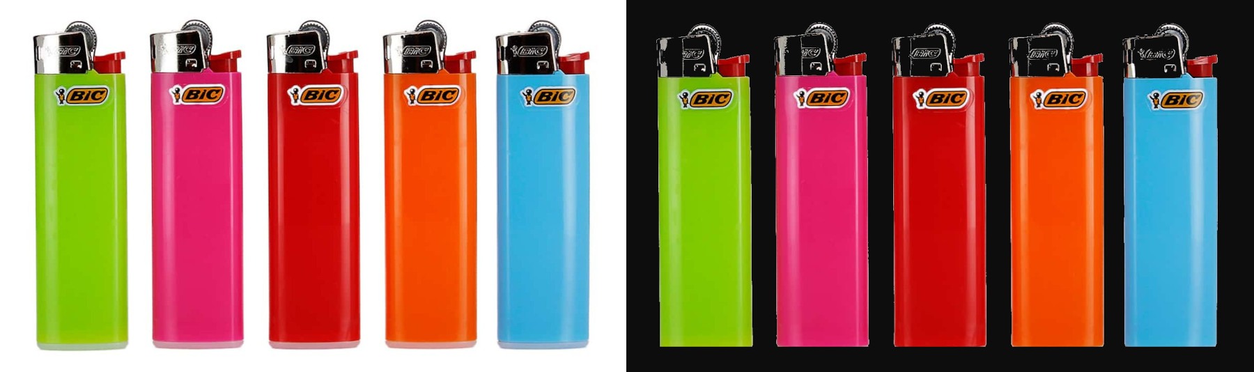
As for the color palette, I believe some of the inspiration was found in something as trivial as gas lighters, they look good on black. Speaking of lighters (and spoilers), our fireman’s relationship with fire is more like lightin’ than fightin’.
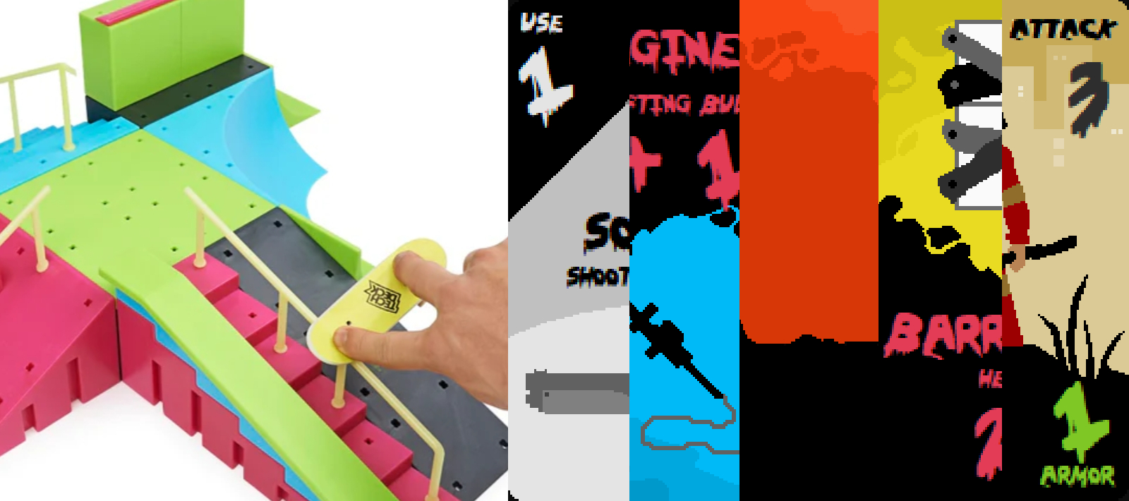
You might think: doesn’t it give a toy vibe? You’re probably right, IF the colors were used side-by-side it would look a bit toy-like, but we rather use them with others on the same spectrum and black. Plus, instead of relying on a purely dark, gory atmosphere, our game wants to primarily focus on being fun. Another spoiler: we plan to also lighten the tone a bit by putting in some surprises and witty remarks 🙄
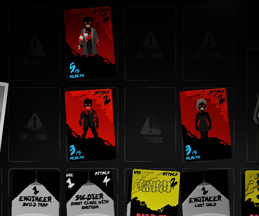
Also, with the chosen lighting (and Unreal Engine’s postprocessing - oh boy we’re surely going to talk about that in the future!), the monsters end up look threatening enough – at least to some chicken like me 🤪.
Till the next post, guys (and gals)! Of course, don’t forget to like and subscribe wishlist us.