
I think if you made both sides colored (if you want to use the same colors you're already using, the left side could be blue and the right side could be pink), removed the dot, and assigned a percentage to both stats it would be more obvious. To use my same example, instead of just having 10% under the bar, there would be a 10% next to bold and a 90% next to reserved. At the point where the dot is now is where it would switch from blue to pink, so the left 10% of the bar would be blue and the remaining 90% of the bar would be pink.
62 days ago(+1)
I’ve updated it to this for the minute as it’s a quicker fix: 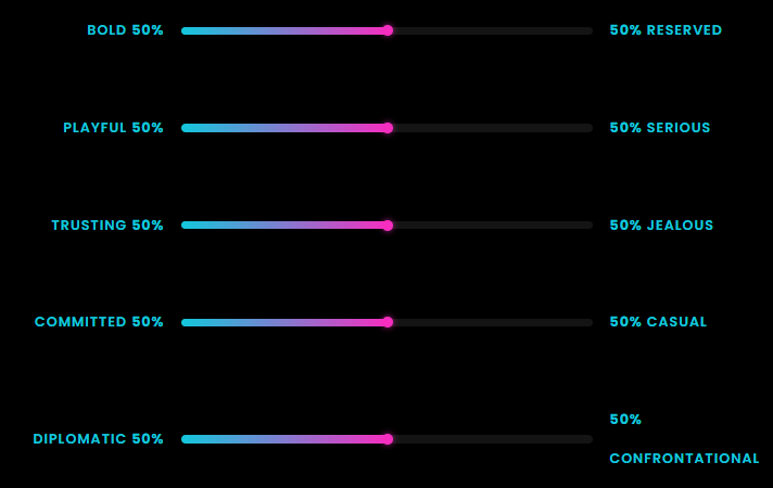 but I will update it to something more similar to your suggestion once I figure it out as I keep breaking it and that’s not the goal. I hope this works temporarily.